Perfect Pizza Distribution and Graphing
Learn how to create a circle graph representing pizza toppings percentages with helpful tips and examples. Explore the process of surveying data, converting it into percentages, and plotting it on a circle graph. Enhance your graphing skills with step-by-step instructions and detailed examples.

Perfect Pizza Distribution and Graphing
E N D
Presentation Transcript
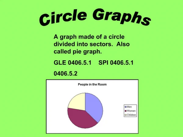
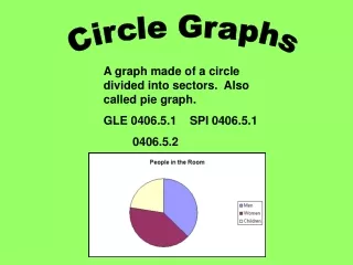
Circle Graphs A graph made of a circle divided into sectors. Also called pie graph. GLE 0406.5.1 SPI 0406.5.1 0406.5.2
Parts of a Circle Graph Graph Title – the title tells what the graph is representing. Sectors – Each sector is one part of the whole circle. Sector Labels – Each label tells what the sector represents. The Perfect Pizza 55% cheese 15% sauce 30% pepperoni
How to make a circle graph • Using a compass, draw a circle large enough to show all of your data. • Determine how many sectors you will need in your graph. You will need to know the percentages of the whole of your data. Try to make the sector sizes look as close to the percentage of the circle as the percentage of your data. • Label each sector and give your graph a title.
Activity Example Survey your classroom for cafeteria favorites. Choose four different lunches and gather the data. Make a table to show data.
You must now change the numbers to percentages. To do this, change each number to a fraction. 10/25 8/25 5/25 2/25 Then divide the numerator by the denominator. 10/25=.40 8/25=.32 5/25=.20 2/25=.08 Then multiply the answer by 100 .40*100=40% .32*100=32% .20*100=20% .08*100=8% Now you are ready to draw your circle graph.
First you will need to divide your circle into approximate sectors to represent each percentage. Label each sector with the appropriate name and percentage. Chicken 32% Pizza 40% Spaghetti 20% Fish 8%
Finally, give your graph a title. Favorite Lunch Foods Chicken 32% Pizza 40% Spaghetti 20% Fish 8%
Additional Resources http://www.emints.org/ethemes/resources/S00000589.shtml http://nces.ed.gov/NCEsKids/graphing/classic/pie.asp http://www.superteacherworksheets.com/graphing.html http://jmathpage.com/JIMSStatisticspage.html http://www.mrnussbaum.com/smartpoll.htm http://www.k111.k12.il.us/King/math.htm#Graphing/%20Data%20Collections