Circle Graphs Pre-Lesson Activity
Learn how to convert percents to decimals, divide a circle into sectors, understand fraction percentages, and create circle graphs using given data.

Circle Graphs Pre-Lesson Activity
E N D
Presentation Transcript
Pre-Lesson Activity Change each of the following percents to decimals: 1) 50% = _____ 2) 35% = _____ 3) 27% = _____ 4) 5% = _____ 5) 1% = _____ 6) 88% = _____ 7) 15% = _____ 8) 112% = ____
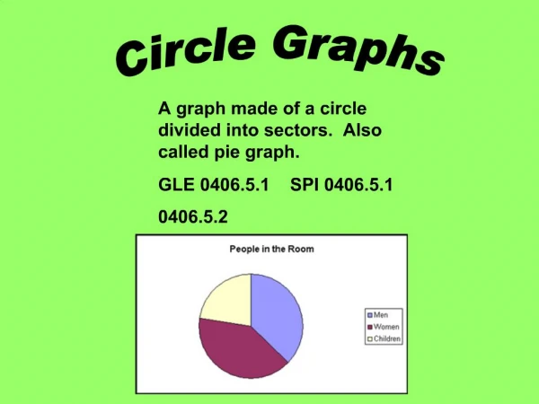
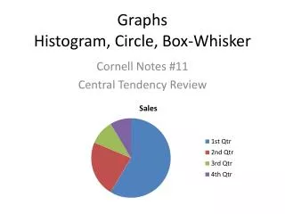
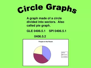
Circle Graphs Circle graphs (or pie charts) are good for comparing categories and seeing how each part compares to the whole.
The circle is divided into sectors that show how the data are divided into parts by percent.
Draw a circle with a radius of 4 cm using the Bullseye compass. • Divide the circle into 4 equal sectors. • What fraction of the whole circle is each sector? 3) Colour two sectors red, one sector blue, and one sector green.
4) What percent of the circle does each colour represent? 5) There are 360° in a circle. What is the relationship between the size of the sector angle and the fraction of the whole circle it represents?
Drawing Circle Graphs • Given the following table about vacation choices, construct a circle graph.
Step 1: Write each number as a percent of the total. 152 + 92 + 64 + 52 + 40 = 400 people total Ocean: Lakes: Cities:
Mountains: Forests: Make sure your total adds up to 100%.
Step 2: Find the size of each angle for the circle graph. Oceans: 38% 0.38 x 360º = 137º Lakes: 23% ____ x 360º = ____º Cities: 16% Mountains: 13% Forests: 10%
Step 3: Draw in the angles with a protractor. Step 4: Label each section (sector) with a name and a percent. Step 5: Give the graph a title.
Ryan surveyed 200 students about their most common use of the Internet
1) Use the size of the sector angle for each activity to construct a circle graph. 2) Label the sectors and give your graph a title.
Practice A grade 8 class of 32 students is surveyed about their favourite type of music. Draw a circle graph to display the data.