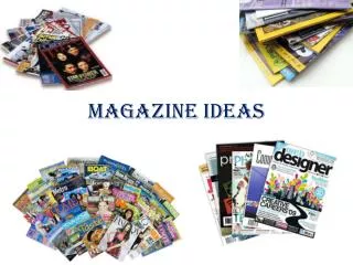
Exploring Terminator Salvation: An In-Depth Look into the Film Magazine's Bold Design
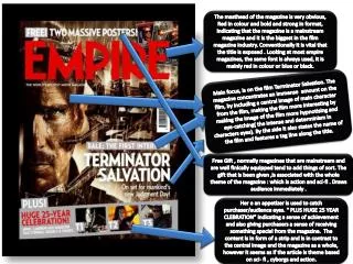
The magazine’s masthead, prominently displayed in bold red, signifies its status as a leading mainstream film publication, especially focusing on 'Terminator Salvation.' The cover features a captivating central image of the film's main character, designed to draw readers in with its intense gaze. In addition, the magazine promotes a 'Free Gift' tied to its action and sci-fi theme, enhancing its appeal. Celebrating 25 years, the content reflects a balance of exclusive interviews and thematic articles, while its artistic choices evoke an engaging atmosphere, distinguishing itself in a crowded marketplace.

Exploring Terminator Salvation: An In-Depth Look into the Film Magazine's Bold Design
E N D
Presentation Transcript
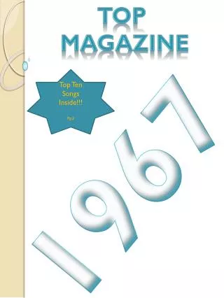
The masthead of the magazine is very obvious, Red in colour and bold and strong in format, indicating that the magazine is a mainstream magazine and it is the biggest in the film magazine industry. Conventionally it is vital that the title is exposed . Looking at most empire magazines, the same font is always used, it is mainly red in colour or blue or black. Main focus, is on the film Terminator Salvation. The magazine concentrates an immense amount on the film, by including a central image of main character from the film, making the film more interesting by making the image of the film more hypnotising and eye-catching( the intense and determinism in characters eyes). By the side it also states the name of the film and features a tag line along the title. Free Gift , normally magazines that are mainstream and are well finically equipped tend to add things of sort. The gift that is been given ,is associated with the whole theme of the magazine : which is action and sci-fi . Draws audience immediately . Her e an appetizer is used to catch purchaser/audience eyes. “ PLUS HUGE 25 YEAR CLEBRATION” indicating a sense of achievement and also giving purchasers a sense of receiving something special from the magazine. The content is in form of a strip and is in contrast to the central image and the magazine as a whole, however it seems as if the article is theme based on sci- fi , cyborgs and action.
The masthead of the magazine uses a black, bold and non- capital format. Unlike the poster above it lacks prestige as in the title does not portray to the audience that it is a mainstream magazine, but rather a niche magazine because of its non cap format and small size. The name of the title suggests to the audience immediately that it is a film magazine because of the use of the words sounds and sight The picture is off centred and is not of camera level meaning no eye contact with the audience. This magazine subverts from normal magazines as like in the above the main image is eye level and is looking at the audience. The use of such a small picture and the subversions that are occurring suggest that this magazine is a niche magazine. The sub title just next to the picture describes the main film that the magazine is marketing. The use of a sky background and the city just below it is a screen shot from the film 21st Century Girl. This is creative as it sets the atmosphere, location of the film being focused on without the use of a trailer. Its does tend to make this magazine look more like a book instead of a magazine. The use of additional information is used. It informs purchaser what the magazine has included in it. The use of significant names in black/bold, suggest that magazine is offereing exciting exclusive interviews with prominent people. The us e of text shows once again how niche this magazine is. An Effort Has not been made