RIFT Magazine
160 likes | 494 Views
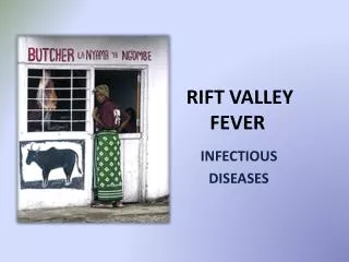
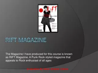
The Magazine I have produced for this course is known as RIFT Magazine. A Punk Rock styled magazine that appeals to Rock enthusiast of all ages . RIFT Magazine. Evaluation By Harry Andrew Clarke.

RIFT Magazine
E N D
Presentation Transcript
The Magazine I have produced for this course is known as RIFT Magazine. A Punk Rock styled magazine that appeals to Rock enthusiast of all ages RIFT Magazine Evaluation By Harry Andrew Clarke
1) In what way does your media product use, develop or challenge forms and conventions of real media products?: Cover Analysis • My Magazine (RIFT) has taken inspiration and has also differed in numerous ways in comparisons to other magazines of its genre. When designing my magazine cover I had the intention in following the style of two magazines in particular, NME and Kerrang. Both of these magazines use an image of either a band or a solo artist that usually takes up the majority of the cover. As you can see, I also used this style as I believe the image I used, effectively displays the tone and attracts and specific audience I am aiming at. • The language style for RIFT magazine is fairly standard for what you would expect from a music magazine. Quotes from artists can be seen on the cover in an attempt to entice the reader to read the full piece. • Terms such as “check out” and “get the inside scoop” are terms that encourage the reader to discover the contents of the magazine. Implementing exclusives also gives the potential reader an incentive to buy the magazine. As well as these terms being sell points to the consumer they are also terms used primarily with a younger teenage audience so in this sense the reader feels the magazine is much more relatable. • My cover artist for my magazine is Caitlin Pearson, dressed in a school girl skirt and a pulled back denim jacked, the intention was that she represented a girl new onto the punk rock scene. Breaking away from her traditional roots to express herself through the volume of music . Her body language suggests she is almost breaking away from societies expectations and suggests she is now feeling much more secure, expressing her true self. She is also looking directly at the camera, giving the impression that she is not afraid to send a message directly to the audience. This is a technique used frequently by magazines such as Kerrang who try to address a perhaps rebellious audience who want to strive away from society's standards.
Masthead: Informing the reader of the magazine title and style of the magazine based on font. (Subheadings) Brief headings informing the reader of the magazine contents. (Bonus Content) Gives the reader an increased incentive to read (White backdrop) Gives the consumer the impression this image is made professionally with a studio finish. (Corresponding text & colour) Organised text with corresponding text allows images to be seen easily and text to be read clearly .
1) In what way does your media product use, develop or challenge forms and conventions of real media products?: Contents Analysis • My contents page follows the same style as magazines in the past with corresponding text being layered down the side of the page, while also including some images to give the reader an idea of the artists included in the magazine as well as any exclusive features. • The same font for the cover page was used once again for my contents page so the audience is still familiar with the style and tone of the magazine as it appeals to a specific audience • I have also taken inspiration from the layout of NME’S contents page as they, like me, have included the issue date and copy number of the magazine and also included bonus content such as a website link to improve consumer emersion with the consumer • The same R used on the double page spread and cover can also be seen on the contents page as it gives the magazine in general a sense of recognition and so consumers will be familiar with the layout throughout the entire magazine. • Images are also located down the right of the page to give visual representation of the type of individuals the magazine has chosen to focus on. • Many magazines also uses the same colours of red, white and black, (also used on the images) as these colours are closely associated with the rock genre and this is a consistent theme throughout my magazine to help establish my magazines identify.
(Bonus Content) Gives the reader an increased incentive to read (Subheadings) Brief headings informing the reader of the magazine contents. (Corresponding text & colour) Organised text with corresponding text allows images to be seen easily and text to be read clearly . (Direct quotation) A quote from one of the artist featured in the magazine, giving an incite into what topics they are discussing. Image placement: Two images located at the side of the page to show artists features and stories regarding them.
1) In what way does your media product use, develop or challenge forms and conventions of real media products?: Double Page Spread Analysis • My double page spread follows the same style many magazines choose to use. An interview/ Q&A is located down the centre and right side of the page, taking up the most space to emphasise its importance. • Questions are highlighted in a bright red so the splits in conversation can be seen easily by the reader. They are also spread evenly across the page so the text is easier to read and the page looks much more organised. • The image (although smaller than the total text), is cropped and positioned accordingly to the page where the artist is easily recognised and yet the image presence doesn’t distract the reader. The image to the right clearly identifies the artist featured and the black and white filter placed over the image helps the artist stand out against the white back drop, after using this image positioning on my front cover, it helped add to the idea that Rift is a professional looking magazine. • The Rift logo of ‘R’ can be located at the top left of the page simply placed as a reminder that the audience is reading a copy of Rift Magazine. As well as the ‘Rift exclusive’ proving to be another reader incentive to the consumer.
(Subheadings) Brief headings informing the reader of the magazine contents. (Direct quotation) A quote from one of the artist featured in the magazine, giving an incite into what topics they are discussing. (White backdrop) Gives the consumer the impression this image is made professionally with a studio finish. Image placement: Two images located at the side of the page to show artists features and stories regarding them.
2) How does your media product represent particular social groups? • When creating my music magazine I had the intention of aiming at a particular audience who could relate to the artists that represent my magazine. • I attempted to represent primarily teenagers In today's society who are fanatic over the rock/punk rock music produced today by bans such as Fall Out Boy, Green Day and Panic At The Disco. This representation is of both men and women as I believe rock is a genre in which everyone can relate to regardless of gender. • Individuals who want to rebel against standards set by today's media, as well as proving g that the genre of rock is still expanding with huge success. This is emphasised with the images used throughout my magazine as they feature artists dressed in a certain way that identifies with the genre of rock. As well as using the corresponding colours of red, black and white which are commonly used in rock magazines. • I tried to present my artist (teenage girl)that is perhaps more radical from what most teenage girls are expected to be like. Most girl who would appear to be representing this magazine or rock movement would perhaps feel that they want to express themselves in a way that is perhaps rebellious and angry to societies standards, perhaps due to deprived backgrounds, troubled home lives or because they are struggling to find themselves in a conflicting community of teenagers. Hence why my cover artist is looking directly at the camera, clothes spread back and is also using a certain facial expression to show how she expressing herself through the volume of music, no longer caring what society thinks of her.
3)What kind of media institution may distribute your media product? • Please follow the following link to see the answer to this question: • https://www.youtube.com/watch?v=vBzbYRPBZmg
4)Who would be the audience for your media product? • Please follow the following link to see the answer to this question: • https://www.youtube.com/watch?v=WNRm-8iJQAU
5)How did you attract/address your audience? • Please follow the following link to see the answer to this question: • https://www.youtube.com/watch?v=EE-KcOA6-8U
6) What have you learnt about technologies from the process of constructing this product? • Throughout the process of creating my magazine, I have increased my knowledge on current technologies to a large existent and so the final outcome of my three media products is evidence of this. • I used a wide variety of programmes, equipment and digital tools to help me create the final media products, and so now I will begin to analyse how I used these technologies in a number of different ways. • Photoshop- This computer programme was incredibly helpful in creating my media products. The programme was required to help edit each of my photos and this was achieved by learning how to use the tools the programme provided. The cropping tool allowed me to adjust the size and shape of the image to fit my specific needs. It allowed me to reshape text and alter the font so I could successful create the look and professional representation of a real life music magazine. It also allowed me to alter the colours used for my image as well as font to make the overall final product much more appealing to a potential buyer.
6) What have you learnt about technologies from the process of constructing this product? Part 2 • Indesign: This product was knew to me as I began creating my products so to begin with I had some difficulty adjusting to this programme. However as I spent more time using it I learnt that it was incredibly helpful when creating the contents page for my magazine. It once again allowed me to crop images, alter text in a similar way as Photoshop, however it became most helpful when shaping my images in a specific way that helped create a believable layout of a contents page. Examples including having the text layered down the side of the page like magazines currently, with the images located to the right of them. Overall this product was essential in creating my contents page. • SLR Camera: I had previous experience with this camera and so using it for my magazine was very useful. It allowed to take photos of a very high quality due to the high camera resolution and the size of the camera also allowed me to take photos at specific angles with specific lighting.
6) What have you learnt about technologies from the process of constructing this product? Part 3 • Internet Explorer: Quite simply used to look at inspiration for my media products by looking at other music magazines such as NME and Kerrang. It also allowed me to post to my online blog for others to see my work and organise my work appropriately. • Microsoft Word: Used to type up specific extracts from my magazine, whilst also helping to maintain a high standard of grammar and spelling throughout my work. • Microsoft PowerPoint: Used during my course to make an analyse of current music magazines, and also used to make my media evaluation and present information in an alternative way. • Overall each programe or piece of equipment i used throughout this media course proved to be very helpful in the process of achieving my final product.
7) Looking back at your preliminary task, what do you feel you have learnt in the progression from it to the full product? • Due to the fact I have already discussed what I have learnt from a technological point of view, it is important to analyse what i have learnt from different perspectives. • Firstly I believe I have learnt a great deal about the way music magazines appeal to a consumer by the use of images, colour, promotion and appealing to consumer needs. • After making comparisons to my friends magazines, and asking other individuals my age of what to expect from a magazine I have learnt how to present information and how to sell a magazine depending on the specific consumer. • Overall I believe I have learnt in general about the necessary requirements to sell any product of this kind but in terms of a music magazine, I have learnt that you need to focus on the specific genre of your magazine, the audience in which you are selling too, and the purpose of your magazine in general.
Thank you for watching! I hope you enjoyed my media evaluation