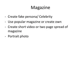
Unveiling Dzhokhar Tsarnaev: A Bold and Striking Magazine Cover
Explore the impactful design choices of Rolling Stone's cover featuring Dzhokhar Tsarnaev. The cover image and text arrangement are analyzed to understand consumer attraction strategies.


Unveiling Dzhokhar Tsarnaev: A Bold and Striking Magazine Cover
E N D
Presentation Transcript
Magazine Presentation By Bradley Wedlake
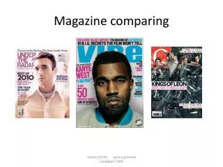
Title at the forefront All the other boxes are pushed to the side but the important words as in bold and enlarged Picture is very bold and striking, we are forced to stare at his face The words are nearly as prominent as the title
The Image The image of DzhokharTsarnaev is very ominous because even though it is not at the forefront, it is still the only thing a passer-by in a shop would look at, especially as he is such a controversial figure, this would attract consumer attention hopefully leading to a purchase, which is exactly why Rolling Stone did this. They could have used a lot of photos of him but they chose the picture where his dark black hair contrasts with cream surroundings but also fits with the red and black outline of the title, further attracting attention towards it.
The Text A lot of the attention to the text is sacrificed on the cover in order for the cover image to gain attention but some words are enlarged and in bold to attract attention towards them as well. The majority of the special words are names of artists, this is done to attract consumer attention. For example, Robin Thicke gains a number one single and album both called Blurred Lines, people hear and like his music and become Robin Thicke fans, they are more likely to buy a magazine if it mentions the name Robin Thicke. The words “The Bomber” are significant to explain to people who Dzhokhar is, if they didn’t recognise him and it is used as a title for him, maybe implying he doesn’t deserve a name. The font is very solid, which gives a very striking look to the cover and the black colour helps to contrast with the cream clothes of “The Bomber” and the background of the cover, also used to emphasise the image.
Target Audience The Target audience for Rolling Stone judging by the cover of this edition alone, I would say between 18 - 45. The text suggests that the main article is of his life which wouldn’t appeal to any children or teenagers but the mention of articles about popular artists like Jay – Z or Robin Thicke, suggests that young adults or even young people could seek to purchase it as well as implying that older generations who might not have as much of an appreciation towards todays popular music, may steer away from this magazine but of course all this is just speculation and generalisation.