Correlations and Scatterplots: A Practical Guide
160 likes | 187 Views
This guide explores correlations using Pearson's r, emphasizing direction and strength. Learn to create scatterplots in Excel to visualize relationships between variables effectively. Understand how to interpret correlations mathematically and in descriptive sentences.

Correlations and Scatterplots: A Practical Guide
E N D
Presentation Transcript
Correlations A quick review: • Every correlation has a direction (positive or negative): • + correlation: high scores on one variable are associated with high scores on another variable. • - correlation: high scores on one variable are associated with low scores on the other variable. • Every correlation has a magnitude or strength: • The closer the correlation coefficient is to +1.00 or -1.00, the stronger it is. • The closer the correlation coefficient is to 0.00, the weaker it is.
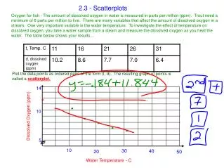
Calculating Pearson’s r • Correlations are described using the Pearson Product-Moment correlation statistic, or r value. • In Excel, there are many functions that can calculate a correlation statistic, however, we will only use =PEARSON in this class. Let’s say we want to determine if there is a relationship between number of hours spent per week studying for Psych 209 and GPA earned in the class at the end of the quarter. To do so, we can calculate Pearson’s r for our two variables.
Enter the following data into Excel: StudyHrs = average number of hours spent per week studying for 209 GPA = grade-point average earned in 209 at the end of the quarter
Step 1: Select the cell where you want your r value to appear (you might want to label it). Step 2: Click on the function wizard button. Step 3: Search for and select PEARSON.
Step 4: For Array1, select all the values under StudyHrs. For Array2, select all the values under GPA.
Step 5: That’s it! Once you have your r value, don’t forget to round to 2 decimal places. Knowledge check: What does the r value of 0.88 tell you about the strength and direction of the correlation between StudyHrs and GPA?
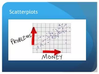
Scatterplots • A scatterplot is an excellent way to visually display the relationship (correlation) between two variables. • Each point on the scatterplot represents an individual’s data on the two variables. • We will now create a scatterplot for StudyHrs and GPA.
Step 1: Select both columns of variables you wish to plot (StudyHrs and GPA). Step 2: Click on the tab labeled ‘Insert’, and then select ‘Scatter’ in the ‘Charts’ menu.
Step 4: Remove the legend by clicking on it and pressing Delete.
Step 5: Add axis titles by selecting the ‘Layout’ tab and clicking on ‘Axis Titles.’ For the horizontal title, you want it below the x-axis. For the vertical title, you want the ‘Rotated Title’ option. NOTE: Your chart must be highlighted for the ‘Layout’ tab to appear under ‘Chart Tools.’
A note about x- and y-axes: • For scatterplots, it does not matter which variable goes on each axis (this is NOT true for other types of charts). • However, you need to make sure you label your axes with the proper variable name. • In this example, GPA is on the y-axis and Study Hours is on the x-axis (we can tell this based on their different ranges of values). • As a helpful hint, Excel will automatically put the first variable (left-hand column) on the x-axis, and the second variable (right-hand column) on the y-axis.
Step 6: Change the chart title by selecting it, typing a new one, and pressing Enter. Chart and axis titles may be altered by right-clicking on them.
Your scatterplot is now finished! Remember: Each point in the scatterplot represents an individual’s data. Knowledge check: Identify Student 8 in the scatterplot.
Describing Correlations and Scatterplots • Scatterplots and correlations are described: • As positive or negative. • As weak, moderate, or strong. • Using the r value. • Sentence 1: There is a strong, positive correlation (r = 0.88) between the number of hours studied and GPA. • Then you want to describe the general relationship between the two variables: • Sentence 2: More hours of studying for Psych 209 was associated with a higher GPA earned in the class at the end of the quarter. • NOTE: We cannot say “More studying led to a higher GPA” – this implies causation, which cannot be determined using correlational research.