Download
1 / 45
490 likes | 675 Views
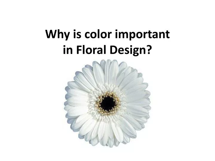
Why is color important in Floral Design?. What is the purpose?. Provokes emotion What emotions are flowers associated with?. How do colors make us feel?. Warm Colors Reds and yellows give us a “ warm ” feeling Remind us of fires and sunlight Cool Colors

E N D
What is the purpose? • Provokes emotion • What emotions are flowers associated with?
How do colors make us feel? • Warm Colors • Reds and yellows give us a “warm” feeling • Remind us of fires and sunlight • Cool Colors • Blues and greens give us a “cool” feeling • Remind us of sky, water, ice, foliage
How do colors make us feel? • To create a bright cheerful arrangement, use colors like yellows, oranges, reds, and whites • Blues, greens, and whites are cool and refreshing • Violets and purples give an almost sad feeling • Black and shades produce a depressing effect
White • Innocence • Simplicity
Gray • Quiet • Delicate
Black • Despair
Browns • Slow • Surety
Red • Love • Outward Interests
Orange • Cheery • Spirited
Yellow • Happiness • Optimism
Blue • Conservative • Sadness
Green • Sensitive • Life
Purple • Sentimental • Reflective
Scenarios • What colors would you use for a funeral? • What colors would you use for a wedding? • What colors would you use for someone in the hospital?
Primary Colors • Red • Yellow • Blue • ALL COLORS COME FROM A COMBINATION OF THESE THREE COLORS!
Secondary Colors • Green, Orange, Purple • Created by mixing two primary colors
Tertiary Colors • Made by combining a primary color with a secondary color. • Always list primary color name first • Examples • Red orange • Blue green • Yellow green
Paint Chips • What’s the difference?
Tint • Color plus white
Tone • Color plus grey
Shade • Color plus hue
Primary Colors • Add your three primary colors: • Red • Yellow • Blue
Secondary Colors • In the middle slot between each group • Add a mix of Red and Yellow to make Orange • Add a mix of Red and Blue to make Purple • Add a mix of Blue and Yellow to make Green
Adding Tints • Add white to each color to give its tint
Adding Shades • To make a shade of a color (darker), you can add black. • HINT: Rather than add Black you can add a little bit of its opposite color on the color wheel. This creates lots of other colors. • Ex: Yellows become Yellow Ochres, Greens become Raw Umbers and Burnt Siennas.
The Color Wheel • Full Color Wheel Colors • Primary: Blue, Yellow, Red • Secondary: Orange, Green, Purple • Tertiary: Equal mixture of a primary and secondary color • Primary color placed first • Red-Violet • Blue-Green
Color Harmonies • Generally two types: • Related (Monochromatic and Analogous) – Neighbors on color wheel • Contrasted – Strangers across wheel from each other
Color HarmoniesRELATED MONOCHROMATIC • One, single color supplemented by tints, tones, or shades of that one color
Color HarmoniesRELATED MONOCHROMATIC • Tints • Color + White • Hue • Family name of a color (Ex: red)
Color HarmoniesRELATED MONOCHROMATIC • Shades • Color + Black • Tone • Color + Gray (mixture of white and black)
Color HarmoniesRELATED ANALOGOUS • Achieved by using colors adjoining each other on color wheel • Example: Red with Orange, Yellow
Color Harmonies – ContrastedComplementary Harmony • Colors directly opposite each other • Examples: • Orange and Blue • Red and Green • Violet and Yellow
Color Harmonies – ContrastedTriadic Harmony • Combines three colors equidistant, forming a triangle • Example: • Red, Blue, Yellow
Color Harmonies – ContrastedTetrad Harmony • Combines four colors, equidistant, forming a square • Must use 1 primary color, 1 secondary color, 2 tertiary colors • Example: • Red, Green, Yellow-Orange, Blue-Violet
Poly Chromatic • Includes a wide variety of colors • Anything goes
Movement Through Colors • Advancing color- Moves towards the viewer • Receding color- Disappears into the background • Example: With yellow and purple, • Yellow = advancing • Purple= receding