Download
1 / 14
140 likes | 276 Views
Presenting Data Visually. Mass Academy of Math and Science Worcester, Mass. http://www.massacademy.org/. Purpose of Visuals. To inform or persuade Makes complex data clear To emphasize To present data out of context To involve an audience To counteract distracting environment

E N D
Presenting Data Visually Mass Academy of Math and Science Worcester, Mass. http://www.massacademy.org/
Purpose of Visuals • To inform or persuade • Makes complex data clear • To emphasize • To present data out of context • To involve an audience • To counteract distracting environment • Makes data more memorable http://www.massacademy.org/~kgagne K. Gagné
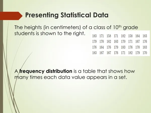
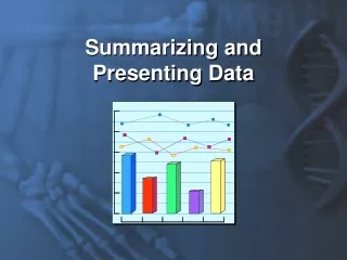
Types of Visuals • Numerical Tables • Bar Graphs • Line Graphs • Pie Charts http://www.massacademy.org/~kgagne K. Gagné
Numerical Tables Business district stock values http://www.massacademy.org/~kgagne K. Gagné
Bar Graphs Compare Data http://www.massacademy.org/~kgagne K. Gagné
Line Graphs Show Changes Over Time http://www.massacademy.org/~kgagne K. Gagné
Pie charts show percentages http://www.massacademy.org/~kgagne K. Gagné
Preparing Visuals • Purpose • What should audience see or think? • Emphasis • Specific values? • Comparisons? • Patterns? • Audience • Tech background? http://www.massacademy.org/~kgagne K. Gagné
Design Reminder • All tables should have titles at the top • Figures are labeled at the bottom • All axes should be labeled proportionately • Use units! • Keep color scheme simple and high contrast • Use space well; avoid overcrowding http://www.massacademy.org/~kgagne K. Gagné
Good Design At Work http://www.massacademy.org/~kgagne K. Gagné
What Happened Here? http://www.massacademy.org/~kgagne K. Gagné
What Happened Here? http://www.massacademy.org/~kgagne K. Gagné
What Happened Here? http://www.massacademy.org/~kgagne K. Gagné
Practice Design a chart to convey the following: • 70 freshmen prefer Snickers for Halloween • 25 freshmen prefer Milky Ways • 5 freshmen are undecided • 30 seniors prefer Reese’s Pieces • 70 seniors prefer Milky Ways http://www.massacademy.org/~kgagne K. Gagné