Download

1 / 37
370 likes | 509 Views
This document explores the two primary types of data used in statistical analysis: qualitative and quantitative. Qualitative data are categorized into distinct groups (e.g., eye color, exam results), while quantitative data involve numerical values, either discrete (counts) or continuous (measurements). The text highlights important statistical concepts such as variables, frequency distributions, histograms, and measures of central tendency (mean, median, mode). Additionally, it covers variability measures to describe data spread, emphasizing their importance in accurate data interpretation.

E N D
Summarising and presenting data www.anu.edu.au/nceph/surfstat/
Types of data • Two broad types: qualitative and quantitative • Qualitative dataarise when the observations fall into separate distinct categories. • Examples are: • Colour of eyes : blue, green, brown etc • Exam result : pass or fail • Socio-economic status : low, middle or high. • Such data are discrete
Quantitative Data • Quantitative or numerical data arise when the observations are counts or measurements • Discrete if measurements are integers • number of people in a household, • number of cigarettes smoked per day • Continuous if measurements can take any value, (usually within some range) • weight • height • time
Variables and statistics • Quantities such as sex and weight are called variables, because the value of these quantities vary from one observation to another. • Numbers calculated to describe important features of the data are called statistics. For example, • the proportion of females • the average age of unemployed persons, in a sample of residents of a town are statistics.
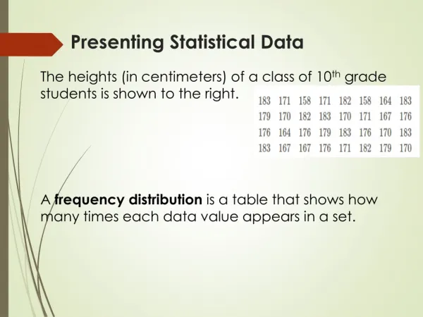
6000 6700 3800 7000 5800 9975 10500 5990 20000 11990 16500 10750 9500 12995 12500 8000 9900 18000 9500 9400 7250 15000 4500 8900 9850 9000 5800 29500* 15000 9000 4250 4990 11000 9990 2200 4000 13500 14500 Example: Commodore data • Prices of n=38 second-hand cars • Continuous data, need to summarise
Constructing a frequency distribution • Calculate the range and divide it by the chosen number of intervals to get the approximate length for each interval. • Usually use from 5 to 15 intervals. • Define interval end points so they don't overlap or leave gaps (ie. they are mutually exclusive and exhaustive) - This ensures that every observation belongs in exactly one interval. • It is a usually simpler idea to have all intervals of the same length • Count the number of values in each interval (the class frequency) - go through the data once only and use tally marks to help counting. • Usually relative frequencies or percentages are helpful to show the distribution of data.
Histogram • area of rectangle = frequency (or relative frequency) • But area = length x height • So if all intervals are the same length, L
Mode • The mode is the value or category which occurs most frequently. • If several data values occur with the same maximal frequency, they are all modes. • For example, in the Commodore data, using the grouped data, the class interval, [8,000 - 10,999], is the modal interval.
positive skewness (skew to the right) negative skewness (skew to the left) Modality and Symmetry • Modality: No. of peaks • E.g. one peak-unimodal • Skewness: departure from symmetry
Process control example • Deming • 500 steel rods • Ideal dia. = 1cm • Is process in control? • Why the gap?
MEASURES OF CENTRAL TENDENCY ("Averages") • Mean(arithmetic mean): (read as 'x bar') • Notation: denote data values by x1,x2,…,xn • n denotes no. of data points
Median • ‘Middle’ value of the data set • A number which is greater than half the data values and less than the other half • (n+1)/2 –th ordered observation If even: 6, 6.7, 3.8, 7, 5.8, 9.975 Data set: 6, 6.7, 3.8, 7, 5.8 Ordered: 3.8, 5.8, 6, 6.7, 7 Median: (5+1)/2 ordered obs.
Quartiles and percentiles • Median: 50% below, 50% above • 1st quartile: 25% below, 50% above • Q1: (n+1)/4 ordered observation • Q3 (3rd quartile): (3n+1)/4 ordered observation Data set: 6, 6.7, 3.8, 7, 5.8 Ordered: 3.8, 5.8, 6, 6.7, 7 • p-th percentile or quantile: p% below, (100-p)% above
Stem and leaf plot Finally order the leaves
Percentiles via stem and leaf plot Get the median: Median= (n+1)/2 ordered obs. i.e. 10.5 th ordered observation Lies in the stem 7| Median=(72+76)/2 = 74 Get 1st quartile: Q1 = (n+1)/4 ordered obs. Get third quartile: Q3 = (3n+1)/4 ordered obs.
Percentiles from a freq. distr. • What are median, 1st and 3rd quartiles ? • Actual values are 6700, 5900 and 10200 • You lose details in a frequency distribution
Comparison of Mean and Median Data set A: 2,3,3,4,5,7,8 Data set B: 2,3,3,4,5,8,20 Both have n = 7 values. • The median is not affected by extreme values, but the mean is changed • Median is useful for incomplete data • E.g. consider an experiment to measure average lifetime of a light bulb (n=6) : 200,400, 650, 700, 900,..
Comparing Mean, Median and Mode • If distribution is symmetric and unimodal, all three coincide • If only symmetric, mean and median coincide • If distribution is not symmetric, better to use median than mean
MEASURES OF VARIABILITY • Statistics which summarise how spread out the data values are. Also called measures of dispersion • The range=max-min(used in quality control) • The range is susceptible to extreme values
IQR • The interquartile range is defined as IQR = Q3 - Q1 • IQR is less susceptible to outliers (like the median)
Five number summary • Boxplot (or box-and-whisker plot) • Box contains middle 50% of data • If an obs is > 3 times IQR, it is an outlier
Mean absolute deviation: Summarising deviations from mean The deviation of each value xifrom themean is: The mean (or sum) of deviations is not a good summary: • Instead use a positive function such as di2 or |di| • Variance or mean square error:
Variance and Standard Deviation Usually n-1 instead of n is used in the denominator: sample variance Problem: squared distances have squared units s = the sample standard deviation.
Example: small data set Data set A: {xi} = 2, 3, 3, 4, 5, 7, 8: There are n=7 observations and mean = 4.57. The deviations from the mean, di , are: -2.57, -1.57, -1.57, -0.57, 0.43, 2.43, 3.43. So
Bivariate methods • We have (mostly) looked at univariate methods • Most interesting problems are bi (or multi) variate • Continuous variable vs. qualitative variable: comparative boxplot • Continuous variable vs. continuous variable: scatterplot
Presenting bivariate data • Scatterplots are useful for illustrating the relationship between continuous variables (xi, yi), i = 1,..n • Indicates type of relationship
Creating a scatterplot Step 1: Create variables ht and wt Step 2: plot(ht,wt,xlab=“height”, ylab=“weight”)
Summarising a relationship plot(temperature,ozone) abline(lm(ozone~temperature,data=air))
Summarising a nonlinear relationship • Use a smoother • plot(E,NOx) • lines(supsmu(E,NOx))