
Design Principles for Font Families Proximity
Learn the key design principles for font families proximity to create visually appealing and organized designs. Understand the importance of grouping related items together, utilizing white space effectively, and maintaining consistency across different font types. By Stefanie Zehner, this instructional tech guide emphasizes contrast, repetition, and alignment for a clean and sophisticated aesthetic. Follow these tips to create visually attractive and instantly understandable designs with strength.

Design Principles for Font Families Proximity
E N D
Presentation Transcript
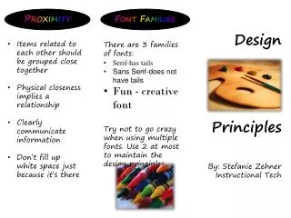
Font Families Proximity Design Principles • Items related to each other should be grouped close together • Physical closeness implies a relationship • Clearly communicate information • Don’t fill up white space just because it’s there • There are 3 families of fonts: • Serif-has tails • Sans Serif-does not have tails • Fun - creative font • Try not to go crazy when using multiple fonts. Use 2 at most to maintain the design principles. By: Stefanie Zehner Instructional Tech
Contrast Repetition Alignment • Organization & unity will lead to consistency • Visual interest • Push existing consistencies further • Repeat some aspect of design throughout entire piece • Clean & sophisticated • Don’t use multiple text alignments • Use right/left alignment to be more dramatic • Be conscious of placement of elements • Avoid similar elements, like: • Make it visually attractive • Able to glance & instantly understand without scrutinizing it • Do it with strength • Go big or go home Too close in color Little differenceinsize Little differenceinfont


