Effective Design Principles for Visually Pleasing Content
Learn key design principles for creating visually appealing content, including contrast, repetition, and alignment. Discover how to use proximity and font families to enhance your design elements.


Effective Design Principles for Visually Pleasing Content
E N D
Presentation Transcript
Proximity • Keep items that are relates with each other together, keep others far, far away. • Do NOT leave a blank line between a story’s title and the story. They are relates keep them together! • Use white space to provide distance between unrelated items. • Font Families • There are 3 major font families • Serif - font with a foot Example: Times • San serif - font without a foot Example: Arial • Fun – all other fonts Example: GiddyupStd Design Principles Daniel McCulloch April 16, 2013
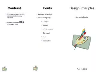
Contrast • Visual attraction on the page • Keep elements the same or very different • Make darks dark and light items light • Place dark text on a light background and light text on a dark background • Make big items big andsmall ones small • Repetition • Aim for consistency. • Repetition will strengthen the reader’s sense of recognition. • Repeat elements throughout your document. • Repeat fonts, font sizes, colors, and graphics. • Alignment • There are 4 alignments: • Left- Use for large blocks of text that need to be read. This is a traditional style. • Right- Use for titles and small amounts of text. This is funky. • Centered- Use for titles. Is formal. • Block- Use in newspapers