DO’S AND DON’TS IN WEB TYPOGRAPHY
120 likes | 262 Views
DO’S AND DON’TS IN WEB TYPOGRAPHY. Eva Borsje and Wendy Plant. INTRODUCTION. TYPOGRAPHY IS THE MOST IMPORTANT IN WEB DESIGN. FONTS, TYPEFACES AND TYPOGRAPHY. Digital. “ What language looks like ”. What we call ‘font’. THE WORKSHOP. EXAMPLES. EXAMPLES. ROUND ONE. In your group:

DO’S AND DON’TS IN WEB TYPOGRAPHY
E N D
Presentation Transcript
DO’SANDDON’TSIN WEB TYPOGRAPHY Eva Borsjeand Wendy Plant
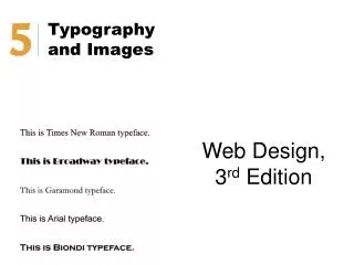
TYPOGRAPHY IS THE MOST IMPORTANT IN WEB DESIGN.
FONTS, TYPEFACES AND TYPOGRAPHY Digital “Whatlanguage looks like” What we call ‘font’
ROUND ONE • In your group: • Find at least two examples of good and two examples of bad typography on websites • Analyse these websites and write down what is good and bad about these websites. • Think of ways to improve these points.
ROUND TWO • In your group: • Write down the most important guidelines to you on the do’s and don’ts list