Download
1 / 55
560 likes | 714 Views
Elements of Design. Type Using Typefaces and Fonts to make a Point. Objectives. After this lesson, you will understand: The 6 primary categories of type Elements of typography Special characters Using type to convey a mood or idea Type Do’s and Don’ts. Two Basic Text Classifications. T.

E N D
Elements of Design Type Using Typefaces and Fonts to make a Point
Objectives • After this lesson, you will understand: • The 6 primary categories of type • Elements of typography • Special characters • Using type to convey a mood or idea • Type Do’s and Don’ts
Two Basic Text Classifications T Serif is a little pointy swoosh on the end of a letter. Used to be caused by writing with a quill. T No swoosh or serif on the ends of the letter. Serif Sans Serif
4 Type Faces Regular Bold Italic Bold Italic
Sans-Serif Type • In French, sans means “without.” Therefore, sans-serif means “without the stroke.” • These are very legible and are often used for labeling illustrations. • Newspaper headlines are usually set in a sans-serif font • Associated with “the facts” • Also good when reversing type on a background (light type on dark background)
Examples of Sans-Serif Type Arial Century Gothic Tahoma Verdana
6 Categories of Type Styles Old- serious, formal Modern- serious, formal Slab Serif- assertive, use sparingly Sans Serif- good in modern publications, headlines, on screens Script- used for special occasions, use sparingly Decorative-never used as body text, special occasions only, not easy to read
Type Categories • The Six primary categories of type are • Old Style • Modern • Slab Serif • Sans-serif • Script • Decorative
Script Type • Any typeface that has the appearance of being handlettered with a pen or a brush, whether the letters are connected or unconnected, is a script typeface. • Often used for invitations or announcements and sometimes for logos. • Use with caution; they are not always well received.
Decorative Type • These are meant to be used in headlines and to convey specific meaning. • These can be extremely elaborate. • These fonts are fun, distinctive & easy to use. • These fonts often look like their name.
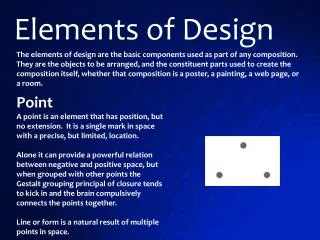
Good typography is what separates quality from amateur design. Some of the most important typography issues are: Weight Size Alignment Leading Kerning Tracking Baseline shift Horizontal scale Elements of Typography
Weight • The weight of a typeface refers to the thickness of the strokes. • Most type families are designed in a variety of weights; regular, bold, extra bold, semibold or light.
Weight Examples • Eras Light ITC • Eras Medium ITC • Eras Demi ITC • Eras Bold ITC
Ascender Height Typed X-height Baseline Descender Size • The size of a typeface is measured vertically from the bottom of the descender to the top of the ascender in units known as points. • There are 72 points per inch.
Size Examples • Six point • Eight point • Ten point • Twelve point • Fourteen point • Eighteen point • Twenty-four point • Thirty-six point
Size/Type Examples Wimp
Size/type Examples Wimp
Size/type Examples Wimp
Size/Type Examples Wimp
Conveying Mood • Type can create an attitude, set a mood, or establish a theme. • A “spring” catalog might use decorative or display type with soft curvy lines, airy spacing, and wafting ascenders and descenders.
Type Do’s • Use decorative type sparingly. • Use decorative type in display sizes only (24 point or larger) • Use script type for announcements and invitations. • Use type appropriate to your message.
Type Do’s • Use serif type to convey an attitude of traditional, conventional values or stability. • Use sans-serif type to label illustrations. • Use sans-serif type for a modern look, or for a children’s book. • Use decorative type for a “novelty” treatment.
Type Don’ts • Use type in all upper case. It is harder to read than upper and lowercase letters. • Use several typefaces within a project. Stick to a couple of fonts. • Use unkerned type for display purposes. • Leave too much or too little space between lines of type.
Alignment • The four alignments of text are: • Align left (or ragged right) • Align right (or ragged left) • Align center (or ragged center) • And justified.
Alignment Examples This is an example of text that is aligned to the left. Notice that the right side is jagged, but the left side is smooth along the left edge. This is an example of text that is aligned to the right. Notice that the left side is jagged, but the right side is smooth along the right edge.
Alignment Examples This is an example of text that is center aligned. Notice that the right and left sides are jagged. Everything extends out from the center. This is an example of text that has justified alignment. Notice that the left and right sides are smooth. This is achieved by adjusting the spacing within the line. Often the last line of justified text does not extend all the way to the right edge.
Leading Leading Leading Leading Baseline to baseline Leading • Leading is the spacing between lines of text. • Pronounced ledding not leeding – like the metal called lead. • Leading is measured from baseline to baseline, in points.
Kerning • Adjusting the kerning increases or decreases the space between pairs of letters. • Kerning units are based upon an em space – the amount of space occupied by an uppercase M, which is usually the widest character in a typeface.
Kerning • Each letter has a width that butts up against other letters. • Kerning tightens the spacing between letters.
Baseline Shift • This moves the selected type above or below the baseline in an amount specified in points. • The movement is measured from the baseline of the type, which is the line where the bottoms of the letters rest.
Horizontal Scale • This affects the horizontal width of the selected text. • This is a fast way of condensing type, but it’s not the preferred way. • Type that has been squashed or stretched destroys the type’s balance. • It is always better to use a condensed or expanded version of a typeface before resorting to horizontal scaling.
Special Characters • Most professional publishing applications feature special characters. • The use of these characters is the hallmark of a professional. • To use most special characters in Web design, you will need to know the ASCII code for the specific character you want.
Special Characters • End of line. This character is often used in both print and Web design to move text to the next line without creating a new paragraph. This is often called a “soft return.” • Non-Breaking Space. This is used to insert a space character between words that will not allow the words to break apart at the end of a line.