Download
1 / 38
380 likes | 641 Views
JRN 302: Introduction to Graphics and Visual Communication - Typography. Tuesday, 3/20/14. Class Objectives. Lecture Typography Homework assignment Book chapters 9-11. What is typography? (no e).

E N D
JRN 302: Introduction to Graphics and Visual Communication- Typography Tuesday, 3/20/14
Class Objectives • Lecture • Typography • Homework assignment • Book chapters 9-11
What is typography? (no e) • The arrangement and selection of faces of type, sizes and spacing on the printed page/design; fundamental to visual communication. • Basic building block on any design • Usually there is more than one element of type on the page (heads, subheads, page numbers, etc.)
What is typography? • Typography is for the benefit of the reader, not the designer/writer
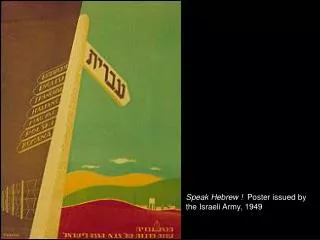
Google’s logo • Interesting look at some of the versions of Google’s text only logo • http://www.huffingtonpost.com/2012/10/19/google-logos-from-way-back-old-designs-include-eyeballs-clip-art_n_1974104.html?icid=hp_technology_top_art • And http://inspirationfeed.com/inspiration/top-45-google-logo-designs/
Typeface, Font, Style and Points • Typeface: is a set of one or more fonts that share common design features • Font: all the letters, punctuation marks and numerals in the same size in a particular type style. • Style: plain, bold, italic, underline, shadow and reverse. • Points: is a relative measure of the size of a font
Order Typography • Arial • Arial Black • Arial Black Italicized • Arial Black Italicized 10 points Typeface Typeface Typeface Font Font Font Style Style Style Point Point Point
Not all point sizes are equal • When you add contrast- let’s say by choosing different typefaces- be aware that not all point sizes are equal in terms of visual weight
Leading • The space between lines of type. • Vertical space separating two lines of characters; its precise value is proportional to the size of the characters.
Kerning • The space between specific letters.
Type Classification • Sans Serif: Has no serifs (“sans” means w/o). • No thick/thin strokes; letterforms are same thickness all the way around • No stress; most are monoweight. Sans Serif
Helvetica • A 2007 full-length feature film about the typeface, Helvetica • Preview here: http://www.color.co.uk/all-about-fonts/ • Helvetica was developed by Max Miedinger with Edüard Hoffmann in 1957 • Examples of Helvetica are here: http://designbeep.com/2010/07/21/40-stylish-typographical-wallpapers-for-helvetica-lovers/
Type Classification • Serif: Has serifs • We will get into various serif typefaces next Serif Serif Serif
Type Classification • Old Style: Based on the hand lettering of scribes • Pronounced contrast between thick and thin strokes • Most commonly used in text. • May be called Roman. • Always has slanted serifs on lower case. • Has a diagonal stress. Old Style
Type Classification • Modern: Does not follow handwritten look. • Serifs are horizontal and very thin. • Vertical stress • Radical thick/thin transition in the strokes. • Not very readable for lengthy or small text b/c thick/thin effect is hard on the eyes. • Tends to have a cold, elegant look. Modern
Type Classification • Slab Serif: Have little or no thick/thin transition or contrast in the strokes. • Serifs on the lowercase letters are horizontal and thick slabs. • Are darker than Old Style because of their thick strokes. Slab Serif
Type Classification • Script: simulates handwriting. • Use sparingly. • Never as all caps. • Some connect letters, some don’t • If used for contrasting effect of large and small, remember, don’t be a wimp! S cript
Type Classification • Decorative: can be illegible when used a lot. • Should be used sparingly. • Carry obvious emotions Decorative
Anatomy of a Letter • X-height: the height of the main body of lowercase letters. • Baseline: the invisible line on which the type sits. • Ascender: part of letter higher than the x-height. • Descender: part of the letter that is below the baseline.
Designing with Type • Most basic function of type =Text to read • Can also create a mood • Look at the variety of fonts you can choose from in Powerpoint!
Designing with Type • Can also be just shape or purely visual element • Extra large lettering, or Glyph, used for purely graphic reasons • Can also be used for “branding” the image… creating an identity • Conservative font for the NY Times • Fun for Yahoo
Contrast with Type • Use styles (bold, italics) • Size (large vs. small type) • Color • Changes in type alignment • Changes in kerning
Be careful with Contrasting and Typefaces • Rule of Thumb… don’t be a wimp! • Concordant = when you use only one typeface • Safe, OK to use, but not interesting • Conflicting = when you use two typefaces that are too similar • Look at this line and the one above. Not enough contrast is confusing to the viewer • Contrasting = clearly differences between lines of type • Easy to achieve with serif and sans serif
Type Contrast- Size • Non-Designer’s book, rule is “Don’t be a wimp!” • Using Size • Go big type versus little type • Don’t do 12 pt versus 14 pt • Can also use size of type with location and design on page • Small line of text by itself in middle of page surrounded by white space
Type Contrast- Size • Use Size of typeface to emphasize or de-emphasize important words • Can get contrast of size by enlarging a single symbol or letter
Type Contrast- Weight • Weight refers to thickness • Regular, bold, extra bold • Rule- Don’t be a wimp! • Contrast between thinnest and thickest letterforms in same family Where are the fonts? Do a search to find out…
Type Contrast- Weight • Weight can help organize text • Such as in a table of context
Type Contrast- Form • Form of a letter or word is its shape • We recognize both words and shapes of words • This is why all caps are hard to read- forces us to read word letter by letter
Type Contrast- Direction • Can mean literal direction of word • Such as on a diagonal • Or can mean type of direction • Vertical or horizontal • Used a lot in newsletters and newspapers
Free Fonts • Why pay for a font/typeface when there are so many free online? • Free fonts are normally lesser • in terms of quality/smoothness (see this when you print) • With inability to kern • In terms of boldness or contrast • Free fonts may not have all the symbols and/or characters • Free fonts are commonly used • If you want unique for your client, pay for the font
Where to buy fonts? • http://www.t26.com/fonts • http://www.adobe.com/type/fontfinder/ • Be aware of all of the characters and symbols • Be aware of which platform (Mac, PC or both)
Using downloaded fonts • Whether your use a free font or pay for one, IF it was not included within your software • You will need to install it on every computer you work on • You will need to digitally drop the font file with your project files • Note: may not be able to do this for lab computers! • One thing for sure, unless a font says it is for both platforms, it won’t work on a Mac if PC font (and vice versa) • Professionally- need to provide all font files to your commercial printer as well as tifs, indesign files
Designing with Type • Avoid using type that interferes with message (Sound familiar? The message is the most important thing = clear communication) • “When choosing a typestyle for your design, keep in mind that one of the most important virtues to possess is restraint” • Do NOT use more than 2-3 typefaces • Some fonts should NOT be ALL CAPS.. EVER • Don’t forget your audience’s preference for type/fonts • Conservative audience may prefer conservative font • Youthful audience can take more decorative font
Designing with Type • Smaller type is harder to read (don’t go below 6pt for print; 12 pt for older adults) • Use italics sparingly and to accentuate. It’s not good for a lot of copy and many typefaces don’t italicize well.