Download
1 / 14
140 likes | 275 Views
Music magazine evaluation. Evaluation. How my magazine compares to ‘real’ music magazines. Front cover examples. Front cover.

E N D
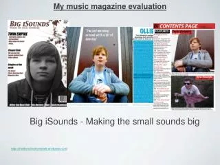
Front cover My main image is all the way down the right hand side of the page. This is the case for most music magazines including NME, Vibe and Kerrang. If the image is interesting or is of someone famous, people are more likely to look at the magazine. After the image has drawn them in, they will read the copy because it might relate to the image. Almost always the title is at the top of the page either all the way across or on the left. This is shown in all three of my examples. This is because having the title of a magazine at the top helps consumers to see what magazine they’re looking for when buying it. Secondary images are used on many magazine covers. These are included in the examples of NME and Kerrang that I’ve used. They are used to show what it inside the magazine so that potential readers are drawn to buy the magazine by attracting interest. Quite often there is a colour scheme for magazines. Mine includes red, grey, black and white like the NME and Kerrang examples. The Vibe magazines colour scheme is white and yellow. This makes the magazine look professional and will often get the attention of a certain group of people. Red and black are colours associated with rock and metal music so people will clearly see what genre this magazine is.
Contents page The colour scheme has stayed the same as the front cover like it does in the NME examples. The title is in the top left corner. This is also the case in the NME example. This keeps the contents page and the front cover similar which makes the magazine more professional looking, encouraging people to buy it. There is one main image on my contents page like there is in all of my examples. This usually relates to what is inside the magazine so that readers are interested. None of my examples do, but I have seen in other magazines that there are quite often articles on the contents page.
How my magazine represents a particular social group • The audience for my magazine is both genders, age 18 to 30 who like rock and metal music. I have aimed my magazine at this audience because I like this type of music and the style so know what my consumers would like from a rock magazine.
Colour scheme • The colour scheme for my magazine is red and black with some grey. These are the colours that are usually associated with ‘alternative’ people. This type of people stereotypically listen to rock and metal music so by attracting this type of people the sales will increase.
Images • My main image will encourage alternative people because the girl in the photo is wearing the same sort of clothes and she looks like a ‘rock chick’. • The black and white image of guns ‘n’ roses corresponds with the colour scheme while attracting people by being a popular band.
What kind of media institution might distribute my product and why
What I have learned about technologies from the process of constructing this product
My skill in Photoshop has developed throughout the course. I do use Photoshop at home but I have never used it for something like this. I have learned how to use a MAC computer as I have also never used one of these. I’ve never really looked at the way that magazines are made before but now I’ve made my own, I realise how difficult it is.
Looking back on my student magazine, what do I feel I have learnt in the progression to making the foundation portfolio