Download
1 / 14
140 likes | 264 Views
My music magazine evaluation. Big iSounds - Making the small sounds big. http://sheldonschooltomjewitt.wordpress.com /. In my evaluation. I shall take you though the six main criteria required of my music magazine media work. I shall be covering: 1. The forms and conventions of each page.

E N D
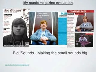
My music magazine evaluation Big iSounds - Making the small sounds big http://sheldonschooltomjewitt.wordpress.com/
In my evaluation... • I shall take you though the six main criteria required of my music magazine media work. I shall be covering: • 1. The forms and conventions of each page. • 2. How I attracted my target audience. • 3. Institutions and potential distribution. • 4. How I have used, and what I’ve learnt, about different technologies. • 5. How different social groups are represented in my product. • 6. Finally, how I’ve progressed and improved my work throughout the course. I documented all of my work on my wordpress blog.
My music magazine is called Big iSounds, which helps promote new and rising music talents, as well as bigger, well known talents and artists. Features such as the date of release, price, and barcode were all added to create a sense of authenticity and professionalism to the piece. Conventionally, I used a larger, broader font for my music magazines title in order to let the target audience know what they are reading. In addition, I added a tagline to entice them into reading more, as well as giving an idea about what my magazine focus’s on. As you can see, I went for a plain background to bring out the main image in the magazine, and to really act as a frame for my model. Furthermore, the background brings out the model image more abstractly, adding to the apparent minimalistic features and style conventions. I’ve followed the typical music magazine convention of using a simple three basic colours general colour scheme. I have used red, black, and white. I wanted to create an image that really made an impact on my target audience, whilst keeping the conventions of a minimalistic music magazine. So I used photoshop to simply edit the colour and contrast to the model image, and I magic lassoed the background around my model image, and kept the colour in the background, layered underneath my model image. Typically, I set out the layout of my front cover by placing the main callouts and textual information away from the image. As found on many professional music magazine front covers, I have snapped the model at a mid-shot, with parts of him bleeding off of the page. This implies his talent and musical skill cannot be contained on just one page of a magazine. Much like your typical music magazine, the photography and imagery lies in the centre of my cover page. This helps to bring my target audiences focus on the main story and model. Big iSound’s - Front cover page In trying to replicate a conventional music magazine, I have added a scroll of additional stories in the music magazine. Again, this helps to tease the target audience into wanting to read on into the main textual and article pieces of the music magazine. In trying to replicate a minimalistic style, I used a very basic, bold font to bring out the simplicity of my piece, and broaden in the overall layout. The minimalistic and contemporary style very much aims the piece and the magazine as a whole at Indie style teenagers.
I’ve branded my contents page by abbreviating Big iSounds with ‘Bi’, which creates a vintage and personal sense of authenticity to my piece. My main callout and headline simply states which page the reader is on, just as a conventional music magazine would do. Furthermore, the date it once again on the page, as well as the added URL link of the magazines webpage. My column inch lies on the left hand side of my contents page, as it would do in most music magazines, in a very typical and conventional layout. Once again, my captions bleed off of the edge of the page, Emphasising each of the models raw musical talent, skill, and individual ability. Another point focusing on my models, is that they both contrast with each other. With my first model, Ollie Judge, is shown in a more moody and scripted persona. In contrast, my second model, India Nunan. brings a more natural and authentic personality to the shot. A level of constancy is brought out and highlighted by my use of three colours in a simple colour scheme on my contents page, just as I did on my front cover page. This time, however, I’ve gone for a more prominent red, black, and white. This divides and texturises my contents page nicely. Following further conventions of music magazine production, I listed the articles in numerical and chronological order. I’ve used a colour code for my callouts to indicate what each article topic is on for my target audience. By taking two of the articles listed in the ‘features’ column, I have mimicked the style of such music magazines like NME and Q, in taking emphasis on the main headlines. Big iSounds - Contents page Again, I’ve used two main callouts in the two captions to let the target audience know which each article is on. Sticking to my music magazines priority of promoting new sounds, the contents page shows features focussing on getting new bands out into the public. Both of my models which I have used in my article follow and represent the conventions of youth and indie culture ravelled into one. They show this by the care free image they perceive.
I’ve placed my caption of my model, Ollie Judge, on the left hand side of my article; taking up a majority of the page. By doing this, I then structured the rest of the double page around this image, building up callouts, quotes etc into the piece. Looking at certain issues of NME, Rolling Stone, and Q. Again, this continues my minimalistic theme and conventions. The quote from Ollie Judge acts a callouts and a hook for the target audience of teenage indie kids want to read more into the piece. Looking at the colour scheme, I once again have stuck to the conventions of using a simplistic, and minimalistic theme. This time, however, I’ve tried to use a more vibrant colour scheme. I’ve chosen a royal blue to lighten and highlight the text. The other two colours I’ve chosen are black and white, again, reiterating my minimalistic conventions, and mirroring the front cover page, adding a sense of consistency to my work. The models bleeding off the page represents an aura of uncontrollable and uncontainable musical ability, skill, and talent. By taking up a large chunk of space at the top of the double page spread, the main callout attempts to hook the target audience in, as well as inform them into the piece, with the added tagline. By placing a quote in the middle of the maim text, bolded and in a contrasted colour. it suggests that Ollie Judges talent and words make more of an impact on the target audience than the article itself. Big iSounds - Double page spread Using software such as photoshop, I contrasted the lighting and brightened the overall image and caption to give it a sunnier, more summery look about it. Even the editing and manipulation of the photography highlights the conventions of my attempted minimalist theme. Following the usual and typical conventions of professional and published music magazines, I’ve added a scroll at the bottom of the double page spread, promoting features of a Big iSounds webpage, which adds a sense of authenticity to the article as a whole.
As a potential institutional distributor for my up and coming music magazine, Big iSounds, I would be looking towards ICP media as my targeted distributor if my music magazine were to be published and exposed to the general British public. Owned by Time Inc. (http://www.timeinc.com/home/), sectioned off from the publishing division of Time Warner Inc., A renowned and global entertainment and media broadcasting company, IPC are best known for their involvement in publishing such magazines as NME, Volks World, Chat, Marie Claire, and many other popular recreationally based magazines spread out over the world. Personally, I believe that my music magazine, Big iSounds, contains the same ideology and values of magazine publication and content that IPC try and aim at the general public, and their overall target audience. My brand’s main priority is to give young, rising bands the recognition and public reception they deserve, as well as the promotion of already well known and renowned artists. As a secondary aim, Big iSounds is looking to establishes itself as a big name in the world of music publication. Big iSounds wants to rival NME and Q for their main target audiences of young, musically interested teenagers and young adults. Taking inspiration from how IPC have used magazines such as Loaded and Nuts to bring in a specific branch of target audiences, Big iSounds is doing the same thing, but presenting music as a way for youth culture to expand and to express themselves. Institutions Ollie Judge - practice shots for my front cover. http://sheldonschooltomjewitt.wordpress.com/
I believe that Big iSounds mainly targets two different and very specific types of audiences: Primary Audience: Individualistically orientated teenagers who are going through the motions of teenage life, and are looking for an external state of mind to escape to, with a basic part-time job (Category E - lowest level of subsistence. For example, students), or at the very least, some kind of disposable income in which they would be able to afford a weekly issue of Big iSounds for £2.99. In terms of age range, Big iSounds will be looking to target youths from the ages of 14-24 years, which helps broaden and expand the target audience. This branch of out target audience is a very important part of our plan to promote up and coming bands, as we feel that they are very much a part of the working/underclass younger public. My Target Audience • Secondary Audience: C1-C2 social graded people of skilled and/or unskilled professions who are looking for a way to keep themselves entertained and away from thinking too much about work. Mainly, again, looking at a wider branched off version of young people, like graduates from university who are trying to find employment in the field of work they have worked at degree for. Essentially, this part of out target audience is a more advanced, older version of our main target audience. At Big iSounds, we like to give something back to the British public at all levels of social class and age. http://sheldonschooltomjewitt.wordpress.com/
Features that will attract my primary targets audience. - New and up and coming acts in every weekly issue. - Youthful language and youth culture references. - Minimalistic and individualistic theme. - Wide range of music genres. - A price that denotes quality. - Debut album reviews from Chapel Club. - Interview with Ollie Judge. - On tour with India Nunan. - Weekly news, reviews, downloads etc. Features that will attract my secondary target audience. - Affordable price for a very high quality magazines with high quality content. - The free download section allows my audience to keep up with music without having to pay for it. It’s a way of Big iSounds rewarding the audience. Addressing our audience...
My blog • During the production of my music magazine, Big iSounds, I recorded the progress I made on a blog on the illustrious blogging website Wordpress. On the blog, I recorded and dated all of my work, from my practice and preliminary work on my student magazine, all the way through to the planning and research of my music magazine, and then to the actual production and creation of music magazine.
During production of my front cover, I faced a dilemma in choosing a colour for callout font, and photoshop allowed me to look at both compared with each other, which made it easier for me to choose. Contrasting colours, enhancing images, placing text, manipulating and cropping images, etc. Photo shop was a fantastic piece of software, one which contributed to immense levels in my music magazine production. When It came to logging my work and recording the progress I had made and was making, Wordpress, the well received blogging site proved to be of fantastic and credible value to me. It allowed me to publish research, analysis, photography, mock ups etc, and even allowed me to get feedback from other bloggers, teachers, and even from my peers about what I could change or improve. Technology Over the course so far, I’ve always felt photography was weak point for me, personally. However, using the camera technology that was available to me, as well as photoshops editing skills, I was able to capture clear and crisp images from angles, heights, and in fair lighting conditions that I wanted. The technology of the camera made up for my lack of photography skill. Conventionally, I follow a minimalistic style of music magazine production, which allowed me to have a very broad and simplistic photography criteria and guideline to follow, which evidently, if you look at my final work, I did at a fairly sufficient level. • I’ve learnt to use many different technological skills during the production of my music magazine. • When using photoshop during my mock coursework student magazine work, I had to learn the very basics of the software. Producing my mock coursework proved to be hard due to my lack of knowledge and understand of such technologies as photoshop. However, when I started using it for my music magazine production, I had been subjected to a sufficient amount of photoshop practice, and I felt more confident in using the software to edit and create the captions I wanted for my work.
This is a screenshot of my very first still save when creating my articles. I was still working out the logistics and methods of using the software. However, after developing a basic knowledge and understanding of how to use Adobe In Design, I started to find the process of making an article quite simple. I only came across a very minor problem whilst making my double page spread, and that was fitting in my textual information. Unfortunately, I had written too much on Pages, so when it came to pasting the text into In Design, I had to crop out and remove a single paragraph in order to font the rest of the text into the rectangular text box. My use of Adobe In Design • In creating my articles page, I used the very efficient and renowned publication software system, Adobe in design. It allowed me to place my edited image, which was edited on photoshop, in places that I wanted it to, allowing the structure of the article gradually build. Without difficulty, I was able to paste the textual information that I wrote on pages, Apples take on Microsoft word, and manipulate the sizes and font styles.
Evidently, my style and skill of photography has improved, with my going for a more basic and minimalistic way, compared to how I used to try and bring more into my shot, restricting the amount of space available for text and callouts. I’ve kept narrower sense of discourse structure to my piece, keeping the text to one side, rather than scattered and spread out over the entire page. Looking back now, I’ve over-edited my work by a long way. In a sense, I tried to do too much. I’ve learnt how to keep to a conventional three simple colours colour scheme, instead of overcomplicated variety of colour use. In my mock coursework, I used a wide range of different fonts, which reduced the authenticity of the piece. I used much more muted and and subtle colours in my music magazine piece than my student magazines piece, which added to the minimalistic theme. What’s changed? • Compared to my provisional mock coursework, I’ve progressed in many ways. I’ve learned to discipline myself to stick to simplistic methods and conventions of magazine production, instead of over-complicating my work. With text, I’ve changed the way I set it out on the page, keeping the sentences and callouts shorter, and not covering some of the main image. I’ve learned how to use photoshop efficiently. For example, using such tools as the eye-dropper to keep a sense of colour cohesion. In terms of fine detail, my eye for more complex features, such as scrolls, branding etc, has grown, and I've brought this idea out in my work.
What I have learnt during the course... • Overall, in A2 Media studies, I have learnt a number of things. I’ve been exposed and given complete control to top of the range photography and image editing and creating software, opening up doors to higher level work and a substantial coursework grade. I’ve gained the correct knowledge and experience of how to crop and layer images, place and edit text, lighten and contrast, filter effect, colour in at a gradient, and many more complex and articulate photoshop skills. • More practically, I’ve learnt how to organise and manage my time professionally and efficiently. I’ve been able to produce and finish work to a specific and targeted deadline without fail, and without completing work to a poor or unsatisfactory level of quality. Also, I’ve learnt how to target my work to a specific, minority, and individual target audience via certain production, advertisement, and pricing features. I can research into what people are looking for specifically in a music magazine, whether that be the genre focus, content, layout etc, I am now able to manipulate aspects of my work to fit the generalised criteria of a specific target audience, and even more so, in my own authentic and original style. • I have managed to learn how to plan and research my work before hand, and not just rush into things without really any knowledge or idea of how to create or to draw out my work. I’ve learnt how to set myself a guideline of things to complete in order to have at least a basic and general idea of what I want to do to create my work. • Furthermore, I’ve learnt how to stick to, and in some cases, challenge, certain conventions and norms of music magazine design and production. For example, I’ve learnt that sticking to a very simplistic and minimalistic colour scheme is more effective and makes a much bigger impact on the magazine as a whole, then if you use a wide variety and range of colours. Also, I’ve learnt that quality of photo’s isn’t the main priority in music magazine production, but layout is the main focus. Layout makes a much more coherent, flowing discourse structure to the piece, and creates a more confident eye-line and eye-flow for the reader of the music magazine.
Big iSounds. • Thank you very much. Making the small sounds big Tom Jewitt