
Design Principles for Effective Font Usage
Learn how proximity, font rules, and design principles impact layout. Discover how to use whitespace effectively and choose between Sans Serif or Serif fonts for your publication.

Design Principles for Effective Font Usage
E N D
Presentation Transcript
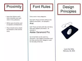
Proximity FontRules Design Principles • Items that relate to each other should be near each other in the publication. • White space should be used to separate unrelated items. • There should not be a blank line between a title and the story. Fonts come in two categories. Sans Serif: These are fonts without tails added to the letters. An example is Arial. Serif: These are fonts with tails, the fancy little extra added to the letters. An example is Adobe Garamond Pro. Up to two fonts can be used on a document. One category should be used for titles and the other category is used for the body of the text. Laura Van Dehy February 18, 2014


