Download
1 / 20
200 likes | 223 Views
Understand correlations, fit scatter plots with linear models, and make predictions using the line of best fit for various data sets. Learn to interpret slopes and predict values accurately.

E N D
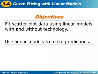
Objectives Fit scatter plot data using linear models with and without technology. Use linear models to make predictions.
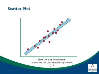
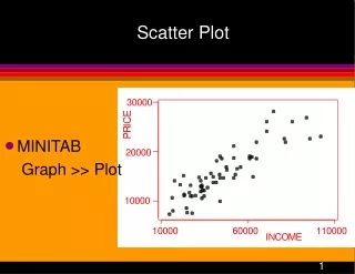
Helpful Hint Try to have about the same number of points above and below the line of best fit. A scatter plot is helpful in understanding the form, direction, and strength of the relationship between two variables. Correlation is the strength and direction of the linear relationship between the two variables. If there is a strong linear relationship between two variables, a line of best fit, or a line that best fits the data, can be used to make predictions.
Albany and Sydney are about the same distance from the equator. Make a scatter plot with Albany’s temperature as the independent variable. Name the type of correlation. Then sketch a line of best fit and find its equation.
o o Step 1 Plot the data points. Step 2 Identify the correlation. Notice that the data set is negatively correlated–as the temperature rises in Albany, it falls in Sydney. • • • • • • • • • • •
o o Step 3 Sketch a line of best fit. Draw a line that splits the data evenly above and below. • • • • • • • • • • •
Step 4 Identify two points on the line. For this data, you might select (35, 64) and (85, 41). Step 5 Find the slope of the line that models the data. Use the point-slope form. y – y1= m(x – x1) Point-slope form. Substitute. y – 64 = –0.46(x – 35) y = –0.46x + 80.1 Simplify. An equation that models the data is y = –0.46x + 80.1.
Make a scatter plot for this set of data. Identify the correlation, sketch a line of best fit, and find its equation.
Step 1 Plot the data points. Step 2 Identify the correlation. Notice that the data set is positively correlated–as time increases, more points are scored • Step 3 Sketch a line of best fit. • • • • • Draw a line that splits the data evenly above and below. • • • •
Step 4 Identify two points on the line. For this data, you might select (20, 10) and (40, 25). Step 5 Find the slope of the line that models the data. Use the point-slope form. y – y1= m(x – x1) Point-slope form. y – 10 = 0.75(x – 20) Substitute. y = 0.75x – 5 Simplify. A possible answer is p = 0.75x + 5.
Anthropologists can use the femur, or thighbone, to estimate the height of a human being. The table shows the results of a randomly selected sample.
a. Make a scatter plot of the data with femur length as the independent variable. • • • • • • • • The scatter plot is shown at right.
b. Find the line of best fit. Interpret the slope of the line of best fit in the context of the problem. Enter the data into lists L1 and L2 on a graphing calculator. Use the linear regression feature by pressing STAT, choosing CALC, and selecting 4:LinReg. The equation of the line of best fit is h ≈ 2.91l+ 54.04. The slope is about 2.91, so for each 1 cm increase in femur length, the predicted increase in a human being’s height is 2.91 cm.
c. A man’s femur is 41 cm long. Predict the man’s height. The equation of the line of best fit is h ≈ 2.91l+ 54.04. Use the equation to predict the man’s height. For a 41-cm-long femur, Substitute 41 for l. h ≈ 2.91(41) + 54.04 h ≈ 173.35 The height of a man with a 41-cm-long femur would be about 173 cm.
The gas mileage for randomly selected cars based upon engine horsepower is given in the table. a. Make a scatter plot of the data with horsepower as the independent variable. • • • • • • • • • •
b. Find the correlation coefficient r and the line of best fit. Interpret the slope of the line of best fit in the context of the problem. Enter the data into lists L1 and L2 on a graphing calculator. Use the linear regression feature by pressing STAT, choosing CALC, and selecting 4:LinReg. The equation of the line of best fit isy ≈ –0.15x + 47.5. The slope is about –0.15, so for each 1 unit increase in horsepower, gas mileage drops ≈ 0.15 mi/gal.
Check It Out! Example 2 Continued c. Predict the gas mileage for a 210-horsepower engine. The equation of the line of best fit is y ≈ –0.15x+ 47.5. Use the equation to predict the gas mileage. For a 210-horsepower engine, y ≈ –0.15(210)+ 47.50. Substitute 210 for x. y ≈ 16 The mileage for a 210-horsepower engine would be about 16.0 mi/gal.
Example 3: Meteorology Application Find the following for this data on average temperature and rainfall for eight months in Boston, MA.
o Example 3 Continued a. Make a scatter plot of the data with temperature as the independent variable. The scatter plot is shown on the right. • • • • • • • •
o Example 3 Continued b.Find the correlation coefficient and the equation of the line of best fit. Draw the line of best fit on your scatter plot. The correlation coefficient is r = –0.703. • • • • • • The equation of the line of best fit isy ≈ –0.35x + 106.4. • •
Example 3 Continued c.Predict the temperature when the rainfall is 86 mm. How accurate do you think your prediction is? 86 ≈ –0.35x + 106.4 Rainfall is the dependent variable. –20.4 ≈ –0.35x 58.3 ≈ x The line predicts 58.3F, but the scatter plot and the value of r show that temperature by itself is not an accurate predictor of rainfall.