Magazine Double Page Spread Analysis
30 likes | 232 Views
Magazine Double Page Spread Analysis. The double page spreads that I will be analysing are going to be similar to the one that I make. .

Magazine Double Page Spread Analysis
E N D
Presentation Transcript
Magazine Double Page Spread Analysis The double page spreads that I will be analysing are going to be similar to the one that I make.
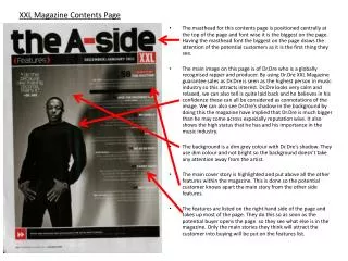
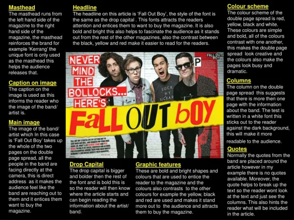
Different font of heading compared to the font of the actual text in the article. The colours vary which is an exciting way to make the page come across, however there is a lot of white space on the left had side. This isn't very good because then it makes the article or page look bland and boring. Having said that there is a lot of writing on the other side of the page. It fills up all of the space so no bits are left uncovered and you can see just by a quick glance that there is a lot of detail in that article. I personally feelthat the layout of this magazine is nt very good as you have the right hand page filled wih writting and a picture whereas, the left hand side here is just the title taking up most of the space. I think they should of spread everything out better so that everything isn't just on one page for the reader. The picture helps make the space fill and it isn't being cut off by the fold in the middle of the page. The photo links and coincides with what the articles is talking about and the colour of the photo has been edited for the affect. The use of making it red and black again coincides with the colour cohesion that is going on in the magazine. The image is unique as in some case the picture will fill up all of the space on one side where as they don’t do this in this article. They just leave one side near enough blank. Different formats and colour of the text and font that is used is to make the text stand out more. This helps the reader address which parts of the article that they want to see and read. It also makes the look of the page more appealing to the reader or consumer so that they will read it and buy the magazine if the customer reads through it.
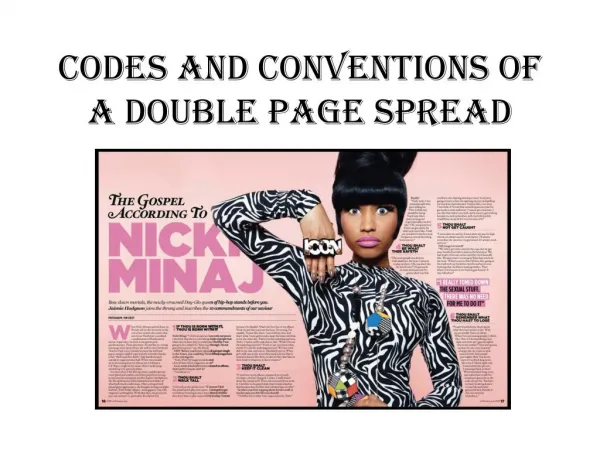
The title of the article is eye catching and colourful. The colour black at the top with the red at the bottom with the use of the black white background helps the the two titles stand out to the reader. The use of an exclamation mark in the title makes it sound like a defensive title which will attract a reader because in British people are stereotyped to like things that get 'bitchy' Click to add text The use of an introduction into the story helps the reader then follow and acknowledge what the article is about. The reader will like the introduction because then the reader gets flavour of whether or not they like the sound of it. The writing under the photo helps the look of the layout of the page as it looks good to view. The writing also helps take up the blank space that would be there. The article doesn't leave any black space,the whole of the page is filled which is good for the layout. The use of the red coloured font helps the reader to know what the journalist is saying and what the artist is saying. It also helps the reader read what questions they ask better because the red on a white background is easy to read as it stands out from the page.