Download
1 / 9
90 likes | 254 Views
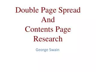
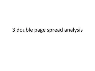
Construction of my double page spread. Sonny McCarthy. From top, left, to right- test edition three, first edition, and second edition.

E N D
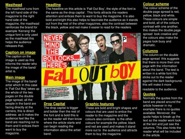
Construction of my double page spread. Sonny McCarthy
From top, left, to right- test edition three, first edition, and second edition.
The first step I took was the creation of the background, I took the image I captured from the setting of the interview, and then manipulated it using photoshop, taking advantage of the crop tool to remove the candle, and then changing the image using settings in Photoshop under “image” to alter the picture into black and white, while rising the contrast and brightness to set the background image into a gray , two toned image, producing a blurred mysterious effect, this was the building block, the pallet for the rest of my images.
The second image I used was relatively easy to manipulate to the double page spreads standards- I used magnetic lasso, select tool, and magic wand tool to select the background of my image, and then after being sure I had successfully separated background and model (the two were difficult to distinguish from each other as my shots were entirely obsessed with being atmospheric, and as a result are dark, and gloomy. But after doing this, I hit the delete key, leaving just my model, but like previous editions, with a jagged pixellated edges, so I reselected the image, and using the feather tool to five pixels, smoothed the edges after clicking delete, then I revised, resized, and compressed my image and its place in the magazine, deciding to place it in the bottom left corner, in light of my research.
I then placed the smaller images of the article into the double page spread, which for each “Z” logo, was a simple process, I copied the stock image I had, cropped the white edges, and then compressed, resized, and placed each “Z” in its allocated place on the magazine. After this, I made the disc for La Blanc’s album for sale. I used Google.com to attain a blank CD image, copied the image, pasted it into word, then attained an exciting font from Dafont.com, I print screened my sample, then cropped to just the text of the sample, removed the colour white suing the “colour remove” tool, then pasted each piece of text on the CD, after then again print screening the image, re-pasting it in word, re-cropping the image to just the disc which was now one image, copied, then pasted that into Photoshop, and placed it where I desired using ctrl and T.
After this stage I made the ratings for my star review of both the album, and interview. This stage was largely independent of Photoshop. I copied the same Image I used for my front cover, which I collected from google.com, I pasted that image into word, sized it to as I desired, placed a series of stars in formations to what I needed for my magazine, then print screened this, pasted it into word, cropped it to show just the formation again, copied it, and then pasted the image into Photoshop, I used the “colour range” tool to select just the white of each star image, then deleted the selected white. Then placed where they were needed using ctrl and T.
After this I made the borders for the magazine that are so well noted in magazines like “Q” and “Kerrang!” this stage was similar to that of the front cover of my magazine, I used the rectangle tool, drew the borders into Photoshop in their owns layers, selected the colour tones which I felt would most accent the content of my interview, and then placed them in line with the lettering, so they run parallel and are aesthetically pleasing.
Originally, in previous editions of the double page spread, I used an image font in place of a regular text title, which I did by copying a sample text from Dafont.com using the print screen key, then pasting this print screen into word, cropping the sample, copying it again, pasting this into Photoshop, and removing the White from the lettering using the “colour range tool with careful adjustments of the sensitivity. The previous edition is featured below. After this I placed the text and page numbers over my image using the text tool available on Photoshop, this stage was also rather simple. I wrote the content of my interview into the magazine, and changed the colours of each lettering using the colour change tool provided, I used ctrl and T keys to move each piece of letter, and was sure to avoid confusion, and later problems by placing each piece of text into its own layer.
After all these stages I was finally left with my first, and eventually final editions of my magazine double page spread, clearly my constructive skills gained have been very influential in producing a competent double page spread.