Download
1 / 5
50 likes | 301 Views
Rock/Alternative music magazine double page spread analysis.

E N D
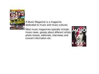
These are the double page spreads of kerrang, Q and rock sound . I noticed that they all use a drop cap on the first letter of the text. The font they use in the main bulk of writing is pretty simple, however other fonts are more interesting and stand out. The title of the page is often the biggest and is in a different font and style also colour. The colour schemes are all still similar, however blues and purples are now being used. The pictures are still big and are mostly close ups or medium shots.
The font of the title on the page is different ot the rest, its also feminine but edgy which works well with the genre of the magazine and the word ‘wild itself. The main image is a close up of the artist, her makeup and costume shows clearly what genre of music she is in, also her carefree look gives attitude and makes her seem rebellious or ‘wild’ The name of the band or artist The type is small and also two colors, you can easily identify between two speakers Quotes makes it feel personal as if you are talking to the artist
Drop cap across the whole page, this is also the initial of the artist, it is also in a different colour, however I find this hard to read the other text Name of the artist in the top right corner The main image is quite seductive, her hair and costume are messy and makeup is dark this all links with feminine rock and the reckless attitude of it The text is plain and simple using drop caps on important paragraphs. There is limited colour on the page but the little there is fits with the theme of the rest of the Q magazine
The main image is of the band, it’s a high shot looking down at them, they all look as if they are shouting which links to the genre of their music. Puffs, this makes it more interesting to read and makes it stand out The colour scheme is quite simple, darker colors are used apart from the baby blue which also suggests it’s a boy band Quotes are in a bigger type than the rest to make them stand out The name of the band and their album are in a completely different font to the rest and a different colour to show that its the most important part.