Download

1 / 10
110 likes | 346 Views
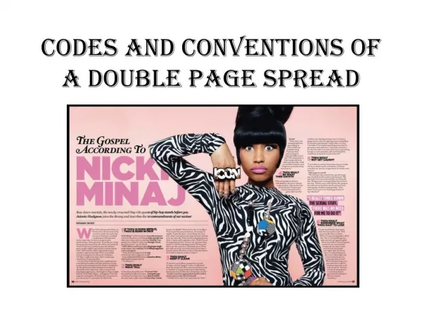
By Carys Norfor. My double page spread explained. Layout. Due to my audience’s response, I closely based my design on this double page spread of a Gallows article.

E N D
By CarysNorfor My double page spread explained
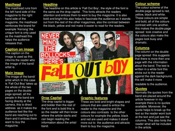
Layout Due to my audience’s response, I closely based my design on this double page spread of a Gallows article. As you can see, I didn’t include the quote because, after asking my audience, they preferred to have a single quote as a bigger bulk, and have the other part of the layout as NME does. In addition, my audience didn’t like big bulks of text, so I separated the text like NME’s designs.
Photos I was very pleased with how similar my photo was to my plan.I was also pleased with how little I had to edit the photo, because I experimented with fading the background, and I felt that it didn’t work, and neither did the majority of the audience – many of them said it looked as if it a fake photo, or a fake background.
Typefaces After discovering that most magazines have a limit of 3 typefaces per article, I only used two typefaces; the one I was already using for my Title, AMPLIFIED, which I used on ‘NICE GUYS FINISHED LAST’, the page numbers and the quote in the top right corner, above the title. Also, because my typeface questionnaire showed that my audience liked having Times New Roman as the main bulk of text, I chose this for my subtitle, my picture’s annotation, my main bulk of text and my quote in my main bulk of text. Some typefaces look different, however, that was just through the use of italic and bold, for example – both techniques I adopted from other magazines. In my research, I discovered that they use these different modes for typefaces in the subtitle.
Text After reading many music articles, I wrote my opening paragraph of the interview. I was careful to use similar language to what magazines such as NME and Kerrang do, and, as my audience preferred, I chose to layout the remainder of the article in Q&A form. The audience said they preferred this way, because they could skip to what part of the interview they wanted. I also added a drop cap into the start of the text. I did this because it is one of the conventions of a magazine; I couldn’t find one article that Didn’t use one, so I used the drop cap tool, in InDesign.
Arrows On many articles, if the article continues onto the next page, the magazine has an arrow to show the reader that the article isn’t finished – it’s a component of a DPS. Consequently, I made an arrow in InDesign, and made it the height of one row of text. This not only meant that it had a nice proportion with the text, but it also meant that there was also space to fit more words onto the last column. For example, here are the arrows Q Magazine used in their Lady Gaga issue/article. Also, this is an example of NME’s arrow used on the first dps of an article.
Header and title After looking at many magazines, I found that if the article name/title wasn’t the band’s name, or a quote, it was, very likely to be a song reference or title. Consequently, I took parts of the interview, where Liam talks about his influences, and thought of some of the songs made by his bands that influenced him, and then I decided I would ask my audience which title was their favourite. Nice Guys Finish Last is a famous Green Day song, and Liam McAuley is a big Green Day fan. If this was a real magazine, the readers of the magazine would Be interested in the article, if they were Green Day fans, because they’d be interested to know why a Green Day name was being used. Also, using a reference title was popular with my audience; I also gave them a choice between ‘The Big Picture’, one of the quotes from my ‘top 10 quotes’ post, and another few song names. The only title close to having the same amount of votes as this was song title ‘Welcome To Paradise’.
Page Number Another component of a double page spread; I made the page numbers in the same typeface and size as the ‘AMPLIFIED’ you see at the head of the screen. To find out what page to start my main article on, I looked through various magazines, such as Kerrang, Rocksound, Q Magazine and NME, made an average (the median) of where their main article was, and 21.34 was my answer. Because my DPS needs to be on a double page, the number needs to be even, and, as you know, you can’t have .34 of a page. Consequently, I made the first page, page number 22. I put the page numbers at the foot of the page because my research showed me that it’s only on rare occasions when the page no. is at the top of the page.
Colour Scheme In my research I discovered that music magazines rarely force their colour scheme throughout the whole magazine, onto each page. Therefore, I used the standard black, white, and then the other colours you see, for the title, were all taken using the eyedropper tool, and taken from the main photo you see.