Download
1 / 2
20 likes | 303 Views
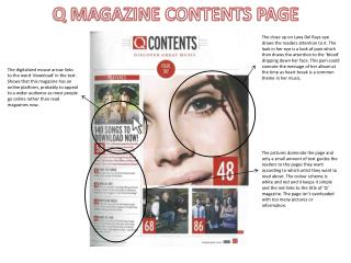
Billboard magazine contents page analysis. The colour scheme consists mainly of black, white and blue. Although simple, this gives the page a very sophisticated look.

E N D
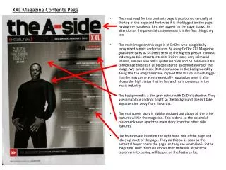
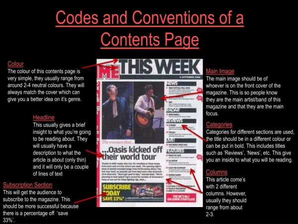
The colour scheme consists mainly of black, white and blue. Although simple, this gives the page a very sophisticated look. The title is printed in a block capital font so that it looks like a stencil which is quite unique and stands out against the other more basic fonts. It’s also black which contrasts well with the white background. The ‘Billboard’ logo showcases the brand image and gives the magazine an established look. This column informs the reader of which songs are currently in the charts. This is appropriate specifically to Billboard as it is based on the US official charts and this will interest readers. The use of grey will instantly attract readers’ attention as it is not used anywhere else on the page. In addition to this, the contrasting colours used within it (yellow, blue, pink, etc) help to highlight relevant, important information to the reader. The page numbers are all in black which is bold and therefore probably used for saliency. Furthermore, the few supporting images shown also have page numbers inserted in them which is effective as it makes it easier for readers to simply go to the page they want by looking at the image. The layout of the page is very busy, however organised coherently. The contents is split into four sections: Upfront, Features, Music and In Every Issue. I believe that this is a good idea as it helps readers know what they’re looking for. The main image displays a music artist crouched down looking towards the body of text, which indicates to readers to look there. Each image is relevant as they are mentioned within the text, creating a visual link for the readers.