
Effective Document Design Principles for Organized Content Schemes
Learn how to apply design principles to organize information effectively: grouping related items together, using font families, and creating contrast. Discover the importance of repetition and alignment in creating cohesive documents.

Effective Document Design Principles for Organized Content Schemes
E N D
Presentation Transcript
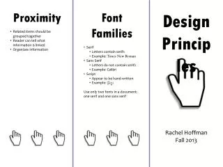
Proximity • Related items should be grouped together • Reader can tell what information is linked • Organizes information • Font Families • Serif • Letters contain serifs • Example: Times New Roman • Sans Serif • Letters do not contain serifs • Example: Calibri • Script • Appear to be hand-written • Example: Gigi • Use only two fonts in a document: one serif and one sans serif Design Principles Rachel Hoffman Fall 2013
Contrast • Avoid making elements on the page similar • If elements are not going to be the same, make them drastically different! • Contrast draws the reader in and gets them interested • Change up the color • Vary the size of the text • Repetition • Repeat certain elements • Makes document cohesive • Repeat colors, fonts, textures, or spatial relationships • Alignment • Everything on the page should align with something else on the page • There are four ways to align text • Flush left • Typical alignment • Flush right • Modern alignment • Center • Formal alignment • Blocked • Formal alignment


