
Effective Design Principles for Visual Communication
This guide explores key design principles for creating visually appealing documents. Learn about the importance of proximity, contrasting elements, repetition for consistency, and proper alignment to enhance readability and engagement. By grouping related items together and providing white space for unrelated items, you can create a well-structured visual flow. Understand the three major font families—serif, sans-serif, and fun fonts—and how they impact your design. Apply these principles to ensure your document is both aesthetically pleasing and easy to navigate, leading to better reader comprehension.

Effective Design Principles for Visual Communication
E N D
Presentation Transcript
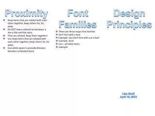
Proximity • Keep items that are related with each other together, keep others far, far, away • Do NOT leave a blank line between a story title and the story. • They are related, keep them together! • Use Keep items that are related with each other together, keep others far, far away. • Use white space to provide distance between unrelated items. • Font Families • There are three major font families • Serif-font with a foot • Example: San Serif-font with out a foot • Example: Arial • Fun—all other fonts • Example: Design Principles Lisa Groff April 16, 2013
Contrast • Visual attraction on the page. • Keep elements the same or very different. • Make darks dark and light items light. • Make big items bigand smallitems small. • Place light text on a dark background and place dark text on a light background. • Repetition • Aim for consistency. • Repetition will strengthen the reader’s sense of recognition • Repeat elements through your document? • Repeat fonts, font sizes, colors and graphics. • Alignment • There are 4 alignments: • Left-Use for large blocks of texts that need to be read. This is a traditional style. • Right-use for titles and small amount of text. This is funky. • Centered-Use for titles. Is formal. • Block-Use in News papers


