Perfecting Design: Principles and Tips
140 likes | 232 Views
Learn the essential Six Principles of Design - Balance, Proximity/Unity, Alignment, Repetition/Consistency, Contrast, and White Space. Discover how to apply these principles effectively through examples and techniques to create visually appealing and well-structured designs.

Perfecting Design: Principles and Tips
E N D
Presentation Transcript
Six Principles of Design • Balance • Proximity/unity • Alignment • Repetition/consistency • Contrast • White space
Balance • Graphics don’t overpower text • Page is not too heavy on one side or the other • Example: • put matching text boxes at the top and bottom of a publication
Tie the elements together: • move closer together • resizing helps accomplish this • overlap • Notice that the graphic slightly overlaps the text • contrast • Reversing the title • increased lead • redistributes the white space in a more balanced manner
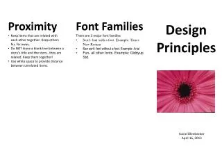
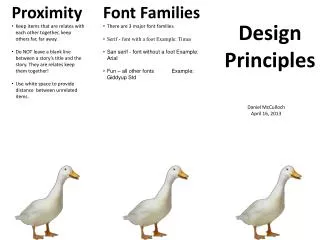
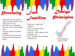
Proximity/Unity • Distance between elements on a page • Demonstrate a relationship or a lack of relationship between elements • Example: • put captions (text) next to the related photograph
Graphic anchors the page, but text elements all float with no apparent connection. • Headline • font change, reversed out • subheading • pulled in closer provides balance with the graphic • spacing between paragraphs • reduced slightly
Alignment • Justification of elements • Related items should be justified the same to emphasize their relationship to each other • Example • text giving the location, date, time, and cost of an event are all CENTERED on a flyer
Centered headlines, text, and graphics lend a formal tone to a layout • But, large blocks of centered text are usually harder to read. • text alignment • left-aligned easier for the eye to take in • wrapped around the bottom graphic • opposing graphics • help balance the overall design
Repetition/Consistency • Scheme - a planned combination of elements • Consistent pattern of font and color schemes and graphic types; repeated fonts, color schemes, or graphics • Examples • Specific font, size, and style for headings, subheadings, and body text. • Do not mix photographic images or digital and cartoon images on the same page.
headline repeated • using graphics that tie in with the copy in the text blocks • using colors • shapes and headline text that are in the copy to reinforce the theme • overlap • graphic and text unifies the design • graphics • all relate to the topic
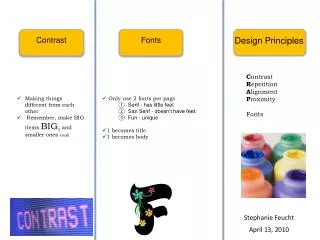
Contrast • Use of color and size to emphasize the most important elements on a page • Example: • black font on a light pink colored page • white font on black paper • light gray on dark blue
Not enough contrast between the headline and text • size • two different serif faces used are too similar • oversized graphic • provides real contrast and reinforces the copy (tall basketball players). • text placement • reinforces the 'towering' aspect of the graphic • unifying elements • reverse text, blue box, blue border, and the drop cap unify • round shape of the drop cap and color echo the shape and color of the basketball • balance • drop cap and reversed text on the left side plus the left-aligned text balance the large graphic element
White Space • Blank or negative space on a page • give the reader’s eyes a break • focus the reader’s attention on important details • White Space does not have to be white • Example • Use wide margins • Poor Example - putting text boxes in the margins of a publication
The large block of black created by the graphic of people adds a large block of black white space. • additional contrast • Multiplying the number of people • reducing the size of the car • leading, larger margins, deeper paragraph indents all add white space or breathing room to the design • oversized drop cap • helps to balance the page with the large, dark elements at the bottom of the page.
