Download
1 / 26
260 likes | 410 Views
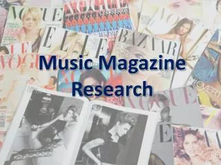
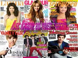
MAGAZINE RESEARCH AND PLANNING. Emma Tennant Candidate Number: 5337 Centre Number: 31030. SUMMARY OF MAGAZINES. On the previous page I have selected a range of different music magazine front covers. I am going to identify some of the conventions used on these front covers.

E N D
MAGAZINE RESEARCH AND PLANNING Emma Tennant Candidate Number: 5337 Centre Number: 31030
SUMMARY OF MAGAZINES On the previous page I have selected a range of different music magazine front covers. I am going to identify some of the conventions used on these front covers. All of the magazines have one main photo of a featuring band or artist on the front cover which stands out and encourages the reader to buy the magazine. Some of the magazines such as Q magazine have used long shots which shows the whole body of the band or artist. Kerrang and Mojo have used medium shots for their main photo. Whereas NME have used a close up of an artist for their main photo. These different camera shots create different effects. A long shot allows us to see the physical relationship between people and their environment as we can se their whole body. A medium shot allows the reader to see the facial expression and some body language of the band or artist. Whereas the use of a close up allows the reader to see the emotion and facial looks of the band or artist. All of the magazines have their title/logo shown on the top of the front cover. This is important because it allows the reader to recognise the magazine. In some cases the logo is slightly obscured by the main image. An example of this is the Q magazine front cover where the main band member from the Killers is holding his hand over the Q logo. The reader can still see that it’s the Q logo but it creates an unusual effect which makes the magazine stand out. Another important convention of the magazine front covers is that they all use a colour scheme which stands out and grabs the readers attention. The colours which are commonly used in these magazines are red, white and black. These colours are very simple but they stand out and they also appeal to both male and female readers. However sometimes magazines will use colours such as pink which is typically a “girly” colour because it stands out. An example of this is the use of pink on the Q magazine front cover featuring the Killers.
The layout of the front covers differs from magazine to magazine. However most of them have an asymmetrical layout. This makes it look more dynamic and interesting. An example of this is the NME front cover featuring the Gossip. They have used a text box which is slightly tilted. Some of the images along the side of the page are also slightly tilted. Most of the magazines that I have picked out have used writing in the middle and on the side of the page which makes the magazine look more interesting and eye-catching. The typography used on the front cover of the magazines is mainly bold. The fonts which have been used have no “ornaments.” They are just plain and easy to read. This indicates to the reader that the magazine is modern, young and fresh. The style and size of the text on the front covers varies. The Mojo magazine featuring Oasis has used some large and some small text in order to make some parts stand out more. They have also used some lower case letters instead of capital letters. This makes the magazine look more appealing and interesting. The language on the front cover of the magazines is quite informal and chatty. On the front cover of the Q magazine featuring Muse they have used phrases like “Nut Jobs” and “Yeah Right.” These phrases are quite youthful and informal. They go with the theme of a music magazine and they appeal to the reader. The language on the front covers is also very persuasive. The Q magazine cover featuring Kylie has used the word “Exclusive” and the NME magazine featuring Noel Gallagher has used the word “Win!” These words stand out and make the reader want to buy the magazine. Some of the magazines have a unique selling point. An example of this is the free CD in the Mojo magazines. This is very effective because it makes people want to buy the magazine. All of these magazines use the same conventions whether they are rock or pop magazines. The editor and designers have carefully thought about the most suitable shot type, colour scheme, typography and language for their magazine. The conventions are very important because they make the magazine look eye-catching and most importantly the make people want to buy it.
Q MAGAZINE FRONT COVER This magazine has a mixture of rock and pop music in it, the conventions that have been used therefore reflect this. They make the magazine stand out and persuade people to buy it. The photo on the font cover is a long shot of the main band member. This immediately draws the reader to buying the magazine because it is very clear and stands out. A small photo of the Beatles has also been used in the bottom corner which allows the reader to see what they can read about in the magazine. The name of the magazine is clearly represented in the top left hand corner. The image and the Q logo have been edited to make it look like Matt Bellamy has smashed the Q logo with his guitar. This is an unusual effect which makes the magazine look more eye-catching. The magazine also has a unique selling point saying it is the UK’s biggest music magazine, which makes it more attractive to some buyers. Another important convention is the choice of colour. A clear red, white and grey colour scheme has been used. These colours are bright and stand out. The red and white together also create a nice contrast. The colours have been selected to go with the colours Matt Bellamy is wearing which creates a theme for the magazine, everything matches. The writing clearly stands out on the grey background which catches the readers attention. The typography which has been used is mainly plain and bold which is easier to read and looks more young and fresh. Muse is written in large capital letters to make it stand out because it is the main featuring band. There is also an outtake from the interview written above in smaller text to make the reader want to read more. On the right hand side of the magazine text boxes have been used for the artist names in order to emphasize them. The fact that text boxes have been used creates some variation which makes the page more interesting to look at. The variation in colour and text styles also makes the magazine look more interesting and eye catching. The use of space on the front cover has a big effect on the look of the magazine. On the left hand side the text boxes have spaces between them which make them stand out more. However the rest of the text on the magazine does not use spacing. The writing is separated by a red line or a different coloured text. This adds to the young and fresh look of the magazine. The language which has been used is informal and chatty. The magazine uses words like “Nut Jobs” and “Yeah right” which goes with the theme of the magazine and appeals to the reader because it is entertaining. Some rhyme has been used when it says “Barmy Army” this sticks in the readers mind and makes it more interesting to read. The overall layout of the magazine is asymmetrical. The text is not all the same size and nicely aligned. This makes it look more appealing and youthful. Even though there is quite a lot of information about what’s inside the magazine there is not too much. There is just enough to make the reader want to read more. The fact that the magazine is not too “cluttered” makes the main image and the text stand out because of the space around it. The barcode on this magazine is located in the bottom left hand corner. The price and date is also written on the barcode. The barcode does not really draw any attention to itself but it is an important part of the magazine.
Q MAGAZINE CONTENTS PAGE The contents page follows the same colour scheme as the front page with red as a main colour. The red bar at the top contains the Q logo which is again reminding the reader that they are reading Q magazine. The word contents also stands out because it is written in black on a red background. Four images have been used on the contents page. The biggest image is of Matt Bellamy from Muse because they are the main feature. This image is an angled shot which looks more appealing because it is original. The photo of Matt Bellamy is a long shot which is overlapped by another photo of another featuring artist. There is also a long shot of the Beatles. The final image is just a double page spread from the magazine. The variation in shot types makes the page more eye catching and interesting to look at. The fact that there are a lot of images also makes the page look more exciting as it engages the reader because there is not just a load of text. There is a large page number on the photos which makes it easier for the reader to find the right page without having to read through the whole contents. The layout is fairly symmetrical because the writing and some of the images are aligned. However the two smaller images at the bottom of the page are tilted and they overlap each other which makes the page look more dynamic and youthful. The Beatles image and the text is nicely aligned on the right hand side making it easier for people to read and understand it. The typography is not as bold as on the front page, but it is still emphasized by the fact that some parts are written in capital letters. Instead of a space between the heading and sub-heading of the features a red line has been used. This splits the text effectively and adds more colour in order to break up the black text. The information which is given about each feature of the contents is very brief. It gives the reader entertaining information which makes them want to read more. The language is chatty and informal because it is trying to engage and entertain the reader. The white background of the contents page contributes to making the text and images stand out. The red bar at the top stands out clearly, along with the text and the red lines splitting the text.
Q MAGAZINE DOUBLE PAGE SPREAD This double page spread is fairly plain but very effective. It has one main image covering the whole of the right hand page. It also has a small image which is placed directly in the middle of the left hand page. The large image is a long shot showing the whole body of the band. It allows the reader to see exactly what they are wearing and what they are doing. The fact that Matt Bellamy is looking straight into the camera makes you feel more engaged because he is looking straight at you. The fact that they are leaning on their guitars also makes the images look more appealing because it is unusual. The smaller image is a mid shot showing the band members when they were younger. The fact that this image is in the middle of the page immediately draws the readers attention to it. The image also gives the reader some background information about the band which is both informing and entertaining. The big image contains a caption which gives readers information about the images. The caption is written in a red text box which goes with the colour scheme and stands out. The red and black colour scheme has been followed. However the background of the large image is light blue in order to make the band members stand out. The left hand page is white which makes the black text stand out. The typography which has been used is Times New Roman. The text is all lower case except for the part which states who has written it and who has taken the pictures. Muse has been written in large emboldened letters in the top right hand corner. Two faint lines split the interview from the word Muse. This space makes the page appear less cluttered and more clean and minimal. The text starts with a huge emboldened M which signals the beginning of the article and grabs the attention of the reader. Another paragraph in the text also begins with a big letter. This contributes to making the page look more eye catching. There is an outtake from the text which has been enlarged and changed to red in order to grab the readers attention. It shows a key part of the interview in order to evoke the readers interest. The language in this article is very chatty and informal. The interviewer describes the meeting with Matt Bellamy and Muse, they also talk about their latest album. The article says things like “Bellamy’s geo-political jitteriness was so overwhelming” and “Its OTT lyrical theme is entirely down to Bellamy.” This type of language appeals to the readers of the magazine because it is young, fresh and entertaining. The overall layout of the double page spread is symmetrical. The writing is aligned and there is not too much information on the page which makes it very easy to read.
Q MAGAZINE DOUBLE PAGE SPREAD This double page spread is very different from the previous one. It has a lot more going on in terms of images, text and colours. A red and black colour scheme has been used in order to follow the theme of the magazine. A number of images have been used on this double page spread as well. One big main image covers both pages. It shows a medium shot of Shakira sitting in a recording studio. This gives the reader an intimate view of her life and makes us feel involved. There is also a small mid shot below this picture which shows Shakira working. An image of her album cover has also been added so that the reader knows what it looks like incase they want to buy it. Finally on the right hand page there is a close up of Shakira posing. These images make the page more entertaining to read and look at. Captions have also been added to the images in order to give the reader more information. The language in these captions is very informal and chatty. For example when it says “Wouldn't you know it her clothes have fallen off again.” The typography throughout the double page spread is varying. Some parts of the text has used bold capital letters in a normal Arial style such as the text box that says “In the studio” and “Access all areas.” However other parts of the text is written in lower case letters using an older style such as Times New Roman. The title which is on the main picture is written in Times New Roman. When it comes to the article itself this is also written in Times New Roman. However there are varying sizes. The intro is written in a larger Times New Roman Font and the main part is written in a smaller Times New Roman font. Certain parts of the text have also been emboldened. The first three words of the intro and the first letter of the main part have both been emboldened. This emphasizes the important parts of the intro and the big S at the beginning of the main part looks more interesting on the page than a small s. Finally an outtake from the text has been emboldened and enlarged. It has also been underlined with a red line. This draws the readers attention to it and makes the rest of the page look more appealing. The red line lightens up the black text and creates a nice contrast on the white page. The white page also makes the black writing stand out. The outtake highlights a key part of the interview so the reader understands what it is about without reading the whole article. The language in the article is informal and chatty when describing the meeting with Shakira and what she is doing. The article says things like “The Colombian pop pixie” and “The only part she is concerned with now is a knob controlling the volume.” This kind of language appeals to the reader because it is entertaining and it makes you feel involved. As well as the main article about Shakira this double page spread also extra things such as “Word of mouth”, “Twitter” and “Do you speak Anglais?” These three elements have been added to entertain the reader. The language and text style is the same as in the main article, informal and chatty. The same colour scheme has also been used. However they have used a different colour for the “Do you speak Anglais?” part in order to create variation and make the page look more interesting. The overall layout of this double page spread is asymmetrical. Some images are tilted and overlap each other. The text also varies in size, colour and style and the article heading is placed on the main image. This contributes to the youthful look of the magazine. The fact that there are so many elements to this double page spread makes it a lot more entertaining to read because there is so much more to look at.
NME FRONT COVER This magazine is mainly a rock magazine, though it does have some pop music in it as well. The conventions which have been used therefore reflect this. The magazine only has one single image on it. This image is a close up of Liam Gallagher. By using a close up the reader is able to see the facial looks of the artist. Liam is also looking straight into the camera and straight into the eyes of the reader. This makes the reader feel more engaged which makes people want to buy the magazine. It also signifyes that it is an intimate interview. The magazine has a black, white and red colour scheme. The red and white bold NME logo is clearly shown in the top right hand corner. It slightly overlaps the main photo which makes it stand out. It is important that the magazine logo is visible so the reader can recognize it. The writing is mainly black which stands out on the white background. There is also some white writing on the actual picture. The colour variation contributes to making the front cover look more eye-caching. The typography is mainly bold with varying styles. Liam is written in bold capital letters in a modern Arial style which makes it very clear that he is the main feature of the magazine. The writing underneath which states what the interview is about is also in the same style. However the outtake is in a less modern Times New Roman style. This emphasizes the fact that it is an outtake and draws the readers attention to it. The outtake is designed to trigger the readers interest and make them want to read more. The word “preview” has been emboldened because they want to emphasize the fact that that they've got the V Festival preview because that will attract a lot of buyers. Across the bottom of the page three bands have been mentioned. They are all emboldened and written in capital letters to attract attention. The language on the front cover is informal which appeals to the reader. The magazine uses words like “Their very Xmas second album.” This is a chatty and informal way of writing which is designed to entertain the reader. The overall layout of the page is asymmetrical. There is no space between the text on the right hand side of the of the page. The text also overlaps the main image. These techniques make the page look a lot more interesting. The barcode on this magazine is located next to the main image on the left hand side. The price is written directly underneath the NME logo. None of these draw attention to themselves but they are still a key part of the magazine.
NME CONTENTS PAGE The contents page of this magazine follows the same red, white and black colour scheme as the front page. The writing really stands out on the plain white background. The contents page has only used one fairly big image which is a mid shot of Pete Doherty. This stands out and makes the reader want to read about him. They have also added the V Festival logo in the top corner of the image to let readers know that he is playing at the V Festival. This is both entertaining and informing the reader at the same time. The typography used on the page is mainly bold in an Arial style. This makes the writing stand out because it is plain and easy to read. The headings are all in white capital letters and the writing underneath them is in small black letters. This makes the headings clearly stand out and makes it easier for the reader to find exactly what they are looking for. The small writing underneath each heading tells the reader just enough to make them interested. The NME logo and the word contents at the top of the page both clearly stand out on the black text box. The black text box also adds some colour to the plain white page making it look more eye-catching. Black text boxes have also been used for each heading in the contents. This makes the bold, white text inside stand out. The page numbers are written in red in order to attract attention so the reader can easily find the right page number. The writing underneath the big photo of Pete Doherty informs the reader of the page number and what the article is about. This text is a lot bigger than the rest of text which emphasizes it and makes the reader notice it more. The contents also contains a band index which informs the reader of which bands are in the issue and what page number they are on. This is very useful for the reader because it allows them to read about what interests them without looking through the whole magazine. The contents page also advertises the magazine at the bottom in a black text box. It encourages people to subscribe. This stands out because it is written in a black text box with yellow and white capital letters. Yellow is a colour which attracts a lot of attention because it is bright. The magazine also uses a few arrows with key information written in them, such as the red arrow at the bottom of the page on the right hand side. This again attracts the readers attention and makes the page look more interesting because different shapes have been used such as text boxes and arrows. The type of language which has been used is informal and entertaining. The magazine says things like “We check out excitable new pups.” This type of language is chatty and entertaining at the same time which keeps the reader interested. The overall layout of the magazine is quite asymmetrical which contributes to giving the magazine a young and fresh look. However the magazine has used spacing in between headings and sub headings which makes the text look more organized and therefore makes it easier to read. The date is written under the word contents at the top. The date is important as it lets the reader know how long the magazine has been out when they buy it.
NME DOUBLE PAGE SPREAD This double page spreads page uses a slightly different colour scheme to the rest of the magazine which makes it stand out and look different. The choice of a new colour (blue) emphasizes the fact that this double page is about new bands and artists. The word Radar clearly stands out in the top corner because it is written in big, white capital letters in a bright blue text box. The name Radar is also fitting to the theme of the double page spread which is new music. The double page spread is very eye-catching because it hasn’t used a normal double page spread layout. Instead they have used one large photo with a text box on top. This is very appealing because it is original. The image shows a long shot of Ellie Goulding lying on a bed. The image allows us to see exactly what she is wearing and what she is doing. It also allows us to see her in her hotel room which is more interesting because it gives us a fuller view of her life. The picture has been carefully thought out because it takes up the whole double page spread. We se her guitar in the corner and we see her relaxing on the bed in her hotel room. There is a caption in the corner of the image which is designed to be entertaining because of the way it is written. The typography which has been used is mainly big and bold for the headings. The main text is small however it starts of with a large T in order to signify the beginning and make it look more eye-catching. The writing is mainly plain without “ornaments” which makes it appear more youthful. The language in the article is informal and chatty which makes it entertaining. It says things like “How did an unknown rural from Wales end up working in the capital’s electro lite?” This sort of language goes with the theme and genre of the magazine, it also keeps the reader interested. The overall layout is very interesting and original. A big text box has been used for the article and a few small text boxes have been used for the headings. The white text box containing the article really stands out on the image which makes it look more appealing. The fact that there is not too much information on the double page spread makes the image and text really stand out and grab the readers attention.
NME DOUBLE PAGE SPREAD This contents page follows the same red, white and black colour scheme as the rest of the magazine. The double page spread also has quite a few images. There is a close up image of Liam on the left hand page which allows the reader to see his facial expression clearly. On the left hand page there is a long shot of Liam showing what he is wearing. This is intentional because he is wearing his new “Pretty Green” clothing line which they talk about in the interview. Finally we see a long shot of Liam at the bottom of the page which has been manipulated to look like he is walking forward. This makes the double page spread look original and eye-catching. It is also intentional that he is walking forward in this image because in the interview Liam talks about moving on to new things. The image symbolizes that he is moving away from Oasis. In this image Liam is dressed in a red coat which goes with the colour scheme of the magazine and makes the image stand out more because red is a bright, eye-catching colour. The colour scheme of this double page spread is red, white and black, but green has also been added to some of the text because it fits in with the fact that they are talking about Liam’s new “Pretty Green” clothing line. The typography which has been used is big and bold. The outtakes from the text are red and green in order to attract attention. They have also been written in a plain Arial style which makes the magazine look more modern and youthful. The outtakes show key parts of the interview which gives the reader an indication of what the interview is about. The main interview is written in small, black Arial style text. This makes the text plain and easy to read. It also stands out clearly on the white background. The first letter in each new paragraph of the text is written in big, red capital letters. This adds colour to the text and makes it look a lot more appealing. A black text box on the right hand page has ‘Liam Gallagher’ written in it with white capital letters making it clear who is being interviewed. The language which has been used is very informal because it uses a few swear words which would appeal to a younger audience as they would find it entertaining. The interview also uses very chatty language. For example it says things like “What the hell kind of a rock“n”roll star turns up to a photo shoot early?” This sort of language goes with the theme of a music magazine and it entertains the reader. The overall layout of the magazine is quite simple and tidy. The three main images stand out on the white background. There is also a space between each major paragraph, making it easier for the reader to read the text. The page number, NME logo and date is clearly shown on both pages in the bottom corners which makes it easy for the reader to find the right page.
TARGET AUDIENCE AND QUESTIONNAIRE RESULTS I am planning on creating a Pop/Rock magazine for older teenagers aged 16-21. The purpose of my magazine will be to entertain and inform. • In order to decide on the style of my double page spread I created the questionnaire on the left. • I asked 15 people from my target audience to fill in my questionnaire and here are the results: • Most people said that they expected to see one big main image of a band or artist on the front cover of a Pop/Rock magazine. They also said that they expected to see the title of the magazine clearly represented. • Most people also said that they expected to see bright colours that stand out such as red, black and white. • When it came to the font most people said that they expected the font to be big and bold. Some people also said that they expected a mixture of big bold text and smaller text. • Most people said that they would expect to see one main image and maybe one or two smaller images. • People had different views on the double page spread question. Some people preferred the images and writing of the double page spread to be mixed whereas others preferred one main image on one page and text on the other page. • Most people said that they were willing to pay between £2.50 and £3.50 for a monthly music magazine. • 6 out of the 15 people I asked said that they were more drawn to buying a music magazine if it had a free gift in it. These questionnaire results have helped me come up with a suitable style for my double page spread. I am planning on having one big main image of the featuring artist. I may use another smaller picture as well. I will use bright colours such as red, white, black and perhaps grey as well. My font will be Arial or a similar plain style. The heading will be big and bold. I will also begin each major paragraph of my article with a big capital letter.
PopRock Date Price FRONT COVER PLAN Artist Name About Artist Outtake from Interview Image Other Feature Plus Band/Artist Band/Artist Band/Artist Band/Artist Barcode Unique selling point
CONTENTS Image P CONTENTS PAGE PLAN Features Features listed with page number Live Live bands/artists listed with page numbers Playlist The most popular songs with page number Reviews Album Reviews with page numbers Image Image P P
DOUBLE PAGE SPREAD PLAN P Artist Name Image going across both pages Text Text Text Text Text Text Image Image Text PopRock Date P Number P Number Date PopRock