Download
1 / 28
280 likes | 412 Views
Includes: DPS Front cover Contents Page Genre Research

E N D
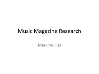
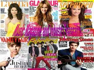
Masthead- ‘Q’ it is simple but it is eye-catching and stands out because it unusual having a letter on a front cover. The connotation of ‘Q’ implies that it is different because ‘Q’ is not often used. Banner- this is the first thing you look at, as it has different colours to the masthead, also it has a catchy heading ‘THE UK’S BIGGEST MUSIC MAGAZINE, the word ‘biggest’ is in italics, this may have been done to emphasize the word and to make it stand out to the audience. Cover lines- Short and to the point so the reader knows straight away what is in the magazine, also gives the reader an insight to what is in the magazine. The colour of the cover lines are Bold and they stand out. Masthead Banner There is also a background colour to highlight the main stories in the magazine. The cover lines at the top seem important towards the top in grey, as it is more eye catching. They also use different colours in the same cover line to catch the readers attention and to make it more interesting. In the main Cover line ‘3 words’ it was a name of Cheryl's songs, would encourage fans to buy magazine, the font is large and bold catches readers attention. Centre Image- The main image is of Cheryl Cole she is dressed in black, her skin tone is quite pale, bright red lipstick, she is wearing black eyeliner which draws attention to her eyes, her red lips and tongue ties together the colour scheme, she had a metal stud ring which brings in rock theme. It also appears that it is raining her hair is wet makes it look like she is daring, this image subverts her pop star stereotype. There is a close up shot used from a face on angle. Layering- Different font is used in the background, text, masthead, banner and barcode. These different fonts goes with the 3 different colours. Target audience- ‘Q’ magazine is normally for people in middle adulthood aged 25, however Cheryl Cole is in the picture she would make a younger. Colours- There are 3 colours used in this magazine black red and grey. The colours are bold and eye-catching and strong to the reader. The colours used show Cheryl's power or dark side Button- Highlights key story in magazine, ‘must reads’. Price/Date/Barcode- With every magazine, one of the main features of a front over is the barcode and the price of the magazine. This is always found at the bottom left hand corner. However in this magazine it is just below the masthead, this may be because there is a cover line at the bottom. Price/Date/Barcode Cover lines Centre Image- Direct mode of address Button Layering/Background 3 Words- Main cover line
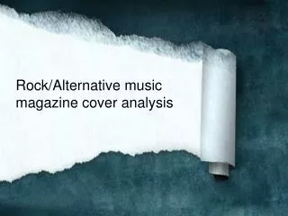
Masthead- The pink writing against the white background makes the masthead stand out. The stars are laying in front of the mast head, makes the audience guess what is in the magazine, and pick it up. Banner- It is just above the masthead so it would catch the readers eye. They are using a promotion to entice the readers. Tilted banner- Theword ‘Special’ is in bold so it stands out, the reader must buy the magazine sounds like it is better than the other magazines. It also has information on famous celebrities , ZacEfron and Vanessa Hudgens , this would appeal to female readers if they buy the magazine they may get to know the stars better. The pink contrasts against the yellow makes ‘jump out of the page’. ‘The truth’ sounds like if they buy the magazine they will find out information that nobody knows. Masthead Banner Colour Cover line- ‘You’ll look fabulous’ everyone wants to look good this would make the readers more engaged into how they can look good. ‘OMG’ this is slang for oh my god, slang may have been used to engage a younger audience perhaps teenagers. Also this may have been used to attract readers they may want to find out exclusive information. ‘5 sexy Hollyoaks hunks’ the language used would appeal teenage girls as they watch soaps and would be attracted to men, there is also a picture of a topless man would grab readers attention. ‘Star style essentials’ sounds like the reader must have them in order to look good. ‘Mcfly exclusives’ exclusive information on Mcfly, you need to buy the magazine in order to find out. ‘Naked’ in bigger writing to appeal female readers girls may be attracted to star. ‘plus all these stars’ makes the Audience think they are getting more for their money as the magazine has extra. Speech bubbles- The speech bubbles are coming from the celebrities to give the reader a feeling that they are talking directly to them. ‘You’ll look fabulous’ there is a picture of Ashley Tisdale she has a song called fabulous . Stories about style engage the reader into looking at that story. Colour- The semiotics theory when girls see pick they think about shopping so they would pick it up more appealing to girls. Also with men they see pink and automatically think that the magazines for girls. The contrast of pink and blue in the magazine. This is important for the key stories so they stand out and catch the audiences eye. Images- All the images on the magazine look at the reader makes the audience think they are talking to them. Price/Date/Barcode- With every magazine, one of the main features of a front over is the barcode and the price of the magazine. This is always found at the bottom left hand corner. However in this magazine it is just below the masthead, this may be because there is a cover line at the bottom. Slogan Centre image- Direct mode of address Cover line Tilted banner Pealed Button Barcode Speech Bubbles Celebrities
Compare both magazines Similarities: • Both the magazines have female celebrities on their front covers. • Both the fonts used are simple and youthful. • Both have buttons indicating key articles in magazine. • Both magazines have eye-catching, youthful logos, which could be remembered and recognised by audience. • Clothes worn by the front cover celebrities in both the magazines are fashionable. Differences: • The ‘Top of the pops’ magazine is aimed at young teenage girls, however ‘Q’ magazine is aimed at both men and women. • ‘Top of the pops’ has a more youthful looking logo, however ‘Q’ magazines logo looks like it is for a newspaper aimed at business men. • ‘Q’ magazines layout looks more organised, however ‘Top of the pops’ magazine looks like it has just been put on the page look ‘mess’. • The language used in ‘Top of the pops’ is informal, however in ‘Q’ magazine the language is formal as it is aimed at an older target audience.
Masthead OASIS special The colour of the masthead has kept its traditional scheme of red and white with the contents page. It has a simple and clear title with the issue date besides it. Also the logo and name of the music magazine has been put in the corner so the reader knows what magazine they are reading. The word ‘contents’ make it clear what page the reader is on. Also in the ‘Oasis special’ they have used the colours of red, black, white and a sort of beige colour. They have gone with the same colour scheme as logo but then clashed it with the beige, which seems to calm it down. The ‘OASIS special’ is mainly based on one band, there a thin lined box around this, this may because it is a separate section or maybe to highlight it and make it stand out. They have an image for their main story. This may be so that fans recognise the picture and may be keen to read about it, also would be eye-catching as the rest of the contents page is in words. This may have been the cover story of this magazine. Where it says the page number below it there is a quote, this the reader an insight into what the article is about. In the every month box it shows you what key things come up in the magazine and how many in total. This gives the readers the ‘wow’ factor because the number shows are big. At the bottom of the page their a review box, in the review box their an image the size of a thumbnail. This shows the readers who the article is going to be about. The review box is for reviews that the magazine does on books and music etc. having this would influence people into reading or listening to music that is recommended by the magazine. There are also bold subheadings in capital letters this would be eye catching for the readers. Enticing phrases acting as puffs. Easy to read layout, most of page taken up by pictures of bands. The page is very clear and informative. Page numbers Colour scheme Main Image Font size Bold Font Quote Review box Subscription
Masthead In order to catch the readers attention, this is young women mainly teenagers . There is a list of articles, the magazine included a banner which implies that this is the contents page ‘inside the mag…’ this is a useful as the colour of the banner the background is a bright pink with white text this would make the writing stand out to the audience. The ‘…’ after the ‘inside the mag’ is helpful because it directs the audience to the ret of the information on the page. The colour scheme in the contents page is consistent with colours that are used on the front cover, this shows that the colours should be consistent in the front cover, contents page and double page spread in order for the audience to be engaged in the magazine. The colours are bright, pink and yellow are used which connotes happiness and is also very feminine. The sub-headings used in this contents page are in bold. This is to draw the attention of the reader . The font used is comic sans this shows that the audience if or females. The page numbers are really big compared to the text beside it. This is to ensure that the readers can see on what pages are the articles they want to read, it is also pink so stands out from the white background. The page numbers and the main articles are highlighted in yellow, this implies that the articles are a ‘must’ read for the readers. The use of rule of thirds on the contents page , they have split into three columns so that the page looks more organised and neat. This conforms the conventions of a contents page. There are many images used on the contents page. There are mainly pictures of jewellery and clothes, this is to appeal to the female audience. The use of images has been smartly incorporated as this magazine is aimed at young girls and they would prefer visual preferences. The mode of address is informal and colloquial. For example they have used language such as ‘we love boys’ ‘mag’ which shows that the target audience is for a younger age group as the language is simplistic. There is no ‘Top Of the Pops’ logo or ‘Contents page’ which breaks conventions of normal contents page, the way the magazine has written contents page is ‘inside the mag…’ and is easier for the young audience to understand. Sub-headings Page Numbers Mode of address/Language Images Colour Rule of thirds Thirds Of Rule
Compare both Contents Pages • Similarities: • Both contents pages have numbered pages, with information to see what the article is about. • Both have sub-headings indicating what the topic of the article is. • Both have images on what the main article is about, which grabs the readers attention. • Both contents page maintains there colour scheme throughout. • Differences: • The layout for ‘Top of the pops’ is rule of thirds, however in ‘Q’ they have a ‘big’ image which shows that is there main article. • In ‘Top of the pops’ the magazine has a cover page with arrows showing what page numbers the cover lines are on, however ‘Q’ has a subheading called features and it has all the page numbers under it. • There is no ‘Top Of the Pops’ logo or ‘Contents page’ which breaks conventions of normal contents pagehowever, ‘Q’ has a masthead that says ‘Contents’. • ‘Q’ has a review and subscriptions box however, ‘Top of the pops’ does not.
Drop capital Layout- The image takes up the whole of the right page . This image could be used as a poster, after the reader has finished using the magazine. The article is in small font, this is so all the information fits on the page. The font fits around the image at the bottom of the page which relates to the overall look of the magazine, which is rock. There is big capital ‘C’ in red, which follows the colour scheme, which is placed across the page, this stands for Cheryl. It is a striking feature. For the bulk of the interview a simple sans-serif font is used. Contrasting this style is the huge red letter “C” seemingly overhanging the text and the quote which is in red block capitals. The heading is simply ‘Cheryl COLE’ which implies that it wants to get the reader attention. Capital C Column Masthead Text/font- Drop capital has been used on the ‘C’ above the image on the left hand side of the page, this goes down 5 lines. There is a pull quote at the bottom left hand corner, this in bold, red writing which is eye-catching and matches the colour scheme. The pull quote may relate to many readers, some of the readers may feel the same way. The font is small and simple which shows that the article e does not need to be fancy, it is the content that counts. Editorial-The language used is some what formal, it is not humorous or chatty. It sets the tone of the article as being serious and not just about gossip. Image- The image takes up the whole of the left side of the double page spread, this shows the feisty image of Cheryl Cole, the fact that there is no text on the page shows that article is mainly about Cheryl Cole . Once gain the image reinforces the rock theme , this is effective as readers would be more engaged in the article. She has red lipstick and dark eyes and looks seductive which would arouse male audiences. Overall, the double page spread from ‘Q’ looks very classy and is very effective. Main image Caption Quote Page number
Two page featuring the stars of camp rock- readers of top of the pops most likely to be fans. Film logo- In the top left hand corner of the first page, which is the primary optical area according to the Gutenberg diagram. This logo makes fans recognise what the article is about. The Plot- a brief outlines of the plot is used as an enticement for the audience, which encourages them to watch the film. The font is also outlined in black so it makes the writing stand out. Columns- The two columns are positioned at a slight angle to target young audience. There also a subheading in red font, to highlight the question. This engages people to read. Quote- a quote has been pulled out from the text and been put in the middle of the columns- this is used to capture the readers attention , and to make them read the article. It has been positioned in a very ‘fun’ way in the middle of the two articles with a circle boarder, makes it ‘jump’. Characters- The characters from the film camp rock, who the target audience of the magazines are likely to be fans of. This is spread across both pages. The colour is in pink and yellow which stands out, as the background colour is blue. Colour scheme- There are bright colours throughout, to attract young readers. Pink is a feminine colour which appeals to female audience. The yellow connotes happiness and fun, which also attracts the audience. Main image- The main image are of the Jonas brothers, these are the main characters of the film. They take up a small part of the other page. They are the similar age of the target audience of the magazine., therefore they can identify with them. The Jonas brothers also attract female attention, teenagers. ‘CAMP ROCK’- These words are in big bold font, stands out and is fun to read. Also the word rock matches its font. Has a yellow background suggests camp rock is fun. Alliteration- ‘Come to camp’ its catchy and a memorable headline. Alliteration Film Logo Quote Stamps Big bold font Main image http://prezi.com/pptimport/ Characters Colour scheme Brief outline of plot Columns
Compare both Double page spreads Similarities: • Both of the double page spreads have images matching the article content. • Bothe of the images have a heading to introduce what the article is about. • Both the articles have quotes pulled out of the text to catch the readers attention. Differences: • In the Top of the pops magazine the main image does not take up the whole page, however in Q magazine the image of Cheryl Cole takes up the whole page. • In ‘Q’ magazine the colour scheme is very simplistic, with red and black even though both the themes are the same ‘rock’, however in Top of the pops magazine the colours used are vibrant and vary. • The language used in Top of the pops magazine is very chatty which suites the younger audience, however the language used in ‘Q’ is formal and suites an older audience. • The layout of ‘Q’ magazine is very organised in its place, however in Top of he pops the layout is scattered on to both pages.
The history of the genre • Reggae is a music genre first developed in Jamaica in the late 1960s. • the term reggae more properly denotes a particular music style that originated following on the development of Ska and Rocksteady. • Reggae is based on a rhythmic style characterized by regular beats on the off-beat, known as the skank. Reggae is normally slower than ska, and usually has accents on the first and third beat in each bar. • Reggae song lyrics deal with many subjects, including religion, love, sexuality, peace, relationships, poverty, injustice and other social and political issues. • The word reggae as a musical term first appeared in print with the 1968 rocksteady hit "Do the Reggay" by The Maytals, but it was already being used in Kingston
Key artists in the development of the genre The Wailers, a band started by Bob Marley,Peter Tosh and Bunny Wailer in 1963, is perhaps the most recognized band that made the transition through all three stages of early Jamaican popular music: Ska, Rocksteadyand reggae. Other significant reggae pioneers include Prince Buster,Desmond Decker and Ken Boothe. At the moment, the 64-year-old reggae singer takes home the Grammy Award for Best Reggae Album for his 2012 album, ‘Rebirth.’ Jimmy Cliff was up against the Original Wailers, Sean Paul, Sly Robbie & the Jam Masters and Toots and the Maytals.
Audience You Don't Have to Be a Rasta to Listen to Reggae! Those who listen to reggae music are generally considered to be Rastafarians or Jamaicans. The target audience for reggae was poor, working class Jamaicans, however the genre ended up being listened to in all countries by people of all ages and race and it was adopted by the skinhead culture of 1980’s Brita in and the Mods-also in Britain. The target audience has a broad number of admirers, for example: white middle class, Asians etc.
Public perception of the genre • Many people view reggae as music which brings peace to people, however there are many stereotypes such as: • People who make or listen to the reggae smoke weed. • They have dreadlocks • They are Rastafarians
Conventions of the genre • Tracks consist of mainly percussion and strong baselines, with a typical tempo of with singing and guitar. ‘Dub’ tracks are usually without singing and focus on the instruments and can be re-worked versions. • In the music videos the artist usually seen performing cuts to the artist with people • The videos are very simple and not overcomplicated which sits the genre perfectly- chilled and relaxed.
Sub-genres There are several sub-genres for reggae: • Early reggae • Roots reggae • Dub • Rockers • Lovers rock Newer styles and spin offs: • Hip hop and rap • Dancehall • Raggamuffin • Reggaeton • Reggae fusion
Record labels There are many record labels in the Reggae industry: • Blood and fire • Circulation music • East star records • Falasha recordings • I grade records • Jah works • Magnet records • Tanty records • Trojan records • Universal Egg
Analysis of United Reggae Magazine The colour scheme matches the theme of the magazine reggae, green, yellow, red. The masthead is big and stands out its in capitals. Next to the word ‘united’ there is a reggae flag with stars in the middle, represents the reggae culture. It is east to identify, the main image also has a black man with the colours of the reggae flag on his jumper. Issue date Masthead Main image Main Cover lines Cover lines Banner
Cross Media Radio Stations: Shows: Websites: TVStations:
Radio Stations There are many different types of radio stations that are a part of Reggae: Official Radio Stations- Pirate Radio Stations-
Bob Marley Artist: Bob Marley and The Wailers Genre: Reggae Nesta Marley “Bob” Marley (6th February 1945-11 May 1981) he was a Jamaican singer song writer and musician. He was the rhythm guitarist and lead singer for the Ska, Rock steady and reggae bands. The Wailers (1963-1974) and Bob Marley & The Wailers (1974-1981). Marley remains the most widely known and revered performer of reggae music, and is credited with helping spread both Jamaican music and the Rastafarian movement to a worldwide audience.
Bob Marley Marley’s music was heavily influenced by the social issues of his homeland, and he is considered to have given voice to the specific political and cultural nexus of Jamaica. His best-knows hits include “I shot the sheriff”, “No women, no cry”, “Could you be loved”.
Reggae Future Reggae music has developed widely in the music industry through many different media, such as magazines, radio, TV and websites. This reaches a wide variety of people. This shows that it is a popular music genre and is appreciated.