Download
1 / 4
40 likes | 182 Views
This analysis explores the conventions used in music magazine advertisements for artists like Trey Songz, Rihanna, and Katy Perry. Each advert features the artist’s name prominently in bold and vibrant fonts to capture readers' attention, while the album title is styled distinctively to stand out. Visual elements, such as striking images of the artists and matching color schemes, are employed to appeal to diverse audiences. The use of logos to signal content warnings and the inclusion of popular songs also play roles in influencing potential buyers.

E N D
Analysis1)Trey songz The name of the artist is in bold capital letters on top of the page to grab the magazine readers attention and inform them of who the artist is, and the style and size of the font does this. The name of the album is in a different font style, and colour scheme to the rest of the page. this is done to make the albums name stand out and the colour red does this. The centre image of the advert is of the music artist, this has been places at the centre of the advert page to inform the readers about who the artist 'Trey Songz' is and to also draw the attention of both the male and female audience, as some will be attracted whilst others are inspired. the colour of the background, has been made to match the edited colour of the artist, this is done to set a colour scheme for the advert, which is grey and black This logo has been put there to advice parents that this advertised product may contains sexual or violent language.
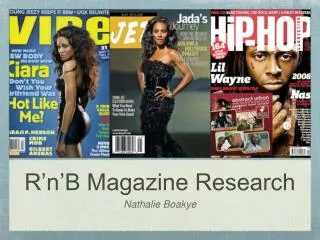
Analysis2) Rihanna To have the picture of the artist bold and at the centre of the page is another convention. This is done to inform the readers about who the artist is and give them a visual insight. To place the name of the artist on top is done to meet the conventions of an advert. this is also done to inform the readers about who the artist is. The name of the album is in the same font as the name of the artist, this is done for layout purposes. Even though this isn't a release date which is one of the usual conventions of an advert, this is there to inform the readers about the album being exclusive. As this is an advert of a music album, its best to have popular songs of the artist to influence the audience into purchasing it. As this is an advert for an album its conventional to have a mini picture of the album at the bottom to inform and the readers about how the album looks, and guide them into buying it.
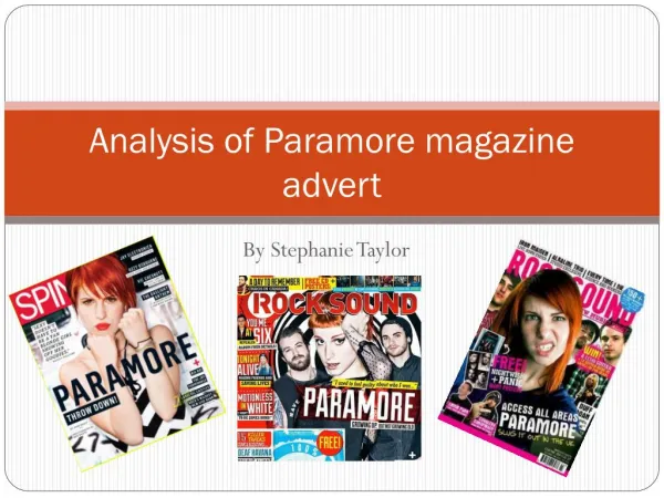
Analysis 3) katyperry The name of the artist is in bold and bright font on top of the page to attract the audience attention and notify them of who the artist is. Some music magazine adverts follow the conventions of including detailed information of what the tracks in the album are and what the precise release .date The name of the album is directly under the name of the artist this is another convention of a music magazine advert as it is there to address the readers. Just like all music magazine adverts, this one has a large of the artist, covering half of the page to attract the audience attention.