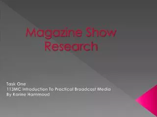
Creative 6th Form Magazine for Students
40 likes | 135 Views
This magazine research by Brandon Stevenson critiques a school magazine's design, offering insights into both positive and negative aspects. While sustainability of a color theme lends a professional look, dull colors and a focus on only one female individual limit its appeal. The central image lacks depth and relevance, failing to engage a broader audience effectively. The use of free products as incentives is positive, but lacks emphasis. Positive elements include impactful title design and some creative choices, but negative aspects like font and color choice hinder its professional appearance. Suggestions for improvement involve creating a dynamic collage for the central image, refreshing the title layout creatively, and enhancing the overall aesthetic appeal for a wider student audience.

Creative 6th Form Magazine for Students
E N D
Presentation Transcript
School magazine research By Brandon Stevenson
This magazine cover has a mixture of positive and negative aspects. It sustains the colour theme throughout which gives it a professional look but the colours which the theme is built up of extremely dull, boring and aggressive. This has a negative effect on the audience as they wont want to read it. When I create my magazine I also want to sustain a specific theme to maximise its professional look but with alterations to make it as fun and appealing as possible. The central image hasn’t been well thought out and selected, this is due to the fact that its all about one person, who is female. The effect of have one individual who is female has a negative impact on the audience as it narrows it down to who it can appeals to. For example it wont appeal to males as they cant relate to it, due to the fact that its just a female on a yellowy background which has no relevance to school other then the aspect that she may be a student. However it does have some positive element to it. Such as; she's behind the text, which suggests that the content it more important than her and the shot in which she's been taken in is a close up, making it seem like she's looking straight into the readers eyes making them feel like the magazines directed at them . I will have a central image on my magazine but its going to be a 6 with a collage of different things relating to students and sixth form within it, maximising who my magazine appeals to. The magazine offers a free products as an incentive to buy it which is good, however the element of it being ‘free’ hasn’t really been highlighted to a large degree.
The title of the magazine is effective in many ways, such as; its big, black and bold which makes it stand out to the audiences highlighting its importance's. The fact the title is bold on a grey/white colour sky back ground puts further emphasis on it standing out. I will use a similar technique to insure that mine stands out but in a more creative manner. The title also relates to students directly with positive connotations as they were ‘chosen. To be within the sixth form. This piece of text has positive and negative aspects to it. A positive aspect being that it states an up coming event; that being a play and highlights what the play is without actually saying the name is, this is done by the famous quote “to be or not to be?”. I personally don’t like this element of the magazine because of its font and colour which falls into the category of its negativity. The colour clashes with the grass in the back ground making not stand out to its full potential. The fonts is extremely boring and child like which makes the magazine seem less professional and will make their audience (sixth form students) feel young and looked down upon. The red colour of the text highlights the importance of the piece of information being presented but it doesn’t relate or sustain the colour themes in any way. The red texts of a green background makes it uncomfortable for the audience to read which is negative.
The date is presented which is good as it is informative. The colours and name of the title work well together. This is due to the fact that it has the word “sport” is within it, in the colour green which has healthy connotations. The centre image is good because it relates directly to the content of the magazine, that being sports and the relation that he’s holding a tennis racket. The camera angle in which the boy has been shot in isn't very positive because it’’ make the audience feel small and as if they’re not as important as him due to the fact that they’re looking up to him. My centre image is going to be totally different to this as I want it to relate to a wide range of audiences, I will do so by making a collage of images within my number 6 (the name of the title) The red text is well thought through as its lays on a blue back ground which maximises it standing out. The barcode looks extremely poor and as if its been copied and pasted off Google. This takes the professional look away from the magazine . The reason why it looks like this is because it has a white background around it which is random as it sits on the sky.