Download
1 / 11

E N D
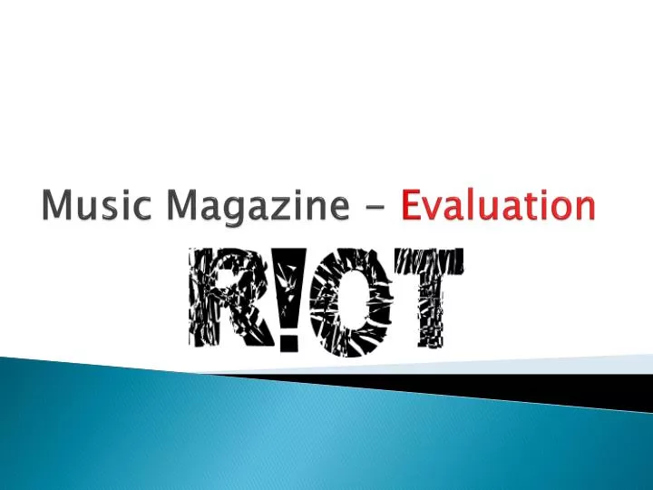
The Task... For our course work, we were told to create a music magazine, aimed at a certain audience or age group, with a specific genre of music. In my case, I chose my target audience to be young adults/teenagers; both males and females between the age of sixteen and nineteen. I also decided that my music magazine will be a punk rock music magazine, which will cover punk rock artists and include articles and stories that my target audience would enjoy. When planning my magazine, I had to consider the factors of a music magazine that my target audience would appreciate, and what would appeal to them. After all of my planning, I chose the original name “R!OT” for my music magazine because I felt it represents the rebellious connotations to Punk rock music. I then went on to plan and draft what my front cover, contents page and double page spread would look like.
Forms and Conventions... • The front cover of my magazine conforms to general styles of magazine front covers, as there are no aspects of it that are not generally found on all magazine front covers. • Similar to other rock music magazines, the font of the masthead is slightly destroyed and distorted. This adds the connotation that the genre of music isn’t soft and timid, but instead loud and rebellious. This was an aim of mine, as my target audience was teenagers between the ages 15 and 19, who already listen and are interested in punk rock music. The masthead is the largest font on the front cover, in order to entice an audience with the eye catching font and title. • My front cover also conforms to the typical appearance of a rock music magazine, because of it’s layout. It doesn't have a large amount of sell lines on the cover, and has a strip at the bottom of the cover with a list of more that can be found inside the magazine. • The masthead on the cover of the magazine is the largest font on the cover, and the second largest text font is the name of the cover artist featuring in the magazine. My magazine aims to attract and entice an already existing audience, so the large font helps make my magazine front cover stand out and be noticeable. • The mane of my magazine, “R!OT” connotes the rebellious attitude and views of my target audience; teenagers aged between sixteen and nineteen. Punk rock music is a genre of music that shows the unruly side to the teenage generation, and I think the name “R!OT” clearly shows this to my target audience, and appeals to their sense of wanting to be part of something that is different to other magazines.
I chose to use an image of my cover artist covering her eye, after seeing this pose being acted out by Paramore’s Hayley Williams. This pose is very different and isn't commonly seen on the cover of music magazines. Having the musician on the cover of my magazine do a pose that obscures part of her face subverts from the typical style of image that would usually be used on the front cover of a magazine. On most rock music magazines, the artist’s face is clear and no text or images in placed close to their face. However I think that this diverse image shows the artist’s and the magazine’s individuality. In order for my magazine to stand put and appeal more to ,my target audience. This image could be said to “break the rules”, which is a connotation of the public perception of punk rock music, and the rebellious appearance of the magazine would be something my target audience would be able to relate to. • The eroded and worn font also reflects the rebellious attitude of the magazine, similar to the font also used on the mast head of other rock music magazines, such as “KERRANG!”. • Also the use of the punctuation in the Masthead adds a sense of urgency to the magazine, suggesting to my target audience that it has an element of spontaneity, appealing to my target audience of teenager’s impulses.
Forms and Conventions contd... • I chose to subvert the typical forms of a contents in a rock music magazine, as my contents page is very structured and organized. Many other magazine contents pages have a large amount of text on them, and include a lot of information of what each article is about and what to expect in the magazine when reading it, however my music magazine doesn't do that, ad is very simplistic. • However my contents page does include some of the common features on all magazine contents pages. For example, it has a few images of what some of the articles will include. There is one large image of the cover artist, and some other smaller images of other artists that will appear in the magazine.
Forms and Conventions contd... • I chose to use an image of the cover artist sitting down in a casual chair to create the sense of her being interviewed, and having a friendly conversation with the readers. I used a slight low angle shot to suggest that the artist is someone to look up to and someone to admire. • I included four other smaller images to go along side the main pictures, to give the reader a bit more of an insight in to the artist’s personality. • I changed the saturation and the lighting of the image, so that it would be more eye catching and stand out more. I created an image with more contrast between the darker and lighter colours, making the photograph more vivid and bold almost going against the usual type of photograph usually used on a double page spread. The image is dangerously different, which goes with the magazine in general, as it is dangerously different and has its own sense of individuality.
Target Audience... • My target audience is teenagers, aged between sixteen and nineteen, who are fans of punk rock music. I tried to address and attract my target audience through the use of bright bold colours, and an interesting image on the front cover that is different from the usual appearance of other magazines. • However my magazine is not for only one gender. I aimed for my magazine to appeal to both males and females. I attempted to achieve this by having a female artist on the front cover as my feature artist and I included sell lines about both male and female punk rock artists. Also, the colour scheme of my front cover and magazine is quite neutral, considering genders, and is not intended to appeal to either just males or females, but all teenagers who are interested in punk rock music.
Institutions... • I have chosen for my magazine to be sold in large supermarkets, such as Asda and Tesco. Large markets like these will have a large range of magazines, however may not have many rock music magazines, therefore there would be less competition for my music magazine. My magazine would be available in music and media shops, such as HMV. • Making my magazine available in a wide range of places shows again that it has no specific demographic apart from simply teenagers. Theses shops are very neutral and have both male and female customers, therefore it doesn’t suggest that my magazine is for only males or just females.
Representational issues... • I think my magazine is an accurate representation of punk rock music and its audience. The conventions on the front cover, the font and the image, show the loud and unruly side punk rock music. The magazine represents the rebellious generation and part of the public and it shows their interests and what they believe in and tolerate. • There are some links in society between teenagers between sixteen and nineteen, and the unruly behaviour and activities. The font on my front cover relates to this, and shows a slightly destroyed and ruined layout and structure to the magazine.
Constructions and Technical Issues... • Initially I had difficulties using Adobe Photoshop when creating my front cover, and double page spread, however after some use, it allowed me to edit and adapt my photographs the way I saw appropriate in order to create the effect I wanted for my magazine. • I also learnt that Adobe Photoshop is a very useful and helpful when changing a picture or trying to improve its quality. • However when it came to the final layout of my Magazine, I chose to use Microsoft Publisher because I found it easier when making changes to text and the placing of items on each page.
Comparison... • I think producing a school music magazine prior to making a music magazine was helpful as it allowed me to understand and experiment with the layout and conventions of a magazine, so I knew how to set up my magazine. • My school magazine was very within the boundaries, and didn't subvert to any conventions of magazine front covers. However my music magazine was more daring, and enabled me to experiment more and adapt and edit my photographs the way I wanted to.