Download
1 / 13
130 likes | 307 Views
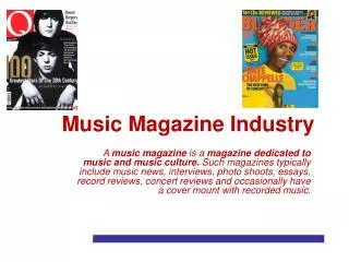
Music magazine. Amy Morgan. NME. NME had been published weekly since 1952. It focuses on punk rock and Indie bands. Other stories are placed at the top of the magazine so that they can be seen as well as the main story. This makes the magazine look more interesting.

E N D
Music magazine • Amy Morgan
NME NME had been published weekly since 1952. It focuses on punk rock and Indie bands. Other stories are placed at the top of the magazine so that they can be seen as well as the main story. This makes the magazine look more interesting. The title is visible and can be seen straight away. None of the text is the same. The Lily Allen story has been written in interesting writing to attract the attention of potential buyers. Lily Allen had many looks but this one makes her suit the type of music that the magazine promotes which is why she has her hair like she does and is wearing this top. Two other statements are written in these bubbles to make it easy to read and make the reader want to read the full story. The main article is written clearly and can be easily seen and read All the people that are featured in the magazine are at the bottom so that if people see a certain band, they are more likely to buy the magazine. Even though the background is white, the cover looks very cluttered which suits the theme of Indie.
Evaluation of NME cover • NME has been published weekly since 1952. It focuses on punk rock and indie bands. NME started as a music newspaper and has since developed into a music magazine aimed at young people who listen to this type of music. The cover shows the stereotypical type of person that listens to this type of music by having Lily Allen looking like she does here. Some people think that all people that listen to this type of music dress and act like the cover shows, such as destructive behaviour which is shown in the type of writing. These colours also relate to this kind of music. Black and red are often the colours worn by these singers and bands. These colours together also give a kind of rebel view. The title is in Red because it makes it easy to see because most of the magazine is black and white. There is no tagline on this magazine cover. The main article is written in big interesting letters so that the reader notices that bit of writing first. Above the title of the article, there is a quote from Lily Allen, giving the reader an idea what the article on her is about. There are two more articles at the top of the page, accompanied by pictures, showing that they are more interesting than the other articles that are placed around the picture. People are automatically drawn to pictures rather than text.
vibe The title is written in black and red writing which makes it easily visible so people cam immediately see what the magazine is. Vibe was first released in 1993 and is a magazine featuring rap and hip hop music. By saying ‘The real rap’, it sounds like this magazine has the best rap inside. This tells the readers what they are going to be seeing in the magazine. Eminem is on the front cover of this magazine because the main article is about him. Eminem is on the front of this magazine because there is a story about him in the magazine so it shows people immediately what they will be reading about. He also represents hip hop and rap. The colour scheme for this magazine cover is good because everything on the page is clear and easily visible. Also, it gives certain parts of the copy more importance. The tattoos on Eminem’s arm are typically associated with people who listen to hip hop and rap. All the stories are written around the main image because this looks good. Because people are looking at the picture, they will automatically read what stories are inside because they’re so close to the image. The background is white and grey to make the image and the red writing stand out.
Evaluation of vibe cover • Vibe is a music and entertainment magazine founded by producer Quincy Jones. It features R&B and hip hop artists, actors and other entertainers. It is a monthly magazine sold in the U.S. Just by looking at the front cover, it is automatically shown as a R&B and hip hop magazine because they layout, the colours used and mainly the image show attitude. The title ‘Vibe’ looks good because it is a merge of two colours. It is also big so that it is easier for a customer to find this magazine. The picture shows what type of magazine this is because it is of Eminem. For people that don’t know who Eminem is would also be able to tell from the picture what type of magazine this is by seeing that he has tattoos and the expression on his face shows that he is an angry person. All these traits are associated with rap, hip hop and R&B music. The background colours are a really good choice because the white and grey are very dull colours compared to the red that is placed over them.
NME contents page This list of articles is located down the left hand side of the contents page. This is because they are not as interesting as the rest of the articles but people still want to read them. The date is written quite largely at the top right of the page so that it’s easily seen. The inside of this magazine is a lot more colourful than the front cover. This gives it a bit more excitement than the cover has. By colouring these boxes, it is easy to see what each box contains and we are drawn to the colours because they are quite bright. The main photo here is connected directly to the article on this page. The fact that there is an article on the contents page is good because the magazine gets straight into the articles. The article is quite small because it is meant to be a contents page, the article just makes it more interesting and is not the main feature of the page. One article in each of the sections looks different to all the others. This is because these are the articles that people want to read. They look different so that people can spot them straight away. There is an advert at the bottom trying to persuade people to subscribe to the magazine. By doing this they have said that it’s ‘only a fiver a month’. They have also got a picture there of the next issues front cover. This makes people automatically read the advert and makes it more likely that they’ll subscribe. The background colours are black and white. I think that this makes the coloured sections, including the title, easier to see.
evaluation of NME contents page • I like the look of this contents page because it’s easy to see everything but doesn’t look too organised. I like the way the colours are used like the ones on the right side. The pictures look good where the are. The main image completely relates to the article, as do the pictures in the right column. The black, red and white theme from the cover is followed on this contents page but there are also added colours on here too. I think that the contents page should always match the front cover because they both look much better like this. Although the extra colours help the reader see the different sections, they don’t really show that this is a punk rock/indie magazine. It looks a bit more like a pop magazine. I like the way that everything that isn’t as ‘interesting’ is on the left column because this way people can see what’s inside if they want to know before they read the magazine. The title of the magazine isn’t very noticeable. It’s only small in the top left of the page. I like the way there is an article on this page. The contents page is usually quite boring but this article makes it much more exiting. It’s a good idea to have the advert for subscription on this page because this is the page that everybody looks at to find a certain story that they’ve maybe seen on the front.
Vibe contents page This contents page is quite boring and not something that automatically makes you look at it. The background colours are quite boring because it is just black, grey and white. A little bit of colour in the page would make it much more interesting. There is only two sections on this page. The features and the fashion articles. These are the only articles featured on the contents page. This is bad because people can’t find the stories they want and have to flick through the whole magazine. I like the way that the contents page every week has the same colour scheme and layout. This picture is good because she is an R&B singer. She attracts people because she looks good and has hardly any clothes on. This is a good idea to use women like this is a magazine because teenage boys will often buy a magazine just for the pictures like this. The contents page doesn’t fit with the front cover. It is not clear from the contents page that this is a hip hop and R&B magazine.
Evaluation of vibe contents page • I don’t like this contents page because it looks boring and doesn’t relate to the magazine. Also, there’s no information about what’s inside the magazine. I like the background but think it is ruined by the boring colours of the text and the image. The title is not on this page either which is disappointing. I like the image because it will draw people to the magazine. There is hardly any articles featured on this page. This magazine is monthly and should excite people when they look to see what articles are in Vibe this week but there is nowhere for people to see these.
NME article It is clearly stated in the top left corner what section of the magazine this is. If someone was just flicking through it they would see that this is the news section. The main image completely goes with the article because it is about Green Day. This picture is a perfect example of what punk bands look like so suits the magazine. The title is written on a red background. This makes the text easier to see and goes with the ‘punk colours’. Some of the words in the article are put into bold writing. These are the names of people so you can automatically see who is involved in the interview other than Green Day. There is an advert on this page for Green Days new CD because it’s likely that people will read it if it’s on a page like this. Green Day are a very famous punk band so most people that buy this magazine will read this page, meaning they’ll probably read the advert as well. The captions for the sections of the interview are written in red to make them noticeable and it can be easily seen what this interview is about. There is an extra story down the side of the page. The background on this is red so that there is a line between both stories so that people know this is a separate article to the Green Day one. The whole page fits with the theme of NME!
NME article evaluation • I like the way this article looks. The colours are a good choice because they fit the theme of a punk magazine and they look good together. The colours are used brilliantly, put in the right places for the right parts of the stories. The things that are meant to be seen first are written in read, such as the captions of the interview. There is the right amount of writing here. Not too much that it’s boring but not too little so that the interview has no information. I want to make my article look like this because I really like the look of it.
Vibe article The title is not very big and doesn’t have any extra colours. It doesn’t look very good because there’s nothing exiting about it. This bit of text is in yellow writing. It makes the reader look straight at this so you can see straight away what the story is about. The text is all in one font and basically the same colour. There should be some bold, italic or coloured words to make the article look better. There is one main image of the man who the story is about in the bottom left of the article. This is effective because by only having one image, the page is not overpowered by them and the text is what readers will look at.
Vibe article evaluation • This article doesn’t look very good and I would say it’s a bit boring. Although the readers eye is not drawn away from the text by additional colours and images, the page does need a bit more excitement than it already has. The title is nothing special and neither is the text for the article or the photos. My double page spread will look nothing like this because I don’t like it.