Download
1 / 6
60 likes | 149 Views
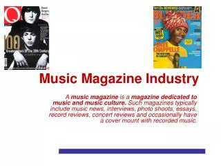
Music Magazine. Analysis. Masthead: The Masthead is bright yellow, making it stand out. If the magazine was on a stand the bright colour would catch customers eyes and draw them into reading it.

E N D
Music Magazine Analysis
Masthead: The Masthead is bright yellow, making it stand out. If the magazine was on a stand the bright colour would catch customers eyes and draw them into reading it. The masthead also matches the chair in the main focus of the magazine, the photograph, this fits the colour scheme thus making the overall look much more aesthetically pleasing. Text: The rest of the text on the magazine is black, with the exception of one word. The colour scheme of black and yellow make the cover bright and eye catching. The magazine makes it clear that the main feature is the musician is Jack White, which would make fans of him want to buy the magazine. Underneath the bold heading of the stars name, it includes a short quote which gives the viewer a taster of what is included inside. It also mentions other musicians in smaller print, and a different font, on the opposite side of the cover which could appeal to other fans too. Image: The main focus of the magazine cover is the musician who is featuring in the magazine, Jack White. The image is positioned in the centre of the cover which draws most attention to him. His head slightly overlaps the masthead, so this could be seen if it were on a stand amongst other magazines. Jack White is wearing all black, sticking to the colour theme of yellow and black, and sticking to his personal fashion sense, and music style. His pose is very simple, but his expression is slightly menacing.
Masthead: The Masthead is bright red making it bold, also above , it includes the name of a famous music artist which would attract fans to read the magazine. The red corresponds with different coloured fonts around the magazine, which has the effect of making certain areas stand out more than others. Text: The big eye catcher of the front cover is the bright pink headline of the featured band Paramore. The pink matches the front models’ lipstick therefore making her stand out from the rest of the text, and her other band members. As the featured band are all wearing dark clothes, the white writing matches the background and also stands out from the band. The title of the magazine and the title of the featured band are very large in comparison to other information on the cover, such as other bands featured in the magazine. Image: The band that is being featured, Paramore, are placed in a specific way. The lead singer is in front of the magazine name, and wears striped clothing and makeup, Whereas the other band members are wearing simple dark clothes, all have dark hair, and are placed further away from the lead singer. The title of the magazine overlaps the other band members as they could be seen as less important than the lead singer.
Masthead: The masthead is different for this magazine, as it is cracked like glass as the model is posing as if he is smashing it, which therefore creates a more interesting and eye catching front cover for regular Q magazine readers. The magazine also includes a black banner at the very top of the magazine which makes it easier to spot on shelves if it is behind other magazines. Text: The text varies a lot on the cover. The featured bands’ title is much larger than the other information on the page, and stands out against the grey background. Above the title of the band there is also a quote from the lead singer to draw in readers. The magazine has a clear colour scheme of blacks, whites and reds as it is used on the model, and in the text. It creates a more sophisticated tone to the magazine, than playful and cluttered such as Kerrang. Image: Matt Bellamy is featured on the front cover as he is the lead singer of the featured band in this specific magazine edition. As he is associated with the band Muse, and it very well known rather than the other band members, they have only chosen to photograph him for the front cover, but this will attract the fans’ attention as they would recognise him. The clothes that Matt Bellamy is wearing are black and red which fit with the front covers’ colour scheme and makes it look more attractive.
Masthead: The masthead for the contents page sticks to the magazines logo colour scheme, and also features the logo. It is very simple and the heading is clear and much larger than the other pieces of text on the page. Text: The text is very small as the page needs to fit a lot of information on each page of the magazine. The titles of each page are the same fonts and size to keep a simple but attractive theme. The break up the text sections there are pictures, and small lines such as in between each page number and title, and between the page title and further information on what the page contains. The text also conforms the red, white and black colour scheme. At the bottom of the page the logo, page number and issue number are included. Image: There are two images on the page, but one is much larger than the other as the readers or fans of that music artist will recognise who it is straight away , and then read the contents to see which page that musician is featured on . Both images are edited to be black and white, therefore they both conform to the colour scheme and are more aesthetically pleasing to the viewers of the magazine.
Masthead: The masthead for this double page spread is very simple but bold against the rest of the page. The first name is in lower case, and the last name is in capitals to stand out and catch the viewers attention. It is in a much larger font than the font for the interview with the artist. Text: The text on the page is very simple, and generally sticks to the same font. The interview is in black as well as the heading. What really stands out is the large ‘L’ for Lady Gaga overlaying the interview. It conforms to the obvious and recognisable colour scheme and stands out against the whole page. Image: The only image on the page is of Lady Gaga in a provocative pose and with direct eye contact which draws in attention. The image is on one side, and the interview on the other, so the seam of the magazine doesn’t cross over either image or text. The image is black and white and the model is wearing chains which contrast with the soft tones of her skin which makes it stand out more.