Download
1 / 16
160 likes | 197 Views
Explore the relationship between two variables using bivariate data, scatter plots, and lines of best fit. Understand correlation types and predict missing values. Apply these concepts to practical examples.

E N D
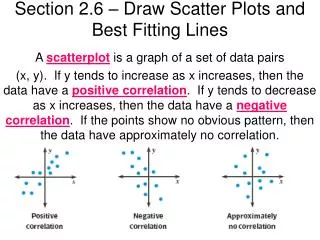
Bivariate data are used to explore the relationship between 2 variables. Bivariate Data involves 2 variables. Scatter plots are used to graph bivariate data because the relationships between the variables can be seen easily.
Line of Best Fit • Definition - A Line of Best is a straight line on a Scatterplot that comes closest to all of the dots on the graph. • A Line of Best Fit does not touch all of the dots. • A Line of Best Fit is useful because it allows us to: • Understand the type and strength of the relationship between two sets of data • Predict missing Y values for given X values, or missing X values for given Y values
An effective way to see a relationship in data is to display the information as a __________________. It shows how two variables relate to each other by showing how closely the data points _______ to a line. scatter plot fit The following table presents information on tornado occurrences. Make a scatter plot for the table.
1200 1000 800 600 400 Do you notice a trend? 200 1950 1955 1960 1965 1970 1975 1980 1985 1990 1995
Scatter plots provide a convenient way to determine whether a ___________ exists between two variables. correlation positive A __________ correlation occurs when both variables increase. negative A ___________ correlation occurs when one variable increases and the other variable decreases. If the data points are randomly scattered there is _______ or no correlation. little
Positive correlation Negative correlation little or no correlation
Example 1: The scatter plots of data relate characteristics of children from 0 to 18 years old. Match each scatter plot with the appropriate variables studied. 1. age and height 2. age and eye color 3. age and time needed to run a certain distance no correlation between age and eye color as your age increases your height also increases 2 1 as your age increases the time will decrease 3
Sometimes points on a scatter plot are represented by a trend line or a _______________________. You can study the line to see how the data behaves. You may have a basis predict what the data might be for values not given. line of best fit Example 2: Find the line of best fit for the scatter plot you made on the first page. To fit the line to the points, choose your line so that it best matches the overall trend. The line does not have to pass through any of the points.
Use the line of best fit to predict how many tornadoes may be reported in the United States in 2015 if the trend continues. 1200 1000 800 600 If the trend continues we predict that there will be 1200 tornadoes reported in 2015. 400 200 1950 1955 1960 1965 1970 1975 1980 1985 1990 1995 2000 2005 2010 2015
If the data points are close to the line of best fit, it is said to have a ___________correlation. strong strong positive weak positive strong negative weak negative
Application • Zimco Bottling Co. is promoting a continuing education program for its employees. The personnel director, Ms. Dirr would like to be able to predict an employee’s salary if she knows the number of year an employee attended college. From the current personnel files, Ms. Dirr randomly selected the files of ten employees. She recorded each employee’s salary and corresponding years of college for the employee. See next slide.
Example 1:Step 1: Graph the data points • To determine the relationship between the number of years of college and the salary, Ms. Dirr graphed the data points to obtain a scatter plot. She found that the points did not lie in a straight line, but clustered in linear pattern. She draw a line suggested by this pattern of points.
Step 2: Select two points • She then selected the points (2.5, 19), (7, 32) on that line to determine the equation of the line. To find the equation of this line, she first used the slope formula and the two points.
Step 3: Find the slope using the two points Step 4: Use one of the points and the slope to find the prediction equation. y = mx+b, where s = y,m = 2.9, and c = x. Point (7, 32) is used for values of c and s. Simplify Subtract 20.3 from both sides to isolate b.
Prediction Equation • Prediction equation is s = 2.9c + 11.7 • By using her prediction equation, Ms. Dirr can encourage the employees with little college education to go back to school. For example, she can predict that with five years of college education, their salary might be $26,200.