Scatter Plots
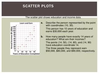
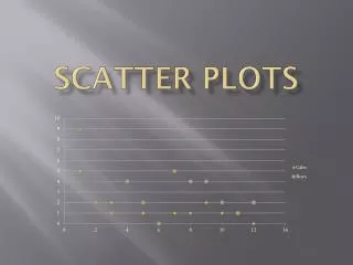
Scatter Plots. Algebra Seminar. What is a Scatter Plot?. A Scatter Plot helps to identify various types of trends and/or correlations associated with a particular set of data. What is a trend? A trend is the general direction that something moves What is a correlation?


Scatter Plots
E N D
Presentation Transcript
Scatter Plots Algebra Seminar
What is a Scatter Plot? • A Scatter Plot helps to identify various types of trends and/or correlations associated with a particular set of data. • What is a trend? • A trend is the general direction that something moves • What is a correlation? • A relationship between two different things
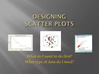
How do you create a Scatter Plot? • To create a scatter plot, simply plot the data as “Ordered Pairs” (x,y) and look for the trend presented in the data.
Note: The best way to use a Scatter Plot to make predictions is to draw a Line of Best Fit. • A Line of Best Fit attempts to go through the center of the data. • You want your line to go through as many points as possible.
The Correlation • If the Line of Best Fit is uphill we have a Positive Correlation. • If the Line of Best Fit is downhill we have a Negative Correlation • The more points the line passes through the Stronger the correlation • The fewer points the line passes through the Weaker the correlation.
Example: Car Weights and Gas Mileage • By plotting this information as Ordered Pairs, we can see their relationship on a coordinate plane. • Describe the trend. • If we know the trend, can we use it to predict anything?
Example: Macbooks sold since 2001 • By plotting this information as Ordered Pairs, we can see their relationship on a coordinate plane. • Describe the trend. • What can we predict from this information?