Download

1 / 23
230 likes | 362 Views
Today’s Lesson. Generating and Interpreting Scatter Plots and Lines of Best Fit. Warm-Up Activity. We will warm up today by working problems with fractions. 7. 3. 5. 4. 4. 5. What can you multiply these fractions by to get 1?. 9. 5. -. -. 5. 9. 14. 17. -. -. 17. 14.

E N D
Today’s Lesson Generating and Interpreting Scatter Plots and Lines of Best Fit
Warm-Up Activity We will warm up today by working problems with fractions.
7 3 5 4 4 5 What can you multiply these fractions by to get 1?
9 5 - - 5 9 14 17 - - 17 14 What can you multiply these fractions by to get 1?
Solve for x. Multiply by the reciprocal.
Solve for x. Add two-thirds to both sides. Multiply by the reciprocal.
Solve for x. Subtract seven-eighths from both sides. Multiply by the reciprocal.
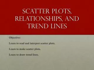
Whole-Class Skills Lesson Today, you are going to generate and interpret scatter plots and find the lines of best fit.
What are some ways to graph lines? y = mx + b two points and the slope formula
The graph we will explore today will not have a straight line.
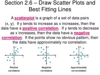
Scatter Plots Scatter Plots relate two sets of data. The strength of the relationship can be seen by looking at the data points.
Scatter Plots If the points are close together, then there is a strong relationship between the two data sets. If the points are spread out, then there is a weak relationship between the data sets.
Correlation Positive Correlation As x increases, y increases. If the relationship is increasing, then the graph has a positive correlation.
Correlation Negative Correlation As x increases, y decreases. If the relationship is decreasing, then the graph has a negative correlation.
Correlation No Correlation If there isn’t a relationship between the data points, there is no correlation.
Line of Best Fit Line drawn on a scatter plot that fits the most data points. The line can be used to make predictions.
Line of Best Fit The line should split the data fairly evenly. Notice this line has about 7 points above and below the line, and it passes through several points.
Walking times were recorded for Saturday’s Fun Walk in a scatter plot. What relationship exists between the two sets of data?
There is a strong positive correlation. The longer you, walk the more miles you have walked.
How many miles do you think you will have walked after half an hour? About 1 mile
What data does this scatter plot show? Test scores and how they relate to time studied
What type of correlation does this graph show? This is a positive correlation. The higher the test score, the longer you studied.
Based on the line of best fit, how long do you think you should study to get an 80? About ¾ of an hour