Download
1 / 51
510 likes | 550 Views
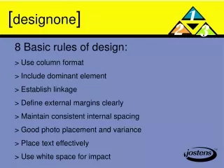
[ design one ]. 8 Basic rules of design: > Use column format > Include dominant element > Establish linkage > Define external margins clearly > Maintain consistent internal spacing > Good photo placement and variance > Place text effectively > Use white space for impact. [ design one ].

E N D
[designone] 8 Basic rules of design: > Use column format > Include dominant element > Establish linkage > Define external margins clearly > Maintain consistent internal spacing > Good photo placement and variance > Place text effectively > Use white space for impact
[designone] Column Format: > Emits a planned look > keep content elements within columns; don’t stop in the middle > options rage from six to 26 per spread > eight column remains popular
[designone] Dominance: > requires one content element, often a photo,be displayed larger than the other elements > showcases important content > becomes the focal point of the design
[designone] Linkage unites pages into spreads: > cross the gutter > establish an eyeline > unify with graphics
[designone] External margins: > Elements line up on side margins > Top margin may vary but high in centre, low on outside > Bottom margin consistent throughout book, while allowing for folios, folio tabs and folio art
[designone] Internal spacing should be consistant: > Spacing between elements > Generally 1 pica spacing > Avoids trapped white space
[designone] • Photo variance creates visual interest: • > size: big vs. small • > format: horizontal vs. vertical • > shape: modular vs. circular > color: process color vs. black and white > eyeflow should direct reader into the page
[designone] Placement of text: > Headlines and story treated as single block > Captions 1 column in width > Orient captions adjacent to photos – above, below, beside > Keep copy to the outside to avoid trapping white space
[designone] White space should be planned: > Outside edges balanced > Can be used to isolate content > Can be used to frame content > Can be used to highlight content
[designtwo] Where do I begin??? > Determine column format > Establish eyeline > Place dominate element > Place photos from centre of spread outward > Place text to the outside
[designtwo] That’s the basics!!! The next step is to go beyond that with your own creativity but always remember the basics
[designthree] Smaller columns offer freedom: > three, four, five and six pica column widths offer more shapes and sizes for content elements > greater command over planned white space