Creating a Powerful PowerPoint Presentation
Creating a Powerful PowerPoint Presentation. By Mr. Cole. - Graphics. When Designing a Powerful PowerPoint Presentation. Concentrate on effective use of Text. - Color. - Animation. - Sound. Text. Be concise- don’t use long sentences or paragraphs Don’t use complete sentences

Creating a Powerful PowerPoint Presentation
E N D
Presentation Transcript
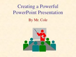
Creating a Powerful PowerPoint Presentation By Mr. Cole
-Graphics When Designing a Powerful PowerPoint Presentation... • Concentrateon effective use of • Text - Color -Animation -Sound
Text • Be concise- don’t use long sentences or paragraphs • Don’t use complete sentences • Make sure your text is large enough to be seen from far away • Your text is only an outline of what you will discuss in detail
Don’t do this! Davy Crockett • Davy Crockett was born on August 17, 1786 in Green County, Tennessee. • Davy Crockett was the 5th of 9 children in his family. • Davy Crockett ran away from home at the age of 15 for 3 years. • He started school at the age of 13. • Mr. Crockett was married in 1813 to Mary (Polly) Finley.
Do This Instead! Davy Crockett • Born August 17, 1786 in Green County, Tennessee • 5th of 9 Children • Ran away from home at 15 • Started school at 13 • Married Mary (Polly) Finley in 1813
Color • Use contrasting colors for background and text • black text on a white or light gray background • violet text on a light yellow background • Use complimentary colors, not clashing colors • Do not use a photo or graphic image as a background - it makes the text difficult to read • Be consistent throughout your presentation
Don't Make your Slides Look Like This • This is very hard to read because the background is too dark for the text • The text here is too small to be read easily from far away • The graphic is difficult to see with this background
Try This Instead • This is much easier to read because the background is not too dark for the text • The text here is easy to read from far away • The graphic is easy to see with this background
Don’t Do This Either! • The colors here take away from the message rather than enhancing it • This is actually difficult to look at- it strains the eyes • Be careful in your use of color.- The text cannot be read when it’s red on red
Try Something Like This Instead! • The colors here do not distract the audience from the message • These colors will not strain the eyes • The text contrasts with the background rather than matching it
Graphics • Should be meaningful • Good as metaphors
Graphics, Con't. • Too many can be distracting
Sound Animation and • Use sound and animation to accentuate and enhance your presentation • Overuse of sound and animation can be distracting and annoying to the audience
Tips to Remember • Keep your purpose in mind • To deliver your information productively • Pay attention to your use of text, color, graphics, sound and animation • Use them to enhance your presentation • Do not overuse • Be consistent throughout your presentation

