Download
1 / 10
110 likes | 321 Views
. C . o . l . o . r . The Color Wheel. The color wheel or color circle is the basic tool for combining colors. The first circular color diagram was designed by Sir Isaac Newton in 1666.

E N D
The Color Wheel The color wheel or color circle is the basic tool for combining colors. The first circular color diagram was designed by Sir Isaac Newton in 1666. The color wheel is designed so that virtually any colors you pick from it will look good together. Over the years, many variations of the basic design have been made, but the most common version is a wheel of 12 colors based on the RYB (or artistic) color model. Traditionally, there are a number of color combinations that are considered especially pleasing. These are called color harmonies or color chords and they consist of two or more colors with a fixed relation in the color wheel.
In the RYB (or subtractive) color model, the primary colors are red, yellow and blue. The three secondary colors (green, orange and violet) are created by mixing two primary colors. Another six tertiary colors are created by mixing primary and secondary colors.
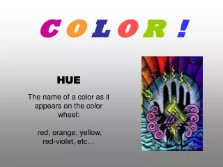
Warm and Cool Colors The color circle can be divided into warm and cool colors. Warm colors are vivid and energetic, and tend to advance in space. Cool colors give an impression of calm, and create a soothing impression. White, black and gray are considered to be neutral.
Complementary color scheme: Colors that are opposite each other on the color wheel are considered to be complementary colors (example: red and green). The high contrast of complementary colors creates a vibrant look especially when used at full saturation. This color scheme must be managed well so it is not jarring. Complementary color schemes are tricky to use in large doses, but work well when you want something to stand out. Complementary colors are really bad for text.
Analogous color scheme: Analogous color schemes use colors that are next to each other on the color wheel. They usually match well and create serene and comfortable designs. Analogous color schemes are often found in nature and are harmonious and pleasing to the eye. Make sure you have enough contrast when choosing an analogous color scheme. Choose one color to dominate, a second to support. The third color is used (along with black, white or gray) as an accent.
Triadic color scheme: A triadic color scheme uses colors that are evenly spaced around the color wheel. Triadic color schemes tend to be quite vibrant, even if you use pale or unsaturated versions of your hues. To use a triadic harmony successfully, the colors should be carefully balanced - let one color dominate and use the two others for accent.
Split-Complementary color scheme: The split-complementary color scheme is a variation of the complementary color scheme. In addition to the base color, it uses the two colors adjacent to its complement. This color scheme has the same strong visual contrast as the complementary color scheme, but has less tension.
Rectangle (tetradic) color scheme: The rectangle or tetradic color scheme uses four colors arranged into two complementary pairs. This rich color scheme offers plenty of possibilities for variation. The color schemes works best if you let one color be dominant. You should also pay attention to the balance between warm and cool colors in your design.
Square color scheme: The square color scheme is similar to the rectangle, but with all four colors spaced evenly around the color circle. Square color schemes works best if you let one color be dominant. You should pay attention to the balance between warm and cool colors in your design.