Download
1 / 32
360 likes | 637 Views
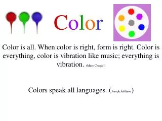
C o l o r. Color is all. When color is right, form is right. Color is everything, color is vibration like music; everything is vibration. (Marc Chagall). Colors speak all languages. ( Joseph Addison ). Color depends on light, because it is made of light.

E N D
Color Color is all. When color is right, form is right. Color is everything, color is vibration like music; everything is vibration. (Marc Chagall) Colors speak all languages. (Joseph Addison)
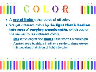
Color depends on light, because it is made of light. There must be light in order for us to see color. The whiter the light the more true the colors will be. Hue, Value and Intensity are the three main characteristics of color. Color Spectrum -
Color Mixing and the Color Wheel The color wheel is a tool artists use to learn the relationships of colors to each other. The color wheel is set up in a Circle using the Primary Colors, Red – Yellow – Blue and usually the Secondary Colors, Green – Orange and Purple. In this color wheel the tertiary Or intermediate colors are also shown – Red-Violet, Blue-Violet, Yellow-Orange, Red Orange, Blue-Green, and Yellow-Green
It's easy to mix paints to make new colors. You can use the primary colors (red, blue, and yellow) plus black and white to get all of the colors of the rainbow.
Neutrals Black, white, brown and gray are not true colors (or hues). They are considered to be neutral, achromatic colors. Typically, the Neutral Colors are Black, White, Brown and Gray. They are not on the color wheel because they are neutral and independent from the Primary Colors. Neutral Colors coordinate with all colors. Neutral Colors do not "clash" with any colors. Neutral Colors also do not "make" any "new" colors by mixing them together. Neutral Colors do produce variations of existing colors.
Intensity refers to the brightness or dullness of a color. An example is bright red (or dull red). You can reduce the intensity of a Color by mixing together Complimentary colors. This makes the color duller or not as bright. Reducing the intensity and Neutralizing a color are considered the same. This also produces neutrals, also called TONES.
By mixing complimentary colors you can develop a whole tonal range of colors called Tones. Tones are mixtures of complimentary colors that reduce the intensity (brightness) of colors. Tones Here, blue and orange have been mixed together to give a whole range of tones. This method is also called neutralizing colors because many become neutral colors in the process.
To make a color lighter in value, add color to white. The more white you add, the lighter the color will get. This is called a tint of the original color. To make a color darker (this is called a shade of the original color), add a small amount of black. If you add too much black, your color will be almost black. Making Colors Lighter or Darker Or --- Working With Value Tints Shades
In the diagram you can see the difference between some of the properties of color. The pure color of “blue” is called a HUE When white and blue are mixed together it is called a TINT When black and blue are mixed together it is called a SHADE
Artists will use tints and shades when creating Atmospheric perspective In a work of art. In his painting, Bathers, Seurat used tints and shades to create a feeling of depth and perspective in his painting.
TEMPERATURE AFFECTS SIZEthe perceived size of an object is affected by its colorwarm colors advance, cool colors recedeboth interior squares are the same physical sizebut the yellow square should appear to be slightly larger
CONTRAST AFFECTS SIZEthe perceived size of an object is affected by its contrastlight areas advance, dark areas recedeboth interior squares are the same physical sizebut the lighter square should appear to be slightly larger
How do artists choose which colors to use? • There are several different color combinations that artists can use. • These different combinations are called “color harmonies”. • On the next several slides, a variety of color harmonies will be discussed. • In the future, you will need to refer to these harmonies, and make decisions for your own artwork.
Monochrome (meaning "one color") color harmonies include only one color in different value (the lightness and darkness of a color) and intensity (the brightness or dullness of a color). An example of a monochrome color scheme could include any color mixed with white, gray, or black. For example, red, rose and pink (red mixed with white) are monochrome.
Analogous colors (also called Adjacent colors) uses colors that neighbor each other on the color wheel. An example is a color scheme that includes various values and intensities of reds and oranges. Adjacent Means “next to”.
Colors that are placed next to, or adjacent to other colors can also appear to be different hues. COMPLIMENTShues opposite each other on the color wheel intensifies the difference between colors ANALOGOUShues next to each other on the color wheelthe colors blend and are harmonious Colors have different moods, temperature and contrast, depending on the color they are next to. OPTICAL COLOR color is affected by surrounding colors both lighter rectangles are exactly the same colorbut each should appear different based on the color around it
Van Gogh used optical color mixing in his paintings all the time. This style of painting was called Impressionism.
So did Gorges Seurat in Afternoon at La Grande Jatte This style of painting was called pointillism.
Colors opposite each other on the color wheel are called complementary colors. For example, violet and yellow are complementary colors. So are red and green, and blue and orange.
A single split compliment uses a primary color plus colors on either side of its compliment. An example is a color scheme that includes various values and intensities of greens, violet-reds and red-oranges.
A double split compliment (also called tetradic) uses two pairs of compliments, one apart on the color wheel. An example is red, green, orange, and blue.
A triad uses colors at the points of an equilateral triangle (three colors spaced equally on the color wheel). These are sometimes called balanced colors. An example of a triadic scheme could be red, blue, and yellow; green, orange, and purple, etc.
Color Has Temperature Warm Colors and Cool Colors:The warm colors include reds, oranges, and yellows; the cool colors include blues, greens and violets. The neutral colors are black, white, and grays.
Analogous: Colors that are Related or Next To Each Other On The Color Wheel
Double Split Complementary
Split Complementary
Triad Color Scheme
Warm Color Scheme