Download
1 / 3
30 likes | 157 Views
Contents Page Analysis Niall McCaughan. The inclusion of an editors letter is something commonly seen in magazines in modern times. It adds a sense of authenticity to the magazine whilst invoking a laid back feel to the contents page.

E N D
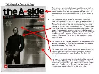
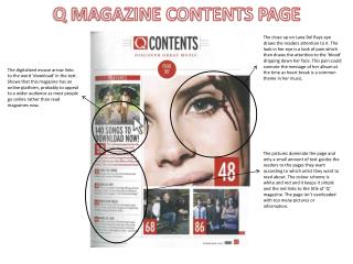
The inclusion of an editors letter is something commonly seen in magazines in modern times. It adds a sense of authenticity to the magazine whilst invoking a laid back feel to the contents page. It is evident that the largest entity of text is at the top right of the page clearly displaying what the page is – the contents. Although this is slightly different to the other text seen on this page, it still complies to the same forms and conventions, black and yellow palette, same font. The addition of a little tag line/article reference is something which could be useful to consider when creating my magazine. The largest picture seen on the page and apart from the masthead ‘contents’ possibly the first thing the eyes are drawn to. I thought it would be a good idea to promotoe my double page spread article in a similar way in my pwn contents page, therefore making it the largest and most profound image on the contents page. The page number refernces again conform to the forms and conventions, which helps maintain the professionalism. Forms and conventions – the same forms and conventions are maintained throughout this Kerrang! contents page. The yellow and black colour palette is very much the main scheme of the contents page, and the consistency of the fonts throughout is another technique magazines use to aid the forms and conventions. The page numbers are also very clear, giving the audience clear reference to the article/feature they are looking for. An assortment of photographs used here give the audience a feel to what is within the magazine and it is also a chance to give the audience a subtle hint as to what is going to be featured within the magazine. The photographs seen are almost all medium close up shots, and they are all the same size as each other to make the page look orderly and neat, and therefore more professional. Interesting use of space towards the bottom of the contents with a subscription promo – in my magazine, however, it could be a perfect opportunity to add a puff, burst, strap line or hook point.
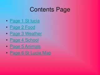
The addition of a ‘band index’ is in my opinion a very useful idea. The small column applies to the forms and conventions of the rest of the magazine, and the index makes it somewhat unique to NME magazine. Although a clever idea, I don’t think it would work as well on my own contents page. In this contents page, the colour palette is also maintained throughout, this time Black, Red and white, the ‘trademark’ conventional colours of NME Magazine. The thirds rule is incorporated through the majority of the contents page, but again the masthead of ‘NME THIS WEEK’ is the most obvious thing to the reader upon first viewing. The inclusion of an editors letter is replaced in this contents page with a snippet of an article featured in the magazine. It is also featured on the contents to achieve the ‘more for your money’ look – if the reader is getting articles and information from the very first page, this makes the magazine more worth its price. It is an interesting feature which I could possibly use in my magazine contents page. The use of sub-headings allows the reader to go directly to the section of the magazine that they were looking for. It also adds a sense of organisation to the contents and also is a convention which gives the audience a regular focus point each week, so that every time they read the magazine they know exactly what to look for under what sub-heading. The thirds rule is at its most evident here with the two pictures. The article and two pictures take up two thirds of the contents page, and this is therefore the most prominent thing on the page other than the large lettering at the head of the page. The two different photographs have similar background tones, which is interesting and makes them look almost blended. This is a technique I may want to use in my magazine for effect. The space towards the bottom of the contents page is used differently here – although it is similarly promoting the magazine further, the space is utilised to inform and persuade the reader to have a look at a certain article.