Download
1 / 12
120 likes | 245 Views
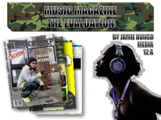
Music Magazine Evaluation. By: Josephine Sylvin -Edwin. The final product. The magazine. Forms and Conventions. In my opinion I think my magazine has a range of different forms from hip hop Conventional magazines and at the same time I think it has its own original look.

E N D
Music Magazine Evaluation By: Josephine Sylvin -Edwin
Forms and Conventions In my opinion I think my magazine has a range of different forms from hip hop Conventional magazines and at the same time I think it has its own original look. Firstly as we can see most magazines you will see in an conventional magazines masthead, sell line Masthead, Sell Lines, Issue Number, Barcode, Main Image etc. With my magazine I layered out the masthead on the top left corner but with the conventional magazine it is mostly in the middle of the page behind the image so that the masthead does not outshine the main image. In my magazine and most magazine the sell lines are concealing so it doesn't give all the information away. However my magazine challenges other magazines because as my main image is in an zoom in shot of her face it shows a bit of cleavage which is also similar to other hip-hop magazine which has an female rapper at the front cover. And finally another way my front cover follows most magazine conventions is the way the slogan is set out on the page normally in real music magazines you will see it under the masthead so that it is more likely people will look at it
Contents page My contents page had crucial components such as: title, contents list, artist image. In most music magazines the contents list always on one side but I decided to make it both side of the page only because so that not only one side looks so cramped up because the image take up most of the space and the title. As you can see it is the same colour scheme that I used for the front cover in most magazines they use a different colour scheme to what the model is wearing. Double page spread As you can see in most double page spread the image is usually on the left hand side of the page and the interview is on the right hand side I made the title big so that it fits in with the picture and the artist character so that the reader knows who she really is.
Representational issues How does your magazine represent a particular social group? My magazine represents the urban hip-hop style which is also leads to ghetto style . Most people stereotype this particular group as drugs, sex , weed and violence which were as I got my main idea from by using these stereotypes so that my image and content can all link to Hip-Hop. However my magazines tries to the main stereotypes by in my front cover contents and double page spread my model is showing a lot of cleavage which is what you would expect in an Hip- Hop magazine also my magazine shows some colloquial language in the main article. Overall I think my magazine represents an particular social group because as it is seen as an stereotypical Hip-Hop magazine.
Addressing the readership How did I attract/address my target audience? In order to attract and address my audience I used many features so it can link to my genre And the target audience. One of the features I used as you can see in my contents, front cover and my double paged Spread on my model she is wearing gold bling and showing a bit of cleavage, I done this as it is an hip—hop magazine they are the main stereotypes that people will want to see in an hip-hop magazine bling nice expensive clothes, bling and cleavage to show off who you are. Another feature that I used to attract my audience is used colloquial language to make the main article headline more interesting as it says ‘I'm the baddest bitch of east London people of the Ages of 16-21 won’t feel offended by the article will know what it means. It mainly means that She is the baddest female rapper in east London. Colloquial language
Institutions I think for my magazine there are a range of institutions that could distribute my magazine. As my magazine is target at the main age group were as young people go to these main shops it will more likely to sell to. I think it would most likely be distributed in an big institution were as most young people will be more likely to enter in there. I think one of the biggest institution that my magazine will most likely be distributed is WHSmith and footlocker mainly because with WHSmith it has all the books and magazine that you are looking for there so for my magazine to be distributed there will fit very well cause it will be in the section were there is all other music magazines. Footlocker is another institution were as I think it will most likely sell because it is an urban kind of background and there is a lot of young people seen inside footlocker as this is my main target audience it will to sell
Technical/construction issues At the process of my product I used a range of technology to make my front cover, contents page and my double page spread. For my front cover double paged spread and contents I mostly used Photoshop to add effect the image either make it lighter or darker, make the model skin look smooth and to also crop the background of the image off so that the background doesn't effect the layout of the page I also used paint for the same effect to crop the background. I used my 14.0 megapixel Samsung camera which gave me a very high quality of the pictures that I took when I zoomed in and out.
Comparisons between Preliminary to Final Work Main Task Preliminary Task
Front cover: • As you can see on the right both of my front covers are completely different due to the fact that there both have different styles of writing and effect towards the image. They are both addressed to a different social group . • Firstly the masthead of my main task is big and bold and it attracts the readers eye as soon as you look straight at it the colour scheme red makes the magazine more brighter as well as the model face is more brighten up as well as it all fits in with the model and what she is wearing. • On the other hand with the preliminary task the main image has less effects then the main task image as it was two people in the image it was more hard to do an effect which made the image successful.The masthead of the preliminary task wasn't really bold and catchy and also the sell lines blends in with the background so it was kind of hard to read. • Overall the preliminary task helped me with my main task by giving me an idea of how to layout my sell lines and everything else on the page so that it doesn't look too congested, how to add more effect to an image which is dark and finally how to make everything on one page stand out not only one thing.
Contents page: • My preliminary and main task has major differences again in the contents page the main differences is mainly on the content, structure, main image. • In my preliminary task the main image is based on two students looking at a book rather then looking at the camera but on the other hand with my main task the model is looking at the camera but in an slanted angle by looking at the camera it make the main image more effective but with my preliminary task the main models are not looking at the camera which hides there face a bit. • The structure of my preliminary task the writing is all laid out at the top of the page which makes the page to squashed up at the top but with the main task most my writing is laid out on the side of page. I also put at the top of my main task the issue number were as in my preliminary task the issue number is on the front cover of my page . • The most similar thing in both my contents page are the text type is the same but just different colour, size. • Overall my preliminary task helped with my main task because having the whole image without the background being cropped is not really professional and also using more effect on my main image and the background to make it link to my genre.