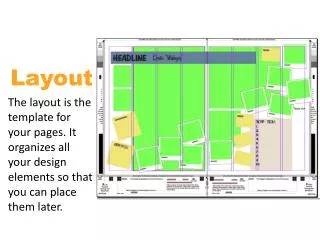
Engaging Two-Page Spread Design for a Rock Magazine Targeting Youth
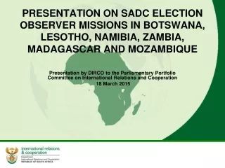
This two-page spread captivates readers with a full-body shot of an American female artist, effectively linking visuals with the text. The layout's balance of bold typography and highlighted areas directs attention to key points, while a color scheme of red, black, and white reinforces its rock genre identity. The organization enhances readability, making it accessible to a younger audience, particularly teens aged 16-18. By featuring more imagery than text and positioning text around the visuals, this design tells a story and invites deeper engagement with the content.

Engaging Two-Page Spread Design for a Rock Magazine Targeting Youth
E N D
Presentation Transcript
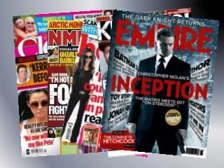
The two page spread is very interesting as it attracts readers attention by the effective use of a full body shot, showing people who the text is about. The artist shows the expected American female and this is shown by her sitting on something that looks like an American flag and the background linking to this. By making the first letter larger than the rest of the text people are guided through the text as it also stands out. The use of a cross head also gives people the chance to gain more information about the text before reading the main text. Some parts have been highlighted by the use of colour as this stands out from the rest of the colours used. The colour scheme used for most of the page is black and grey and the fact that some parts of the text have been highlighted by using contrasting colours makes it more interesting and eye-catching. This can be used to make sure that people do not miss out important bits of information. The simple background has been filled up with text making it seem less boring and more attractive for the audience. Layout The text is in the corner and on the right hand side making the layout easier to follow and more organised. This will attract more people to read the text as most people do not like over complicated spreads. The accessibility encourages people to not flick through without reading the text.
Colours The main colours used on this two page spread are red, black and white. These colours have a link with the type of music and are the conventional colours used when designing for rock magazines. This shows that there is a link with the colour scheme and the content. The colours used also stand out from the rather dark background, making it stand out and eye-catching. The colour red is used only for certain texts so that people are guided through the text easily. There are more images on the page than text, which helps to tell a story to the audience about the artist. All the text has been put on one side which also shows a sense of organisation, contradicting with the wild image the rock star gives the reader. The image used is linked to the large pull out quote at the top of the page, as it shows the process of them trying to become the best MCR they can be. The over all look is effective as it links with the whole stereotype of rock stars being wild rather than calming. This is shown by both the layout and the inconsistency of the size of pictures. Audience The target audience of this magazine (double spread) is most likely to be teenagers between the age of 16-18 years, this is gathered by the young age of the artists and the image of the whole page (mice en scene)
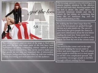
This double page spread is very different from the usual, as the image is positioned in the middle and the text is curved around it. In other magazine spreads the layout is kept simple making it less attractive to younger audience. When making my two page spread I will have to make the layout attractive as well due to my young audience. The colours used can attract a specific and expectedly young audience as the colours are associated with hip hop and other modern dances. They are also considered simple and professional as they are not too outstanding, this then makes the image stand out more. Another reason for the image standing out is the pose of the model as it curves with the text. The artist is shown twice and this also deviates it from normal double page spreads. There is a link between the title and the text contents as the word movement usually refers to dancing and other active things and the image also suggest that this is the text’s topic. When there are links with the image text and other things on a page, it is easier for people to understand what the text is about before they read it.