Effective Data Presentation: Techniques and Tips for Clarity and Precision
This guide explores sophisticated methods for presenting data, emphasizing clarity, originality, and spatial variation through visual aids such as maps. It highlights the importance of using appropriate techniques to convey information clearly and accurately, including the use of key labels and scales. A variety of presentation methods are discussed, with an emphasis on maintaining clear titles and figure numbers. By implementing these strategies, you will enhance the interpretability of your data while ensuring that each method aligns with the specific data set.

Effective Data Presentation: Techniques and Tips for Clarity and Precision
E N D
Presentation Transcript
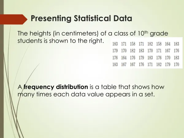
What does a more sophisticated method mean? • Shows how the data varies spatially (use a map) • Is original • Variety • Shows information clearly and accurately • Key, labels, scales etc all present
Use page 43-73 in coursework book for ideas of a range of presentation methods - Remember they must be clear and appropriate!
Things you need to include….. • Always give a clear title and figure number • Use a range of data presentation methods and make sure they are appropriate and clear for the data you are presenting. • Only use one method per set of data (i.e. not 3 different ways of presenting the people count).