Download
1 / 23
300 likes | 608 Views
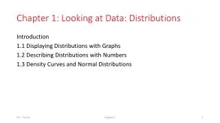
1.1 Displaying and Describing Categorical & Quantitative Data. You should be able to:. Recognize when a variable is categorical or quantitative Choose an appropriate display for a categorical variable and a quantitative variable

E N D
1.1 Displaying and Describing Categorical & Quantitative Data
You should be able to: • Recognize when a variable is categorical or quantitative • Choose an appropriate display for a categorical variable and a quantitative variable • Summarize the distribution with a bar, pie chart, stem-leaf plot, histogram, dot plot, box plots • Be able to describe the distribution of quantitative variables in terms of its shape, center, spread, and outliers.
Types of Graphs • Bar graph • Histogram • Dot plot • Stem leaf plot • Boxplots
Which graph to use? • Depends on type of data • For categorigal you will typically use either a bar or pie graph • For quantitative you can use dotplot, stemplot, histogram, boxplot.
Categorical Data • The objects being studied are grouped into categories based on some qualitative trait. • Can use either use frequency (count) or relative frequency (percentages) to express data ex- eye color, type of car you drive, gender, etc.
Quantitative Variables • Variables that are numerical. They represent a measurable quantity. • Ex- person’s height, # of hamburgers sold each day of the week, speed of a car, pulse rate, etc
Dot Plot • Summarizes quantitative data. • Horizontal axis represents measurement scale. • Plot one dot for each data point.
Stem-and-Leaf Plot • Summarizes quantitative data. • Each data point is broken down into a “stem” and a “leaf.” • First, “stems” are aligned in a column. • Then, “leaves” are attached to the stems.
Statistics: Stem-and-Leaf Plots Here are the scores from two periods of math class. Students took the same test. Period 1: 77 79 85 58 97 94 82 81 75 63 60 92 75 98 83 58 72 57 70 81 Period 2: 57 60 88 85 79 70 65 98 97 59 58 65 62 77 77 75 73 69 82 81
Statistics: Stem-and-Leaf Plots Period 1: 76 79 85 58 97 94 82 81 75 63 60 92 75 98 83 58 72 57 70 81 Notice that the data (numerical facts) are numbers between 57-98. Create the stem by listing numbers from 5-9. Stem Leaf 5 6 7 8 9 8 8 7 Stem Leaf A key should be included when making a stem-and-leaf plot. 3 0 5 6 7 8 9 7 7 8 6 9 5 5 2 0 0 3 Rearrange the leaf in numerical order from least to greatest 5 2 1 3 1 0 2 5 5 6 9 7 4 2 8 1 1 2 3 5 Key: 79 means 79 2 4 7 8 Match up the data to the stem-and-leaf. The last digit in 76 will match up with the stem 7. Then the last digit in 79 will match up with the stem 7. Then the last digit in 85 will match up with the stem 8 and this pattern will continue until all data have been recorded in the stem-and-leaf.
Statistics: Stem-and-Leaf Plots Period 2: 57 60 88 85 79 70 65 98 97 59 58 65 62 77 77 75 73 69 82 81 Stem Leaf 5 6 7 8 9 7 8 9 0 2 5 5 9 Key: 79 means 79 0 3 5 7 7 9 1 2 5 8 7 8
Histogram • Divide measurement up into equal-sized categories (BIN WIDTH) • Determine number (or percentage) of measurements falling into each category. • Draw a bar for each category so bars’ heights represent number (or percent) falling into the categories. • Label and title appropriately.
Use common sense in determining number of categories to use. Between 5 & 15 intervals is preferable Histogram
Strengths and Weaknesses of Graphs for Quantitative Data • Histograms • Uses intervals • Good to judge the “shape” of a data • Not good for small data sets • Stem-Leaf Plots • Good for sorting data (find the median) • Not good for large data sets
Strengths and Weaknesses of Graphs for Quantitative Data • Dotplots • Uses individual data points • Good to show general descriptions of center and variation • Not good for judging shape for large data sets
Summary • Many possible types of graphs. • Use common sense in reading graphs. • When creating graphs, don’t summarize your data too much or too little. • When creating graphs, label everything for others. Remember you are trying to communicate something to others!