Download
1 / 7
70 likes | 148 Views
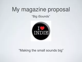
Explore how a classical music magazine follows or challenges media conventions through layout, design, and content choices.

E N D
Evaluation question 1: In what ways does your media product use, develop or challenge forms and conventions of real media products?
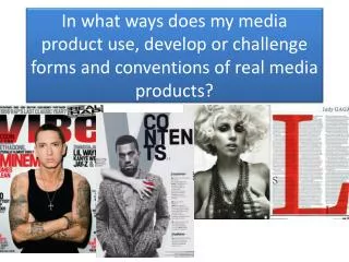
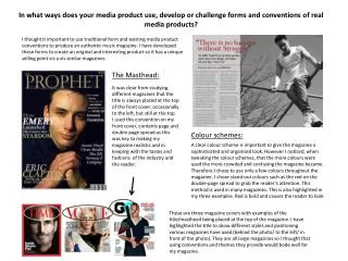
Above is the magazine I created as my Media AS coursework. The first image is my front cover, the second photograph my contents page and the third photograph my double page spread. I chose to create a classical music magazine, as I wanted to create a sophisticated but simple magazine and I felt a classical one would be the best option for that. Through this PowerPoint presentation, I am going to demonstrate how I have followed the forms and conventions of real media products.
MASTHEAD OF MY MAGAZINE The above photo is the masthead for my magazine, as you can see it has the generic positioning of top, left hand corner. This conforms to the majority of real music magazines and the audiences expectations of a music magazine like mine. I chose to position my masthead here as it allows it to be easily seen by the audience, I think this is crucial for a new music magazine like mine. Allowing it to be easily seen goes against the conventions of a rock magazine like Kerrang , which can usually leave the masthead half hidden by their cover photo. This is where we see magazines differ, Kerrang is a well known magazine so can therefore afford to do this.In terms of choosing the name of my masthead, I conformed to the forms and conventions of a classical music magazine. When researching, it was easy to realise classical music magazines tend to go for simplistic names, some of the ones that came to my attention were “music”, “listen”, “classic fm”, “classical music” and “musical opinion” as you can tell these names do not stand out and grasp your attention , they tend to be unpretentious unlike “Kerrang”, “Mojo” and “Rolling Stones” which are the names of the most common rock magazines. I therefore conformed , as my masthead is also unpretentious “note” . However , an idea I quite liked was to give my masthead a double meaning. It has the unambiguous meaning as a music note, but a hidden meaning of to take note, implying its importance. This perhaps isn’t a convention that classical music magazines do. I again conformed to the forms of conventions of a classical music magazine with the colour of my masthead, white. If you look at this link to Google search http://www.google.co.uk/search?hl=en&gs_rn=8&gs_ri=psy-ab&cp=19&gs_id=1x&xhr=t&q=classical+music+magazine&biw=1366&bih=667&bav=on.2,or.r_qf.&bvm=bv.44770516,d.d2k&um=1&ie=UTF-8&tbm=isch&source=og&sa=N&tab=wi&ei=fKZhUdipM9GT0QX6sIGoBg#imgrc=_you will see all the magazines either use the colour white or black. This differs from the conventions of a rock magazine as they tend to use bright vibrant colours like red and yellow. The colour white is not overpowering like the standard yellow/red/black text could be. For this reason, I think this could develop the conventions of a magazine to prove in some cases vibrant colours are not necessarily needed. I feel I have conformed to the conventions of a classical music magazine with the big font, but challenged the conventions with the lower case letter at the start. This is unusual even in classical magazines, but I believe it gives a feel of softness and comf ort with the idea of it being classical.
COVER IMAGE OF MY MAGAZINE The image of my front cover follows the forms and conventions of the majority of classical music magazines in the sense that it focuses on a close up of the model. The attitude of the photograph tends to have a big impact on the magazine, especially I noticed eye contact is important. I conformed to this convention as my model isn’t making eye contact, but still has an intense eye glare. The eye glare is powerful and deep , I believe this shapes the mood of my magazine for the inside contents e.g. my double page spread story isn’t necessarily fun, it has a sense of importance and maturity. I chose to place the image of the model on a plain black background, as it makes the pale neutral colour of his face stand out, making the eye glare and sharp stance more grasping. My photograph also has a formal studio style, which connotes the mature classical sense even more. I believe I have greatly conformed to the forms and conventions of a classical music magazine with this image , as all I stated above is specific to what real media products do.
LANGUAGE STYLE,FONTS, GRAPHICS AND COLOUR. As you can see, I haven’t actually included a lot of text on my front cover . I’ve tried to keep it as simple as possible as this was conforming to real media products. With a classical music magazine, the main focus tends to be on the image as I said in my previous slide. However, evidently magazines must have text on the front cover , although this tends to be kept to a minimum and fairly simple. “London calling, a guided walk through composer hotspots” here I believe I have conformed to the conventions of a classical music magazine, as I have used formal language which connotes a mature tone. Looking into deeper, a guided walk through composer hotspots in London is the type of event the audience would expect . For example if I had instead said “free ticket to one direction concert” the audience would question this and not necessarily be interested. For this particular sell line, I have used a vibrant red against the black background as this stands out and grabs the audiences attention to big city London. I have then separated the text and changed the colour to white, this makes it easier to read and stands out more than it all being the same colour and bunched together, which can sometimes be quite dull. I have done the same with my next sell line “James Lynch . From soldier to soloist. Exclusive interview with the man himself. Has the switch worked?” Also with this sell line I have simply changed the font “James Lynch” so it is different from the rest of the text, this is for the same reason as above to make it stand out. It came to my attention in not just classical music magazines, but all music magazines that they add a catchy phrase that grasps the audiences attention. I have therefore conformed the forms and conventions of a music magazine by adding my own catchy phrase “from soldier to soloist” this is more effective than writing a sentence on him changing positions as it is short and sharp. I have again conformed to the forms and conventions with a rhetorical question, I think this is important as you are involving your audience, asking them a question which gets their mind going. It then encourages the audience to read further , buying the magazine which makes your magazine work and be successful. The majority of music magazines do not come without one or two graphics to give the audience something to gain from buying the magazine, I therefore conformed to the conventions of a music magazine by choosing to create a vibrant red circle, letting the audience know they will gain a free CD of James Lynch’s as well as access to online music. I think this sells the magazine more to the audience more than a magazine that offers nothing. I chose the colour red as it stands out against the maroon coloured berry .
CONTENTS PAGE To the left of this slide is my classical music contents page and to the right is ‘Classical Music’ contents page. Through the use of these two images, I am going to demonstrate how I have followed the forms and conventions of a real classical music magazine. As you can see ‘Classical Music’ magazine have kept their magazine quite simplistic. They have a bold masthead at the top left hand side of the page, the font is humble and easy to read. In some ways I would argue I have followed the forms and conventions of their masthead, however my masthead is central to the page unlike theirs although I don’t think this makes a drastic difference in effect, apart from my masthead is probably more eye catching due to the bigger font. I have added a line underneath my masthead, which I have continued down the page and onto my double page spread, which you will see in the next slide. I chose to do this as I thought it made the page seem less empty and it gave a kind of smart look to the page. Although ‘Classical Music’ do not have an underlining line, I believe I have followed the forms and conventions by giving it a smart look in a different way. ‘Classical Music’ for example have a boarder around their page, that gives off the same effect. My Contents Page Classical Music Contents Page I most definitely agree that I have followed the convention of colours. ‘Classical Music’ has a dull green colour for their masthead, with a matching colour around their boarder. I have followed this with a dull black colour, followed by black underlining throughout the page. This keeps the page fairly unpretentious and easy to read, as I found through research this is a good convention to have in a classical music magazine as you do not want something busy and dramatic like you would have in ‘Kerrang’ for example. My contents and ‘Classical Music’ contents page have both added a touch of a vibrant colour (red) to the most important sell lines/page numbers, which the audience need to pay attention to the most. This makes the page more attractive and less dull. I have conformed to the conventions of the real classical music magazine by the layout of the images. Although the images are in different places, they are both have very much the same effect. Mine are in the same line going down the right hand side of my page and ‘Classical Music’ are going across the top of the page but in a formal straight line. As I have stated before, this gives off a smart mature look. Hence why both of the magazines would be aimed for an older audience, as the audience have to appreciate what is in it, not just the look which youths would most probably be attracted to.
DOUBLE PAGE SPREAD. I believe I have followed the forms and conventions of real music magazines with my double page spread, not only classical music magazines but a various selection. Firstly starting with the written content. The majority of music magazines whether they are rock or classical, tend to have a strong powerful well written double page spread story which sounds professional, I have therefore conformed to that convention. In terms of features of the double page spread, I have added the generic enlarged quotes. This is something I often came across in all magazines ‘Kerrang’, ‘Q’ and the classical music magazines I looked into ‘Classical FM’ and ‘Music’. This is a highly effectible feature, rather than a page full of writing with no space, the enlarged quotes grab the readers attention as soon as they look at the page. I also have an enlarged quote right of the top of the page which is in white, the white makes it stand out from the dark background and a quote like I have written grasps the reader and then requires them to read further. As I stated in my previous slide, I continued with my choice of underlining, I believe this has a great effect on my double page spread as not only is it showing continuity it makes the enlarged quotes stand out more, as does the continued red colour. I made the choice of having a small masthead at the top right hand side of the page, still continuing with the feature of underlining and instead having the main focus on the enlarged ‘S’. This was a convention I came across in the music magazine ‘Q’ it had a great effect on me as a member of the audience, so I thought I would use this as an idea. The ‘S’ starts off my article, as my story begins with ‘since’ , I thought the shape of the S was smooth and soft, implying how a classical music magazine is portrayed to be. The one thing I feel I may not have conformed to is the choice of a portrait photograph. This isn’t something I often came across, the majority of double page spreads tend to have a large landscape photograph with text underneath. However I found the layout of this didn’t work for my magazine. The layout I chose, works well I believe as it is neat and coordinated, again portraying my ‘neat’ classical music magazine.