Authentic Music Magazine: Using Conventions Creatively
This music magazine creatively uses traditional forms and conventions, such as masthead placement and color schemes, to create an original and appealing product. The layout and design are inspired by industry giants like MOJO, appealing to a wide audience. Targeting older boys and young men, the magazine features photos of 'Emery' and uses formal and casual language to cater to different generations. With a sophisticated and organized look, it aims to attract a diverse readership. The editor's note and distribution strategy through a reputable company like 'Seymour' ensure the magazine aligns with industry standards and reaches a broad market effectively.

Authentic Music Magazine: Using Conventions Creatively
E N D
Presentation Transcript
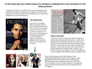
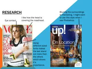
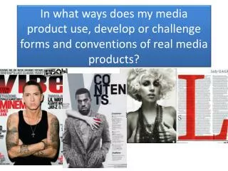
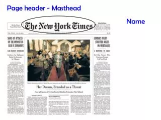
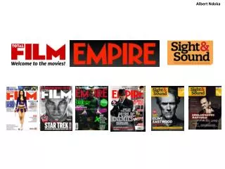
I thought it important to use traditional form and existing media product conventions to produce an authentic music magazine. I have developed these forms to create an original and interesting product so it has a unique selling point vis a vis similar magazines. The Masthead: In what ways does your media product use, develop or challenge forms and conventions of real media products? It was clear from studying different magazines that the title is always placed at the top of the front cover; occasionally to the left, but still at the top. I used this convention on my front cover, contents page and double-page spread as this was key to making my magazine realistic and in keeping with the tastes and fashions of the industry and the reader. Colour schemes: A clear colour scheme is important to give the magazine a sophisticated and organised look. However I noticed, when tweaking the colour schemes, that the more colours were used the more crowded and confusing the magazine became. Therefore I chose to use only a few colours throughout the magazine. I chose stand-out colours such as the red on the double-page spread to grab the reader’s attention. This method is used in many magazines. This is also highlighted in my three examples. Red is bold and causes the reader to look. These are three magazine covers with examples of the title/masthead being placed at the top of the magazine. I have highlighted the title to show different styles and positioning various magazines have used (behind the photo/ to the left/ in front of the photo). They are all large magazines so I thought that using conventions and themes they provide would bode well for my magazine.
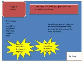
Contents page layout: I based my contents page on the themes and conventions of MOJO as this is relatively plain and the writing is in front of the photo. Also the colour style that MOJO uses is similar an idea I had to use the red to make certain elements stand out. As well as the font colour I also used the size to grab the reader’s eye. I kept the whole thing simple partly because I do not want readers to be too intrigued by the contents page and to keep the look of the magazine smart and sophisticated. I kept the title of the magazine in the bottom left hand corner to make sure I had room at the top for the whole word ‘contents’ to make sure that the reader could see what they were reading. I used two of my own photos taken at an Aussie Pink Floyd concert at the Colston Hall in Bristol as I thought the contents page looked plain without these. This wasn’t necessarily a bad thing as it looked organised and smart, but I thought two small photos would make the page more interesting. This might challenge the forms and conventions typical of music magazines but I believe the contents page will benefit. Editor’s note (contents page): It is common to find an editor’s note on the contents page of music magazines, so I decided that this would benefit my magazine and further help attract my audience. I used a form and convention typical of the music magazine to make the magazine more in tune with the industry giants.
How does your media product represent particular social groups? I have made reference to several social groups, particularly older boys and young men. This is because all of my photos used have included a boy; no girls. I did this deliberately to make the magazine more appealing to a male audience. Also, the magazine is clearly aimed at fans of ‘Emery’ as he is in all of the photos so a high percentage of the magazine is about him and his life. In my double page spread ‘Emery’ is wearing ‘hands on’, or vocational, style clothing which would appeal to perhaps vocational men such as builders and plumbers. The language I used is relatively formal but also casual in places so as to appeal to both older and younger generations. I think that young people might relate to the more casual language, whereas the older generations may prefer more formal language as it can appear more informative. My colour schemes are relatively simple, but this is only to make the magazine more sophisticated and organised which I feel would appeal to more of the mass market including the female market. I think this style of magazine would be attractive to more people of all ages.
What kind of media institution might distribute your media product and why? There are hundreds of distribution companies that publish a huge range of magazine genres, targeting different demographics & audiences around the world, including specialist, niche and Indy markets. Therefore picking the correct media institution to publish one’s product is critical, as it has the ability to dramatically increase or decrease the revenue of the product. The media institution I would use to distribute my magazine would be the company ‘Seymour’. One reason for this is because Seymour is the largest UK magazine distributor and would therefore be recognised by stores and corner shops as a distributor selling the right kind of magazine to make money. Secondly, Seymour exports magazines to more than 70 different countries worldwide. This would enable me to break into the international market, significantly increasing sales. Also, Seymour is part of the Frontline Group and Bauer Media Group which will also help my brand recognition as these are huge companies who sell to over 55,000 retailers. Being with Seymour and the Frontline Group would enable me to sell online to retailers (via delivery) and also in-store directly to the customer. Another reason to distribute via Seymour is that they have the ability to sell an online version of the magazine. This would appeal to many people as it would allow them to read via various devices e.g. iPads and smart phones. This would also enable the reader to read the magazine without having to physically carry it around; far more convenient. The final point is that Seymour and the Frontline Group are fully connected to almost all of the social media websites such as Facebook and Twitter. This could lead to more effective advertising and recognition of my brand as social media sites have millions of consumers and businesses connected to them; more people would see my brand so more sales.

