Download
1 / 55
550 likes | 692 Views
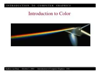
Introduction to Color. Part II. Lecture Roadmap. Color spaces—their rationales, and pros and cons (RGB, HSV, CIE, etc.) How color spaces influence color picking How to use color: some Dos and Don’ts. CIE Space Showing an RGB Gamut.

E N D
Introduction to Color Part II Color II - 10/30/14
Lecture Roadmap • Color spaces—their rationales, and pros and cons (RGB, HSV, CIE, etc.) • How color spaces influence color picking • How to use color: some Dos and Don’ts Color II - 10/30/14
CIE Space Showing an RGB Gamut • Note irregular shape of visible gamut in CIE* space; due to eye's non-linear response (as reflected by response curves) and color-matching using only RGB primaries requiring negative R) • Range of colors displayable on a given monitor clearly smaller than all colors visible in XYZ space (smaller gamut) • Note RGB cube is distorted because of projection used color gamut for typical RGB color monitor within XYZ color space * Abbreviation for the French name of the International Commission on Illumination Color II - 10/30/14
CIE Space Projection to Chromaticity Diagram Several views of X + Y + Z = 1 plane of CIE space • Left: X + Y + Z = 1 plane embedded in CIE space • Top right: view perpendicular to plane • Bottom right: projection of X+Y+Z=1 plane onto (X, Y) plane (i.e., Z = 0 plane). This is called the chromaticity diagram, used to: • Show Chromaticity – color (H, S), not luminance/brightness • Name colors • Define color mixing • Define and compare color gamuts Color II - 10/30/14
Spectral locus made up of chromaticity coordinates of monochromatic light. Outside locus bounds => not a visible color. Spectral locus closed by line spanning a blue and a red (non-spectral colors) CIE Chromaticity Diagram Color II - 10/30/14 • CIE chromaticity diagram is projection onto (X, Y) plane of X + Y + Z = 1 plane • Plots x, y for all visible chromaticity values • colors with same chromaticity map into same point regardless of luminance • spectrally pure, monochromatic colors on curve • points on a line that start/stop on spectral locus are non-spectral, a mix of two monochromatic colors • colors that are luminance-related are not shown • e.g., brown = orange-red chromaticity at low luminance • infinite number of planes that project onto • (X + Y + Z = 1) plane, whose colors all differ; NOT a full color palette! • illuminant C: near (but not at) x = y = z = 1/3; close to daylight
Hue and Dominant Wavelength seen Geometrically X is a non-spectral (i.e., non-monochromatic) color: a mixture of white and dominant wavelength indicated by where line from C through point hits spectral locus Excitation Purity : difference from illuminant's C relative to furthest point on chromaticity diagram with same hue - how pure (saturated) color is Color II - 10/30/14
Using the Chromaticity Diagram • Measure dominant wavelength and excitation purity of any color: • Especially useful because color can be specified even when it can’t be accurately displayed on a display • For a matched color at point A, B is a spectral color defined by the dominant wavelength • Mixture of two colors always on line between them, thus A = tC + (1– t)B where B is a spectral color and t measures distance from B to C • ratio AC/BC is excitation purity of A • NB: this is a more accurate “polar coordinate system” than circular color pickers because it ultimately derives from (non-linear) perception-based color matching data Color II - 10/30/14
Color Mixing/Color Gamuts (1/2) Colors add linearly in CIE: All mixtures of I and J lie on line connecting them Thus, all possible mixtures of I, J and any third color, K, (or additional colors) lie within their convex hull, the color gamut Thus, no finite number of real primaries can include all visible colors because hull is smaller than perimeter of diagram DEMO: http://www.cs.rit.edu/~ncs/color/a_chroma.html Color II - 10/30/14
Color Mixing/Color Gamuts(2/2) • Smallness of print gamut with respect to color monitor gamut means faithful reproduction by printing must use reduced gamut of colors on monitor Left: gamut of printer Right: gamut of monitor Color II - 10/30/14
Chromatic Opponent Channels • From Falk’s Seeing the Light, Harper and Row, 1986 • Can describe all colors in terms of red-green and yellow-blue—called psychological primaries (used in Adobe’s CIELab) Color II - 10/30/14
Lecture Roadmap • Color spaces—why? their rationales, and pros and cons (RGB, HSV, CIE, etc.) • How color spaces influence color picking • How to use color: some Dos and Don’ts Color II - 10/30/14
Color Spaces • A color space is a way of ordering colors in one, two, three (or more) geometric dimensions • From 600BC to 1600AD colors usually ordered by brightness. • Newton demonstrated familiar “rainbow” ordering of white light through a prism • Newton also first to arrange colors in a circle • Key aspect of color science By Mark D. Fairchild Color II - 10/30/14
Color Models for Raster Graphics • Different situations suggest different ways of talking about colors • Unambiguous industry standards—requires something like CIE space. • Programming for monitors easier in space defined by monitor : RGB space (RGB pixels for both CRT’s and flat panels like LCDs) • Printers use CMY (cyan, magenta, yellow) for color printing: CMY(K) space • Six-primary-color projection system: 6-color IRODORI space • User-friendliness: Hue, Saturation, Value (HSV) is easier than RGB • Need perceptual uniformity in the space? Munsell or CIELab • Etc. You can make up your own color spaces too… Color II - 10/30/14
The RGB Color Model (1/3) sRGB • http://www.cambridgeincolour.com/tutorials/sRGB-AdobeRGB1998.htm • https://fstoppers.com/pictures/adobergb-vs-srgb-3167 Adobe RGB • RGB primaries are additive • The RGB cube (Grays are on the dotted main diagonal) • Main diagonal => gray levels • black is (0, 0, 0) • white is (1, 1, 1) • RGB color gamut • differs from one monitor to another • differs by company too: • Adobe RGB - larger space • sRGB (HP/Microsoft) - fewer colors, but allocated bit depth better and more than enough for most on-screen and Web uses Color II - 10/30/14
The RGB Color Model (2/3) • Conversion from one RGB gamut to another (e.g., between two International Color Consortium (ICC) device profiles) • convert one to XYZ, then convert from XYZ to another • M is the 3 x 3 matrix of color-matching coefficients • Form of each transformation: • Where Xr, Xg,andXb are the weights applied to the monitor’s RGB colors to find X, and so on • Let M1 and M2 be matrices to convert from each of the two monitor’s gamuts to CIE • M2-1 M1 converts from RGB of monitor 1 to RGB of monitor 2 Color II - 10/30/14
The RGB Color Model (3/3) • But what if • C1 is in the gamut of monitor 1 but is not in the gamut of monitor 2, i.e.,C2=M2-1 M1C1 is outside the unit cube and hence is not displayable? • Solution 1: clamp RGB at 0 and 1 • simple, but distorts color relations • Solution 2: compress gamut on monitor 1 by scaling all colors from monitor 1 toward center of gamut 1 • ensure that all displayed colors on monitor 1 map onto monitor 2 Color II - 10/30/14
Green Yellow (minus blue) (minus red) Cyan Black Red Blue Magenta (minus green) The CMY(K) Color Model (1/2) • Used in electrostatic and in ink-jet plotters that deposit pigment on paper • Cyan, magenta, and yellow are complements of red, green, and blue • Subtractive primaries: colors are determined by what is subtracted from white light, rather than by what is added to blackness • Cartesian coordinate system • Subset is unit cube • white is at origin, black at (1, 1, 1): • subtractive primaries (cyan, magenta, yellow) and their mixtures Color II - 10/30/14
The CMY(K) Color Model (2/2) • Color printing presses, most color printers use CMYK (K = black) • K used instead of equal amounts of CMY • called undercolor removal • richer black • less ink deposited on paper – dries more quickly • First approximation – nonlinearities must be accommodated: K = min(C, M, Y) C’ = C – K M’ = M – K (one of C’, Y’, M’ will be 0) Color II - 10/30/14
The HSV Color Model (1/3) Hue, saturation, value (brightness) HSV-space invented by Alvy Ray Smith—described in his 1978 SIGGRAPH paper, Color Gamut Transformation Pairs. Hexcone subset of cylindrical (polar) coordinate system Single hexconeHSV color model. (The V = 1 plane contains the RGB model’s R = 1, G = 1, B = 1, in the regions shown) • Has intuitive appeal of the artist’s tint, shade, and tone model. • Based on perceptual variables vs. CRT phosphor (or LCD) colors • pure red = H = 0, S = 1, V = 1; pure pigments are (, 1, 1) • tints: adding white pigment means decreasing S at constant V • shades: adding black pigment means decreasing V at constant S • tones: decreasing S and V Color II - 10/30/14
The HSV Color Model (2/3) • Colors on V = 1 plane are not equally bright • Complementary colors 180° opposite • Saturation measured relative to color gamut represented by model which is subset of chromaticity diagram for a given value (note regular vs. irregular shapes resp.): • therefore, 100% S 100% excitation purity • Top of HSV hexcone is projection seen by looking along principal diagonal of RGB color • RGB subcubes are plane of constant V • Note: linear path RGB linear path in HSV! (has consequences for interpolation/animation) RGB color cube viewed along the principal diagonal Color II - 10/30/14
The HSV Color Model (3/3) • HSV to RGB conversion Cmin=V-C1 (R,G,B)=(R’+ Cmin,G’ +Cmin,B’ + Cmin) • RGB to HSV conversion Cmax = max(R,G,B) Δ = Cmax - min(R,G,B) S= Δ / Cmax V= Cmax Color II - 10/30/14
The HLS Color Model Hue, lightness, saturation Double-hexcone subset of XYZ space Maximally saturated hues are at S = 1, L = 0.5 Less attractive for sliders or dials Conceptually easier for some people to view white as a point Color II - 10/30/14
Perceptual Uniformity (or lack thereof) • RGB, HSV, HSL all perceptually non-uniform • move through color space from color C1 to a new color C1’ through a distance ΔC • C1΄ = C1+ ΔC • move through the same distance ΔC, starting from a different color C2. • C2΄ = C2 + ΔC • the change in color in both cases is mathematically equal, but is not perceived as equal • Moving a slider almost always causes a perceptual change in the other parameters, which is not reflected by changes in those sliders • changing hue frequently affects saturation and value • Want a perceptually uniform space • two colors that are equally distant geometrically are perceived as equally distant • changing one parameter does not perceptually alter the other two • Historically, the first perceptually-uniform color space was the Munsell system (early 1900s) Color II - 10/30/14
The Munsell System (1/2) • Created from perceptual data, is not a transformation of or approximation to CIE • Uniform, perceptually based 3D space • accounts for the fact that a bright yellow is much lighter than a bright blue, and that many more levels of saturation of blue can be distinguished than of yellow • Magnitude of change in one parameter always maps to the same effect on perception Color II - 10/30/14
The Munsell System (2/2) Lightness Hue/Chroma Saturation • Hues (called chroma in Munsell) arranged on a circle • a 20° rotation through this circle causes the same perceptual change • does not cause changes in saturation or value • Saturation as distance from center of circle • moving a certain distance always causes the same perceptual change • does not cause changes in hue or value • Value as height in space • moving vertically causes the same perceptual change • does not cause changes in hue or saturation Color II - 10/30/14
CIE Lab – a Perception-based Color Space • CIE Lab was introduced in 1976 • popular for use in measuring reflective and transmissive objects • based on the three color receptors of the human eye (red, green and blue) • Three components: • L* is luminosity • a* is red/green axis • b* is yellow/blue axis • Mathematically described space and a perceptually uniform color space • Given white = (Xn, Yn, Zn) • Regions of colors perceived as identical are the same size • Color space entirely dependent on the white value Color II - 10/30/14
Bonus Color Space: CIECAM02 Color Appearance Model Each rectangle in a row has the same pixel values Even perceptually developed spaces (like Munsell) don’t take into account color interactions Example: the surround effect, shown left which makes rectangles on a white background appear darker and on a black background lighter http://scanline.ca/ciecam02/ Color II - 10/30/14
Perceptual Effect Corrected For… Same pixel values Pixel values adjusted by CIECAM02 Color II - 10/30/14
One More Time… with Color (1/2) Same pixel values Color II - 10/30/14
One More Time… with Color (2/2) Pixel values adjusted by CIECAM02 Same pixel values Color II - 10/30/14
Color Model Pros and Cons (1/2) • RGB + Cartesian coordinate system + linear + hardware-based (easy transform to video) + tri-stimulus-based - hard to use to pick and name colors - doesn’t cover gamut of perceivable colors - non-uniform: equal geometric distance -> unequal perceptual distance • HSV + intuitive polar coordinate system + easy to specify colors/intuitive + easy to convert to RGB - nonlinear - doesn’t cover gamut of perceivable colors - non-uniform Color II - 10/30/14
Color Model Pros and Cons (2/2) • CIE + covers gamut of perceived colors + based on human perception (matching experiments) + linear + contains all other spaces - non-uniform (but variations such as CIE Lab are closer to Munsell, which is uniform) -xy-plot of chromaticity horseshoe diagram doesn’t show luminance • CIE Lab space + perceptually uniform + based on psychological colors (y-b, r-g, w-b) - terrible interface in Photoshop - sliders used for a curved surface - surface changes when L value changes - no visualization of the color space - very difficult to determine what values mean if you are unfamiliar with the space - primarily used as an internal space to convert between RGB and CMYK Color II - 10/30/14
Lecture Roadmap • Color spaces—why? their rationales, and pros and cons (RGB, HSV, CIE etc.) • How color spaces influence color picking • How to use color: some Dos and Don’ts Color II - 10/30/14
CIELab in Photoshop Lab color space slice—constant value (L) HSB color space slice—constant value (B) Lab slides Color II - 10/30/14
Interactive Specification of Color(1/3): Sliders English-language names are ambiguous and subjective Most programs use numeric coordinates in color space with slide dials: Adobe Photoshop Color II - 10/30/14
Interactive Specification of Color (2/3) : Geometric Views • Interact with visual representation of the color space • Important for user to see actual display with new color • Beware of surround effect! Color II - 10/30/14 HSB color picker from Adobe Photoshop HSV color picker from Mac OS X’s Finder
Interactive Specification of Color (3/3): Geometric Views, cont. Corel Painter Color II - 10/30/14
3D Color Pickers 3D spaces applet: http://www.cs.rit.edu/~ncs/color/a_spaces.html http://web.colorotate.org/ Color II - 10/30/14
Some Commercial Alternative Pickers • A color wheel-based palette creator, based on a perceptual color space: http://www.colorschemer.com/ • A relational palette creator, with HSV, RGB, CMYK, LAB, and HEX color pickers: http://kuler.adobe.com/ • A pen that scans real-world objects, interprets the HEX color, then mixes ink to match the color http://www.getscribblepen.com/https://www.youtube.com/watch?v=whqzGF8Ps8g Color II - 10/30/14
Interactive Palette Tools Adobe Kuler Gradient Mixer Color Grouper Palette Browser Barb Meier, Anne Spalter, David Karelitz, CG&A Vol24, No 3, 2004 (sponsored by Adobe) Dial-a-Color Color II - 10/30/14
Interpolating in Color Space (1/2) • Interpolation needed for: • Gouraud shading • antialiasing • blending images together in a fade-in, fade-out sequence • Results depend on the color model used: • RGB, CMY, YIQ, CIE are related by affine transformations, hence straight line (i.e., interpolation paths) are maintained during mapping • not so for HSV, HLS; for example, interpolation between red and green in RGB: • interpolating in HSV: • midpoint values in RGB differ by 0.5 from same interpolation in HSV: • (60°, 1, 0.5) (60°, 1, 1) • red = (1, 0, 0), green = (0, 1, 0) • midpoint = (0.5, 0.5, 0) • red = (0°, 1, 1); green = (120°, 1, 1) • midpoint = (60°, 1, 1) • RGB_to_HSV = (60°, 1, 0.5) Color II - 10/30/14
Interpolating in Color Space (2/2) • RGB, red is (1, 0, 0) and cyan is (0, 1, 1) which interpolate to (0.5, 0.5, 0.5), gray • in HSV, that is (UNDEFINED, 0, 0.5) • In HSV, red is (0°, 1, 1) and cyan is (180°, 1, 1) which interpolates to (90°, 1,1) • new hue at maximum value and saturation, whereas the “right” result of combining equal amounts of complementary colors is a gray value • (interpolating, transforming) (transforming, interpolating) • For Gouraud shading, use any of the models because interpolants are generally so close together that interpolation paths are close together • For blending two images, as in fade-in fade-out sequence or for antialiasing, colors may be quite distant • use additive model, such as RGB • If interpolating between two colors of fixed hue (or saturation), maintain fixed hue (saturation) for all interpolated colors by HSV or HLS • note fixed-saturation interpolation in HSV or HLS is not seen as having exactly fixed saturation by viewer! Color II - 10/30/14
Lecture Roadmap • Color spaces—why? their rationales, and pros and cons (RGB, HSV, CIEetc.) • How color spaces influence color picking • How to use color: some Dos and Don’ts Color II - 10/30/14
Using Color in Computer Graphics: Ask, “Why?” (Color use guidelines from Barb Meier’s 1987 Brown CS Master’s Thesis, and unpublished web text) Image from bat flight research being done at Brown • Aesthetic uses? • establish a tone or mood • promote realism • Highlight features? • Code numeric quantities? • temperature across the U.S. • vegetation and mineral concentrations on Earth, moon, and planets (LandSat, Mars missions) • speed of fluids in computational fluid dynamics (streamlines) • Font-itis color-itis Color II - 10/30/14
Choose Palette or Scheme • Color harmony: • choose a theme color • complementary colors for objects that should have a dynamic relationship with theme-colored objects • analogous (close together) colors close together to model light (shading) and for coloring objects close to each other • contrasting colors (especially value contrast) for text and background • Color circles can help with these choices • Expert palettes Color II - 10/30/14
Color palette books… Color II - 10/30/14
Assign Colors for Ease of Use/Reading/Viewing • Don’t use more colors than necessary (when in doubt use less color) • Ensure contrast of color between text and background (especially of value) • All else being equal, areas of saturated color will draw attention • Don’t use highly saturated colors of background • Large areas of intense color can lead to eye strain • Use colors that have greatest contrast with the background for most important items • If using several colors of foreground object, use a neutral background • Blue-family colors tend to recede while warmer red-family colors come forward Color II - 10/30/14
Color Coding (1/2) http://www.personal.psu.edu/faculty/c/a/cab38/ColorSch/SchHTMLs/CBColorSeq.html • Do • Use families of color to code related items • Use a progression of values to code an ordered set (don’t use more than 5 steps if values need to be remembered) • Color code for accepted use in specific industry: red often means stop, but in power industry means go (electricity flowing), In finance means money being lost… • Supply a legend Color II - 10/30/14
Color Coding 2/2 • Don’t • Use red and green for important color coding. Many people (10% men) red-green colorblind. • Use similar shades of green and blue for key differentiation. Often confused by viewers • Use adjacent small patches of different colors: they will just blend into each other • Use rainbow/spectral scale for ordinal coding: we have no sense of whether green is more or less than red… Color II - 10/30/14