Download
1 / 21
210 likes | 563 Views
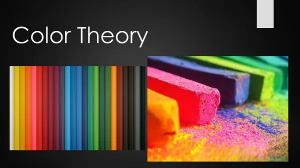
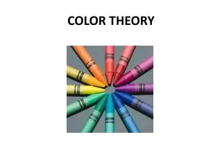
Introduction to Color Theory. Color & Rhetorical Purpose. Color Theory. Color Theory is a system of rules and guidance for mixing various colors in order to: Create Aesthetically Pleasing Blends Produce Maximum Readability and Clarity

E N D
Introduction to Color Theory Color & Rhetorical Purpose
Color Theory • Color Theory is a system of rules and guidance for mixing various colors in order to: • Create Aesthetically Pleasing Blends • Produce Maximum Readability and Clarity • Draw on Cultural Associations to Effect • Meaning
Why Learn Color Theory? Many people choose not to consult color theory. They think, “Well, I’ve got a good eye for these things.” The “good eye” for color may or may not be true based on who’s thinking it. . . . . . but in order to justify your choices it is good to have some theory to fall back on. Otherwise, all you can say is, “It just looks right!”
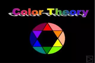
The Foundation of Color At its core, color is light. Light is composed of many different colors and the various mixtures of light compose the colors that we can see. Colors that can not be created by mixing other colors are called: PRIMARY COLORS
Using the Wheel • The colors are arranged on the wheel in such a way that purposeful color choices can be made. • Choices of color combination depend on what you are trying to accomplish. • Such as: • Contrast • Blending • Affect
Using the Wheel Complementary Colors Colors opposite from one another on the wheel. These colors will provide the most visual contrast. Contrast is the noticeable level of difference between two colors.
Contrast with Text The more a color contrasts with the colors around it, the more easily visible that color will appear. This fact is extremely important when using different colored texts and backgrounds. This is why black text on a white background is so popular and effective. There’s a high degree of contrast. On the other hand, blue and black offer little contrast. An extended read of this combination could be painful.
Contrast with Text But be careful, even though colors may contrast they may not always work well for text and background pairing. “Simultaneous Contrast” occurs when a color like red is fore grounded on blue. Note how the text appears to slightly vibrate. This would get annoying real quick. But simultaneously be aware of extreme lack of contrast in your text and background choices. Honestly, this is just painful. Do not make your readers struggle with this!
Rhetorical Color Contrast Contrast draws attention to the item that is most contrasting (or different) among a number of other design elements. Therefore, you can use color contrast to draw attention to an element of your design that is more important, relevant, or immediately pressing.
Practical Example Neither of these flyers is completely ineffective and both provide shape contrast with the text box. But the orange box above provides a nice contrast with the blues and grays of the clothes rack. The blue box here, however, is too similar to the clothes’ color palette.
Using the Wheel Analogous Colors Colors positioned next to each other on the wheel. These colors have very little contrast; therefore, they will provide harmonious blends.
Analogous Colors in Nature Nature offers an excellent look at analogous colors in action. Question: what color of flower could be added to this photo to provide a strong and attention drawing contrast?
Color and Cultural Association Color’s often come with feelings, moods, and associations that you can draw from in your work. For example, the color Red is largely associated with danger, aggression, stimulation, and excitement. Red stop signs signify danger if you don’t stop, and stimulates the senses with excitement less you don’t see one coming up!
Color and Cultural Association It’s an important to remember that these color associations do not come from the color itself. Without us to interpret it, red is simply light and doesn’t need an interpretive characteristic. Because these associations depend on us, they can differ from culture to culture, and they can also change over time. For example, purple use to be associated with solely belonging to royalty. This PowerPoint could now be beheaded if it weren’t made by the King or Queen!
Resources for Color Association There are a number of sources that list and suggest color associations that are commonly agreed upon by many people. A particularly interesting and useful one contains a number of fun Flash videos that illustrate these associations with music and animation. Color in Motion
For More Information • Contact the Purdue Writing Lab: • Drop In: Heavilon 226 • Call: 765-494-3723 • Email: owl@owl.english.purdue.edu • On the web: http://owl.english.purdue.edu