Download
1 / 10
110 likes | 220 Views
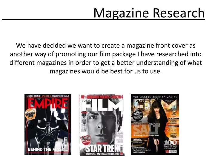
We have decided we want to create a magazine front cover as another way of promoting our film package I have researched into different magazines in order to get a better understanding of what magazines would be best for us to use. Magazine Research.

E N D
We have decided we want to create a magazine front cover as another way of promoting our film package I have researched into different magazines in order to get a better understanding of what magazines would be best for us to use. Magazine Research
Empire Magazine Empire Magazine is owned by Bauer Media, and is a magazine focussing solely on the release of new films and in depth, looks at film culture. Empire describe their audience as “76% male, affluent ABC1 movie fans and cinema hounds”. Empire is Britain’s leading film based magazine with a circulation of 198,947 in the month of January 2010. The price of their normal monthly publications are usually £3.99, which is a fair price for a monthly publication. The age of most of Empire’s readers are between the ages of 15-44, making a percentage of around 89% of the total number of readers. Our film package has a certification of 15 which is one of the reasons Empire magazine would be a good magazine for us to have a front cover on due to their high percentage of readers being 15-44 which would also mean we would be targeting a large audience. Reference: http://www.empireonline.com/magazine/
Analysis of Empire magazine cover Analysis of Cover MastheadThe masthead title of the magazine ‘Empire’ is a sans serif typeface, which tends to give it a lot more impact. This appeals to a male majority audience and demonstrates the magazine’s upfront in depth look at exiting new movies, drawing the viewer’s attention into the page and making the title of the magazine memorable. It’s the iconography of Empire’s font typeface that makes it easy to recognize an Empire magazine front cover, as its most likely the first word you’ll see on the page, even when its been covered up as demonstrated here by Matt Damon’s head. You could argue however in this sense that the character Matt Damon plays here is more important than the title itself, demonstrating the magazine’s priority to supply the information on new entertainment. The vivid red of the text adds to the powerful imagery in the magazine and fits with the theme, being action orientated. Strapline The strapline reads ‘Bourne goes to war!’, adding a bit of questioning to the cover, considering that the film ‘Green Zone’ isn’t a sequel to The Bourne Trilogy but includes the same actor and same director. This could appeal to a male audience, as it has a spoof feel to it but delivers the right punchy line telling the reader everything they need to know in short about the upcoming feature ‘Green Zone’, being that it’s a lot like the Bourne series but in warfare scenarios. The text itself matches the title of the movie’s typeface with its serif font that has impact, looking both formal and imposing to give off a warfare themed feel. It continues on with ‘A week on location withMatt Damon’, which adds intrigue as to the contents of the magazine.
Analysis of Empire magazine cover Main Image The main image probably has the most impact, despite the main character’s lack of a dynamic pose. However, he does look quite determined and resolute as he stands legs wide and arms apart whilst holding a gun in his right hand, clenching it slightly. The contrast between light and shadow is very large, giving a low key lighting effect to present depth and powerful imagery. The character is backlit, most likely from the fire/explosion that’s been shopped into the background. The motion of the fire against the black makes it seem like the image is spilling out of the page and over the text. The colours are very deep and once again powerful to reinforce this combination of imagery. Cover linesThe theme of this edition keeps between the colours white, red, black, green and yellow. This gives not only a lot of impact but a military feel to it as well due to the green, whilst the red supplies a warfare touch to it all. The black and white is the basic bread and butter of any text theme to appeal to a stereotypical male audience. All of the text is san serif apart from the titles and straplines, which helps them stand out against the others, possibly making it the first thing you read. This method could be interpreted in our own magazine, with the use of alternating colour of feature films down the side. Other FeaturesOther things to take notice of that could be constructed in our own magazine is the use of a sticker like bit of text at right side of the magazine, reading ‘Amazing 2010 Preview Issue’. This not only draws attention to the text but layers the magazine more for an aesthetic advantage. Another feature is the use of other photos like features from other films along the bottom, which is used frequently in magazines. Each of the pictures have lighter frames to help it stand out and seem more like a Polaroid, though they often slip under the image of the main character as demonstrated here as the picture slips under Matt Damon’s gun.
Analysis Empire magazine overall Overall View Overall I think Empire magazine would be a good magazine to have a font cover on, however we are wanting to target a mass audience and we need to think about whether or not this magazine will target the widest audience and support our film package. If we chose Empire magazine I think we should stick with how they usually compose their front covers with bold eye catching cover lines and a main image that represents our film package to the maximum As shown on previous slides the target market for this magazine is generally males that hold 76 % of the demographic however I am hoping to research further into a few more magazines and find a magazine with a more equal demographic. On a while I think this magazine would be a good choice to use due to their large demographic and the age of people who read Empire being in the same target age range as we have classified for our film package.
Sight and Sound Magazine Sight & Sound is a British monthly film magazine published by the British Film Institute (BFI). Sight & Sound was first published in 1932 and in 1934 management of the magazine was handed to the nascent BFI, which still publishes the magazine today. Sight & Sound was published quarterly for most of its history until the early 1990s, but in 1991 it merged with another BFI publication, the Monthly Film Bulletin, and started to appear monthly. It is currently edited by Nick James. Sight & Sound has a more highbrow reputation than other film magazines.It says it reviews all film releases each month, including those with a narrow art house release, as opposed to the more mainstream focus of its competitors. Sight and Sound also currently features a full cast and crew credit list for each reviewed film.
Sight and Sound Magazine ’Sight and Sound targets film enthusiasts - some of them within the film industry, film students, academics. We have a very loyal readership, with subscribers making up around 60 per cent of our readership and our average reader is in his mid-30s.’ - Ed Lawrenson Deputy Editor They provide a depth of film and television coverage that isn’t available in the more blockbuster-orientated magazines. They also have a brief to cover the whole spectrum of film, including art cinema, world cinema, and historical pieces. They cover Hollywood films, and aren’t elitist about it but they are also very conscious of British films and tend to concentrate on directors and film makers rather than film stars. Circulation: 26,100 (January - December 1999) Reference: http://journalism.winchester.ac.uk/?page=253
Total Film Magazine Total Film is a British film magazine published 13 times a year (every four weeks) by Future Publishing. The magazine was launched in 1997 and offers film, DVD and Blu-ray news, reviews and features. It is one of the largest circulation English-speaking film magazines in the world. Guest editors have included Peter Jackson, Kevin Smith, and Ricky Gervais and Stephen Merchant.
Total Film Magazine “Total Film has reached an average monthly circulation of over 100,000 copies a month in the latest UK ABC circulation figures, for the six months to June 05 released today. Posting an ABC figure of 100,625 copies per month, Total Film has delivered an impressive circulation growth of 10.9% year-on-year and 21.5% period-on-period, the highest increase for a film magazine in the ABC period. “ Due to Total Magazines mass and growing audience I think total magazine would be a great magazine to create a front cover for and to promote our film due to the mass audience that get this magazine.
Our Magazine Cover- When creating our magazine front cover we also need to make sure our design reaches the largest audience possible so as well as choosing a magazine that is popular with a mass audience we also need to think about what we include on this front cover. Masthead: The masthead functions to create a brand identity, which means the mast head has to look the same in every single edition as customers and potential customers will recognise this first of all. Selling Line: There needs to be a clear selling line that is easy to read and every catching to the reader that they will remember. Main Image: The main image need to represent our film and needs to be eye catching to the audience. Main Cover Line: The main cover line needs to represent our film and make the audience want to continue reading about our film.